Inplace Select
A dropdown that opens over itself: the selected option stays under the cursor and the list unfolds around it, then collapses into the trigger with the chosen row travelling into place.
$149 once · every Pro piece
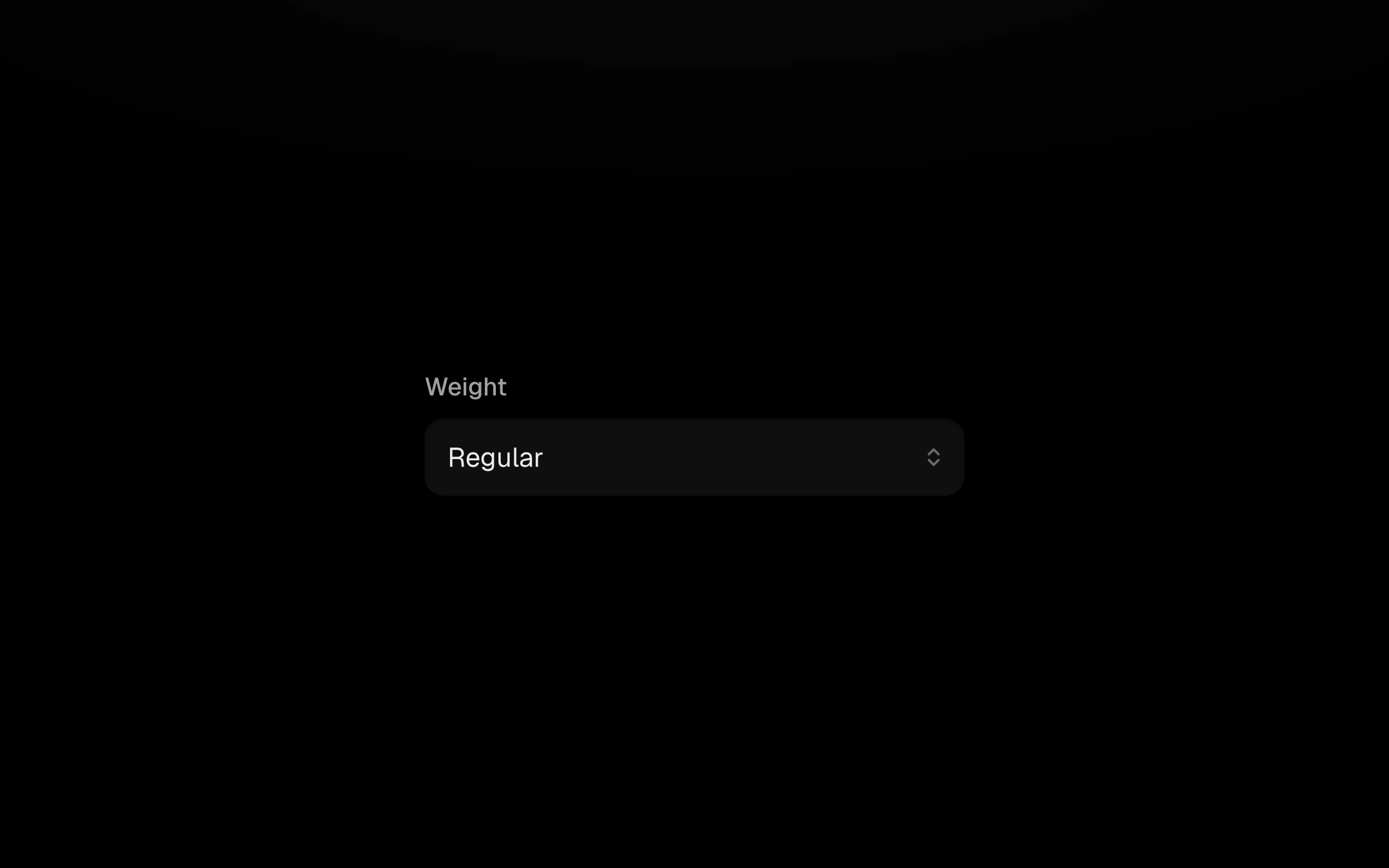
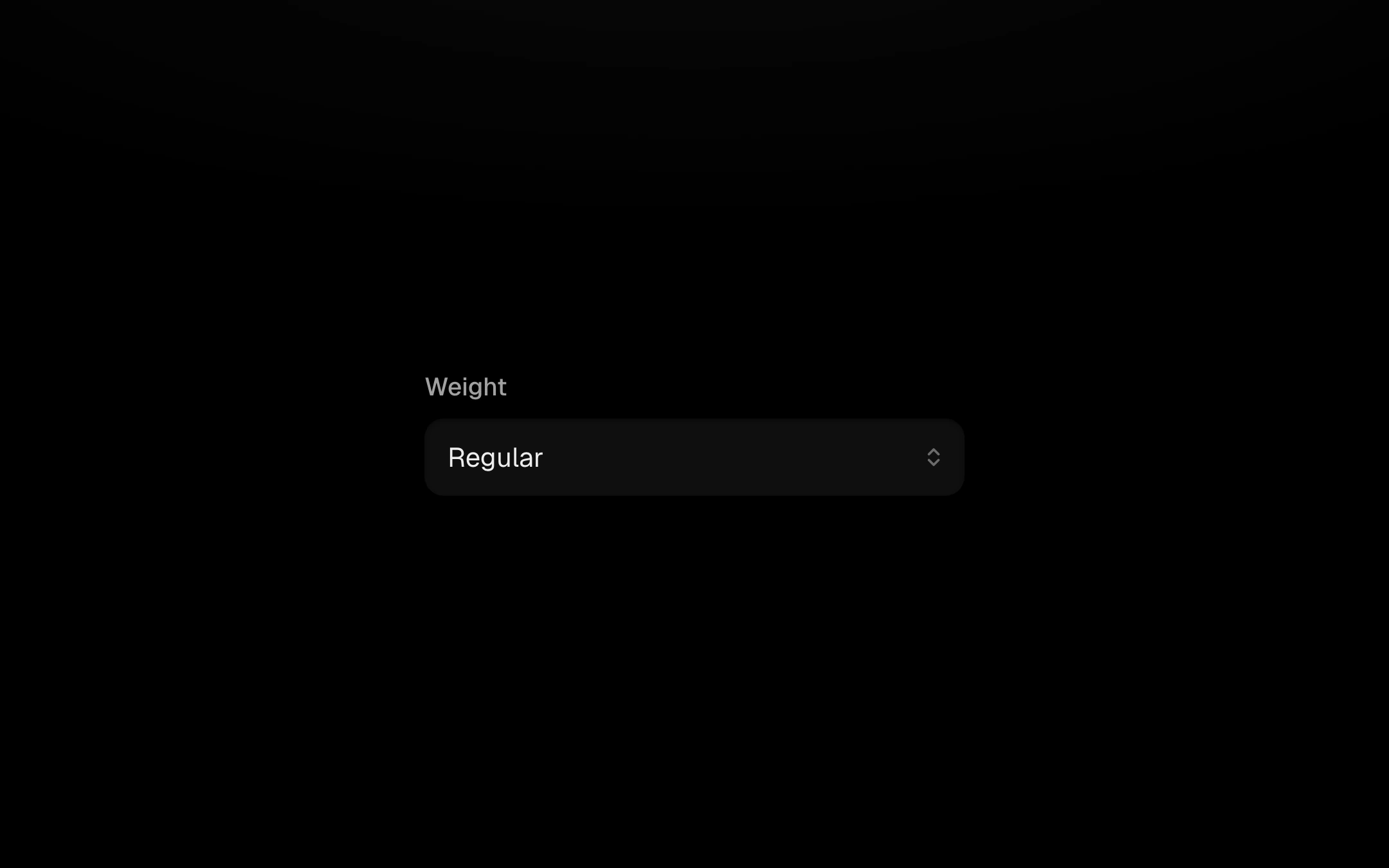
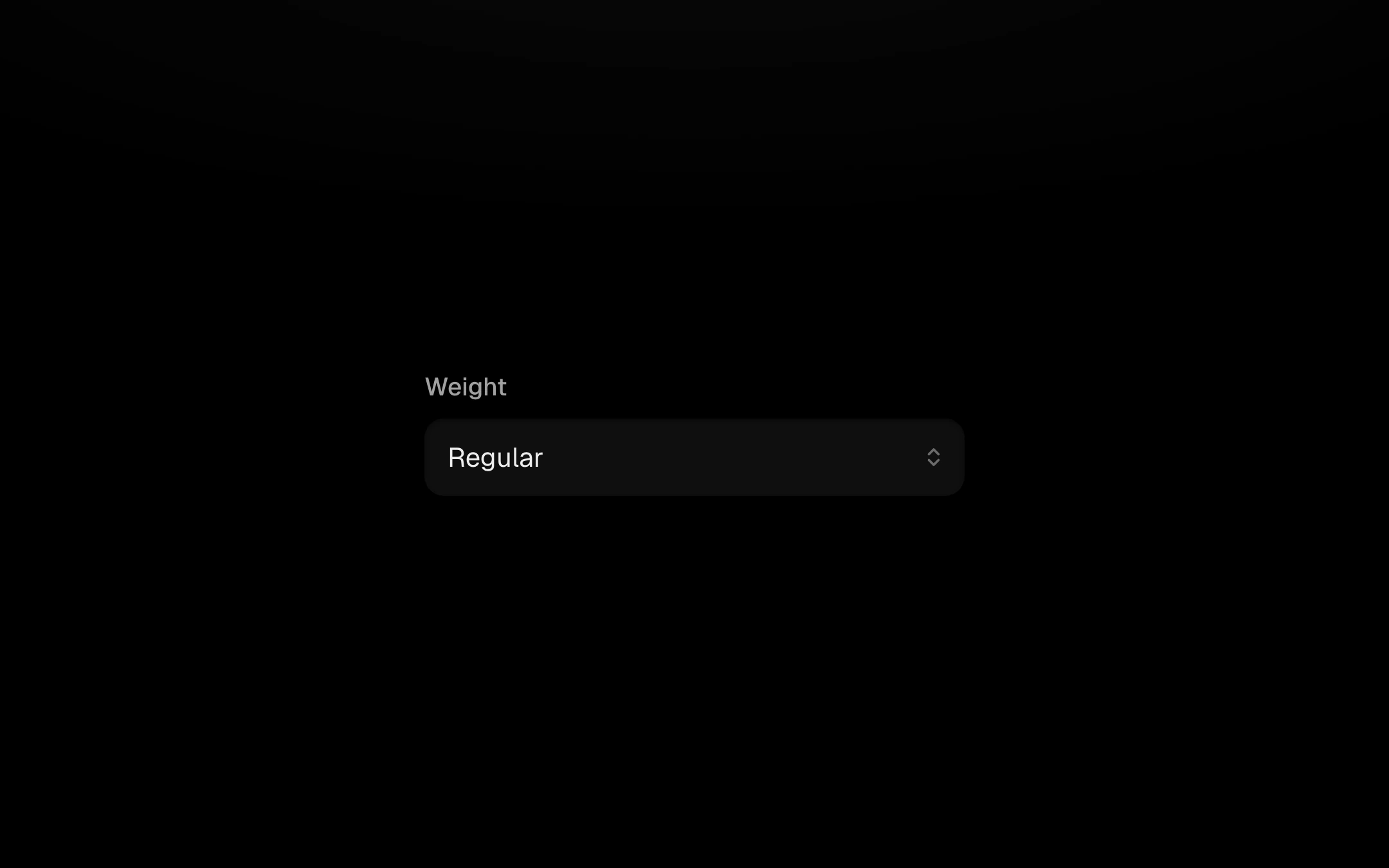
Customize
Press, drag and release selects in one gesture.
Install
npx shadcn@latest add @obsyde/inplace-selectNeeds your licence key · Get Pro
Usage
Import it from where the CLI puts it, or copy the files below by hand.
import { InplaceSelect } from '@/components/obsyde/ember/inplace-select/InplaceSelect';

export function Example() {
  return (
    <InplaceSelect
      label="Weight"
      options="Thin, Light, Regular, Medium, Semibold, Bold, Black"
    />
  );
}
Files
What you get with Pro: plain React, TypeScript and CSS, with no dependencies.
ember/inplace-select/InplaceSelect.tsxcomponentember/inplace-select/inplace-select.cssstylesember/inplace-select/InplaceSelectDemo.tsxdemoember/shared/accent.tssharedember/shared/spring.tssharedember/shared/ember.cssshared
API
| Prop | Type | Default |
|---|---|---|
accentAccent | 'ember' | 'volt' | 'arc' | 'ember' |
labelLabel | string | 'Weight' |
optionsOptions (comma-separated) | string | 'Thin, Light, Regular, Mediu…' |
valueSelected | string | 'Regular' |
disabledDisabled | boolean | false |