Checkbox
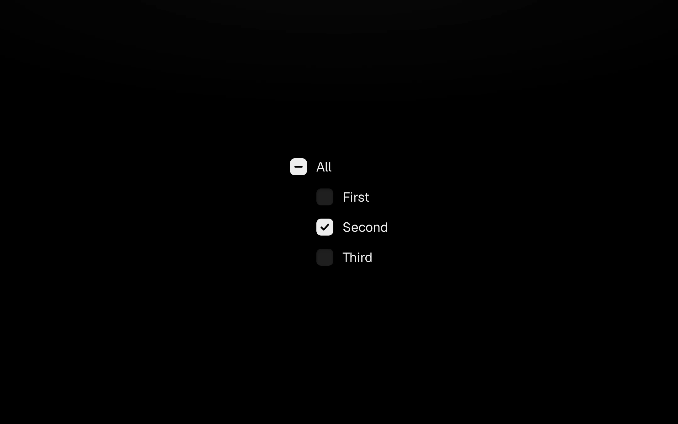
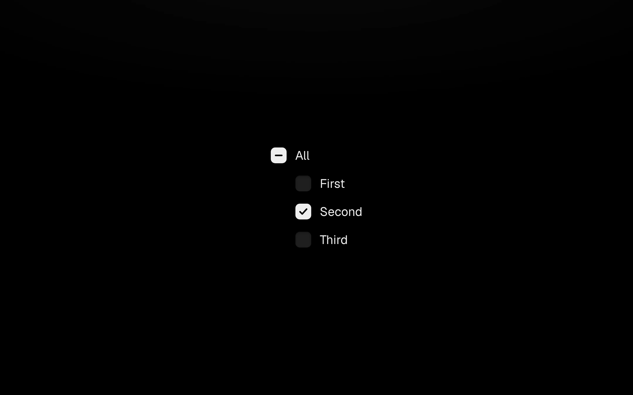
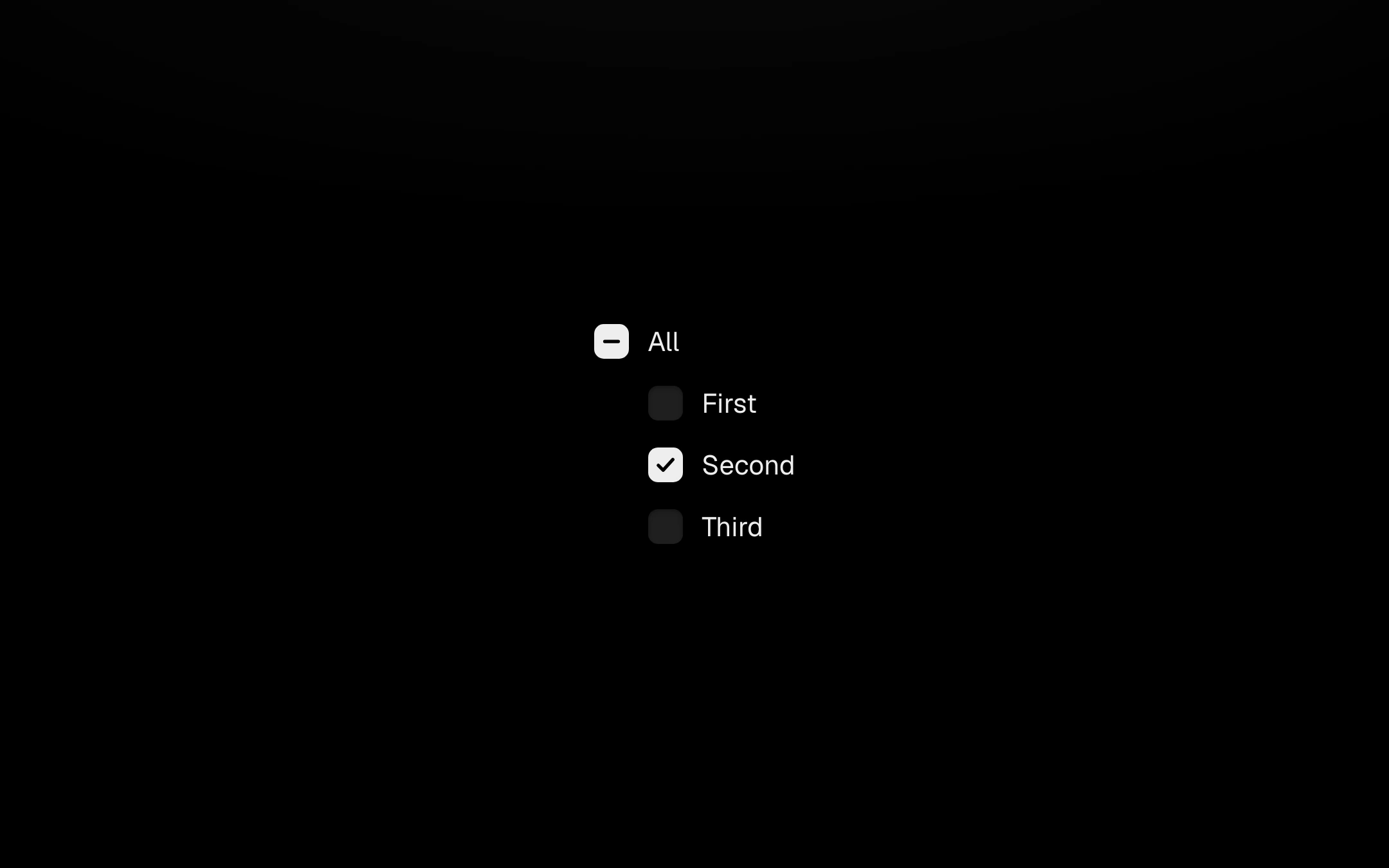
An 18px filled box that turns bone and draws its check; unchecking stays quiet.
Customize
A parent box shows a dash when its children are mixed and toggles them all.
Install
npx shadcn@latest add https://obsydeui.com/r/checkbox.jsonUsage
Import it from where the CLI puts it, or copy the files below by hand.
import { Checkbox } from '@/components/obsyde/ember/checkbox/Checkbox';

export function Example() {
  return (
    <Checkbox defaultChecked="Second" />
  );
}
Files
Plain React, TypeScript and CSS. No dependencies. The download keeps these paths.
ember/checkbox/Checkbox.tsxcomponentember/checkbox/checkbox.cssstylesember/checkbox/CheckboxDemo.tsxdemoember/actions-kit/kit.tssharedember/shared/accent.tssharedember/shared/spring.tssharedember/shared/ember.cssshared
API
| Prop | Type | Default |
|---|---|---|
accentAccent | 'ember' | 'volt' | 'arc' | 'ember' |
checkedChecked | string | 'Second' |
disabledDisabled | boolean | false |