Switch
A switch that feels like a small physical toggle.
import { useEffect, useId, useLayoutEffect, useRef } from 'react';
import type { KeyboardEvent, MouseEvent, PointerEvent } from 'react';
import { Spring, createLoop, onReducedMotionChange, prefersReducedMotion, type SpringConfig } from '../shared/spring';
import { resolveAccent, type Accent } from '../shared/accent';
import { clamp, useControllable, useLatest } from '../actions-kit/kit';
import '../shared/ember.css';
import './switch.css';

export interface SwitchProps {
  checked?: boolean;
  defaultChecked?: boolean;
  onChange?: (checked: boolean) => void;
  /** A static name for the setting. It never changes with the state. */
  label?: string;
  /** An optional muted second line under the label. */
  description?: string;
  'aria-label'?: string;
  disabled?: boolean;
  size?: 'sm' | 'md' | 'lg';
  accent?: Accent;
  className?: string;
}

/* Track and thumb geometry in CSS px. Every size has a 3px inset round the thumb. */
const GEOM = {
  sm: { w: 30, h: 16, d: 10, press: 3 },
  md: { w: 36, h: 20, d: 14, press: 4 },
  lg: { w: 44, h: 24, d: 18, press: 5 },
} as const;
type Geom = (typeof GEOM)[keyof typeof GEOM];

/* The thumb is modelled as two edges on two springs. The edge in front is stiffer than the edge
   behind, so the thumb stretches while it travels (about 1.25x at peak velocity). The trailing
   edge then overshoots a little on arrival, and that shows as a slight squash against the wall. */
const LEAD: SpringConfig = { stiffness: 1400, damping: 72 };
const TRAIL: SpringConfig = { stiffness: 520, damping: 32 };
/* While dragging, both edges follow the finger closely. */
const DRAG_LEAD: SpringConfig = { stiffness: 2200, damping: 94 };
const DRAG_TRAIL: SpringConfig = { stiffness: 1100, damping: 66 };
const PRESS: SpringConfig = { stiffness: 900, damping: 52 };
const SQUASH_Y = 0.7; // how much taller the thumb gets per unit of horizontal squash
const DRAG_SLOP = 3;
const FADE_MS = 140;
// Over the first 20% of travel the fill grows out from under the thumb. In the last 4% next to the
// wall it is fully tucked under, so a spring settling onto the wall never leaves a rim of accent.
const FILL_DEAD = 0.04;
const FILL_GROW = 0.2;

export function Switch({
  checked,
  defaultChecked = false,
  onChange,
  label,
  description,
  'aria-label': ariaLabel,
  disabled = false,
  size = 'md',
  accent: accentProp,
  className,
}: SwitchProps) {
  const accent = resolveAccent(accentProp);
  const id = useId();
  const nameId = `${id}-name`;
  const descId = `${id}-desc`;
  const [on, setOn] = useControllable(checked, defaultChecked, onChange);
  const g: Geom = GEOM[size] ?? GEOM.md;
  const inset = (g.h - g.d) / 2;
  const travel = g.w - 2 * inset - g.d;

  const thumbRef = useRef<HTMLSpanElement>(null);
  const capLRef = useRef<HTMLSpanElement>(null);
  const capRRef = useRef<HTMLSpanElement>(null);
  const bodyRef = useRef<HTMLSpanElement>(null);
  const fillHeadRef = useRef<HTMLSpanElement>(null);
  const fillTailRef = useRef<HTMLSpanElement>(null);
  const fillCapRef = useRef<HTMLSpanElement>(null);
  const geo = useLatest({ g, inset, travel, on });

  const sim = useRef({
    // Left and right edges of the thumb, measured from the left of the thumb's lane.
    l: new Spring(on ? travel : 0, TRAIL),
    r: new Spring((on ? travel : 0) + g.d, LEAD),
    press: new Spring(0, PRESS),
    reduced: false,
    drag: null as null | { id: number; x0: number; start: number; last: number; moved: boolean },
    suppressClick: false,
  });

  /* Write the current physics into the DOM. Transforms only; React never renders per frame. */
  const apply = () => {
    const thumb = thumbRef.current;
    const capL = capLRef.current;
    const capR = capRRef.current;
    const body = bodyRef.current;
    const fillHead = fillHeadRef.current;
    const fillTail = fillTailRef.current;
    const fillCap = fillCapRef.current;
    if (!thumb || !capL || !capR || !body || !fillHead || !fillTail || !fillCap) return;
    const s = sim.current;
    const { g, inset, travel } = geo.current;
    const d = g.d;
    let l = s.l.value;
    let r = s.r.value;
    const max = travel + d;

    // How far across the lane the thumb's left edge is (0 = off, 1 = on), ignoring the press.
    // The fill follows the left edge: it trails the thumb turning on and leads it turning off.
    const pos = clamp(l / travel, 0, 1);

    // Press: the thumb widens toward the side it would travel to.
    const press = s.reduced ? 0 : Math.max(0, s.press.value) * g.press;
    if (press > 0) {
      r += press * (1 - pos);
      l -= press * pos;
    }
    l = clamp(l, 0, max);
    r = clamp(r, 0, max);
    let w = r - l;

    let squash = '';
    let left = l;
    if (w < d) {
      // Narrower than round: draw a round thumb squashed against the edge that is leading.
      const leadRight = s.r.config === LEAD || s.r.config === DRAG_LEAD;
      const ox = inset + (leadRight ? r : l);
      const oy = g.h / 2;
      const sx = Math.max(0.6, w / d);
      const sy = 1 + SQUASH_Y * (1 - sx);
      left = leadRight ? r - d : l;
      w = d;
      squash = `translate(${ox.toFixed(3)}px,${oy}px) scale(${sx.toFixed(4)},${sy.toFixed(4)}) translate(${(-ox).toFixed(3)}px,${-oy}px)`;
    }
    const x = inset + left;
    // Round caps at each end and a straight body between their centres. All three share one
    // vertical gradient, so wherever they overlap they are identical and no seam can show.
    capL.style.transform = `translate(${x.toFixed(3)}px,0)`;
    capR.style.transform = `translate(${(x + w - d).toFixed(3)}px,0)`;
    // The body is 1px wide and only ever scaled up: a gradient scaled far down gets resampled
    // into a visible light column. Below 1px the two overlapping caps already make the shape.
    const span = w - d;
    body.style.transform =
      span >= 1 ? `translate(${(x + d / 2).toFixed(3)}px,0) scaleX(${span.toFixed(4)})` : 'scaleX(0)';
    thumb.style.transform = squash;

    // Fill: an accent capsule whose round head is always concentric with the thumb (it rides the
    // thumb's left edge spring) and whose tail reaches back to the left wall. Heat flows in behind
    // the thumb and drains back with it. Near the wall the capsule grows out from under the thumb,
    // and shrinks back under it, instead of fading, so nothing lingers at the wall.
    const cx = inset + s.l.value + d / 2;
    const t = s.reduced ? 1 : clamp((pos - FILL_DEAD) / (FILL_GROW - FILL_DEAD), 0, 1);
    const e = t * t * (3 - 2 * t);
    // Tucked, the capsule is half the thumb's size, so a squashed thumb still covers it.
    const k0 = (0.5 * d) / g.h;
    const k = k0 + (1 - k0) * e;
    const tail = cx * e;
    fillHead.style.transform = `translate(${(cx - g.h / 2).toFixed(3)}px,0) scale(${k.toFixed(4)})`;
    fillCap.style.transform = `translate(${(cx - tail - g.h / 2).toFixed(3)}px,0) scale(${k.toFixed(4)})`;
    fillTail.style.transform =
      tail >= 0.5 ? `translate(${(cx - tail).toFixed(3)}px,0) scale(${tail.toFixed(3)},${k.toFixed(4)})` : 'scaleX(0)';
  };
  const applyRef = useRef(apply);
  applyRef.current = apply;

  const loopRef = useRef<ReturnType<typeof createLoop> | null>(null);
  const wake = () => loopRef.current?.wake();

  useEffect(() => {
    const s = sim.current;
    s.reduced = prefersReducedMotion();
    const loop = createLoop((dt) => {
      const a = s.l.step(dt);
      const b = s.r.step(dt);
      const c = s.press.step(dt);
      applyRef.current();
      return a || b || c;
    });
    loopRef.current = loop;
    const unsub = onReducedMotionChange((reduced) => {
      s.reduced = reduced;
      if (reduced) {
        s.l.set(s.l.target);
        s.r.set(s.r.target);
        s.press.set(0);
      }
      applyRef.current();
    });
    applyRef.current();
    return () => {
      loop.stop();
      unsub();
    };
  }, []);

  /* Send both edges toward a resting left-edge position; `dir` says which edge leads. */
  const seek = (at: number, dir: number, lead = LEAD, trail = TRAIL) => {
    const s = sim.current;
    const { g } = geo.current;
    if (dir > 0) {
      s.r.config = lead;
      s.l.config = trail;
    } else if (dir < 0) {
      s.l.config = lead;
      s.r.config = trail;
    }
    s.l.target = at;
    s.r.target = at + g.d;
    if (s.reduced) {
      s.l.set(s.l.target);
      s.r.set(s.r.target);
    }
  };

  const fade = () => {
    if (!sim.current.reduced) return;
    thumbRef.current?.animate([{ opacity: 0.25 }, { opacity: 1 }], { duration: FADE_MS, easing: 'ease-out' });
  };

  // The committed state decides where the thumb rests, unless a drag is holding it.
  const firstRun = useRef(true);
  useLayoutEffect(() => {
    const s = sim.current;
    if (s.drag?.moved) return;
    seek(on ? travel : 0, on ? 1 : -1);
    if (!firstRun.current) fade();
    firstRun.current = false;
    applyRef.current();
    wake();
    // eslint-disable-next-line react-hooks/exhaustive-deps
  }, [on, travel]);

  // A size change re-seats the thumb without animating.
  useLayoutEffect(() => {
    const s = sim.current;
    const at = geo.current.on ? travel : 0;
    s.l.set(at);
    s.r.set(at + g.d);
    applyRef.current();
  }, [size, travel, g.d, geo]);

  /* ---------------------------------------------------------------- input */

  const pressDown = () => {
    const s = sim.current;
    s.press.target = s.reduced ? 0 : 1;
    wake();
  };
  const pressUp = () => {
    sim.current.press.target = 0;
    wake();
  };

  const onPointerDown = (e: PointerEvent<HTMLButtonElement>) => {
    if (disabled || e.button !== 0) return;
    e.currentTarget.setPointerCapture(e.pointerId);
    const s = sim.current;
    s.drag = { id: e.pointerId, x0: e.clientX, start: s.l.target, last: e.clientX, moved: false };
    pressDown();
  };

  const onPointerMove = (e: PointerEvent<HTMLButtonElement>) => {
    const s = sim.current;
    const d = s.drag;
    if (!d || d.id !== e.pointerId) return;
    const dx = e.clientX - d.x0;
    if (!d.moved && Math.abs(dx) < DRAG_SLOP) return;
    d.moved = true;
    const step = e.clientX - d.last;
    d.last = e.clientX;
    seek(clamp(d.start + dx, 0, geo.current.travel), Math.sign(step), DRAG_LEAD, DRAG_TRAIL);
    wake();
  };

  const endDrag = (e: PointerEvent<HTMLButtonElement>, commit: boolean) => {
    const s = sim.current;
    const d = s.drag;
    if (!d || d.id !== e.pointerId) return;
    s.drag = null;
    pressUp();
    if (!d.moved) return;
    // A drag commits to the nearer side; the click that follows must not toggle again.
    s.suppressClick = true;
    window.setTimeout(() => (s.suppressClick = false), 0);
    const { travel, on } = geo.current;
    const next = commit ? s.l.target > travel / 2 : on;
    const at = next ? travel : 0;
    seek(at, Math.sign(at - s.l.value));
    if (next !== on) setOn(next);
    wake();
  };

  const onClick = (e: MouseEvent<HTMLButtonElement>) => {
    if (sim.current.suppressClick) {
      sim.current.suppressClick = false;
      e.preventDefault();
      return;
    }
    setOn(!geo.current.on);
  };

  // Space squeezes the thumb while held; the browser's own click on release toggles it.
  const onKeyDown = (e: KeyboardEvent<HTMLButtonElement>) => {
    if (e.key === ' ' && !e.repeat) pressDown();
  };
  const onKeyUp = (e: KeyboardEvent<HTMLButtonElement>) => {
    if (e.key === ' ') pressUp();
  };

  const named = Boolean(label);
  return (
    <span
      className={`ember em-switch${disabled ? ' is-disabled' : ''}${className ? ` ${className}` : ''}`}
      data-accent={accent}
      data-size={size in GEOM ? size : 'md'}
      data-on={on || undefined}
    >
      <button
        id={id}
        type="button"
        role="switch"
        aria-checked={on}
        aria-label={named ? undefined : ariaLabel}
        aria-labelledby={named ? nameId : undefined}
        aria-describedby={description ? descId : undefined}
        disabled={disabled}
        className="em-switch__track"
        onPointerDown={onPointerDown}
        onPointerMove={onPointerMove}
        onPointerUp={(e) => endDrag(e, true)}
        onPointerCancel={(e) => endDrag(e, false)}
        onLostPointerCapture={(e) => endDrag(e, false)}
        onKeyDown={onKeyDown}
        onKeyUp={onKeyUp}
        onBlur={pressUp}
        onClick={onClick}
      >
        <span className="em-switch__well" aria-hidden="true">
          <span className="em-switch__fill">
            <span ref={fillCapRef} className="em-switch__fill-head" />
            <span ref={fillTailRef} className="em-switch__fill-tail" />
            <span ref={fillHeadRef} className="em-switch__fill-head" />
          </span>
        </span>
        <span ref={thumbRef} className="em-switch__thumb" aria-hidden="true">
          <span ref={capLRef} className="em-switch__cap" />
          <span ref={capRRef} className="em-switch__cap" />
          <span ref={bodyRef} className="em-switch__body" />
        </span>
      </button>
      {named || description ? (
        <label htmlFor={id} className="em-switch__text">
          {named ? (
            <span id={nameId} className="em-switch__label">
              {label}
            </span>
          ) : null}
          {description ? (
            <span id={descId} className="em-switch__desc">
              {description}
            </span>
          ) : null}
        </label>
      ) : null}
    </span>
  );
}

export default Switch;
Customize
sm
md
lg
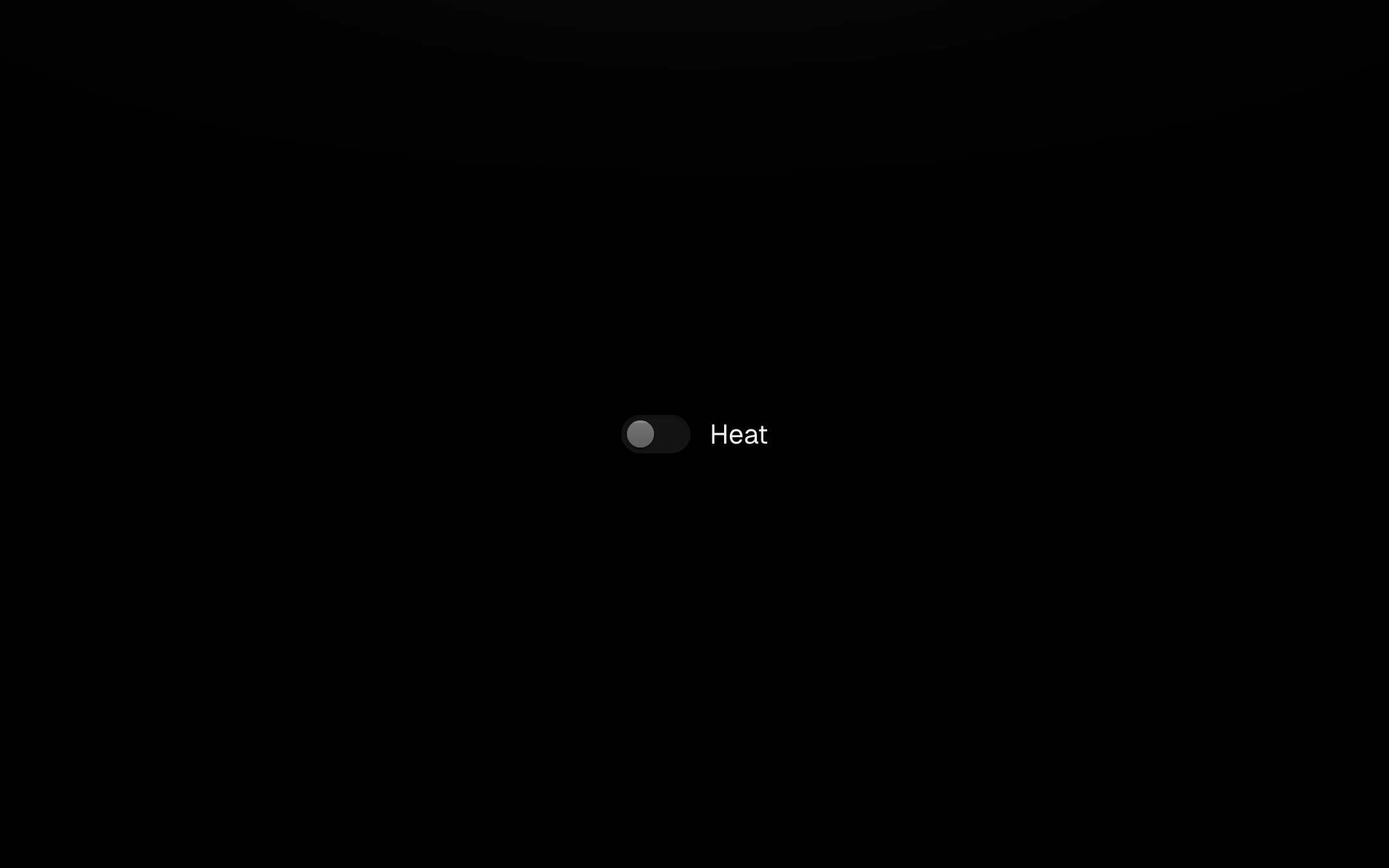
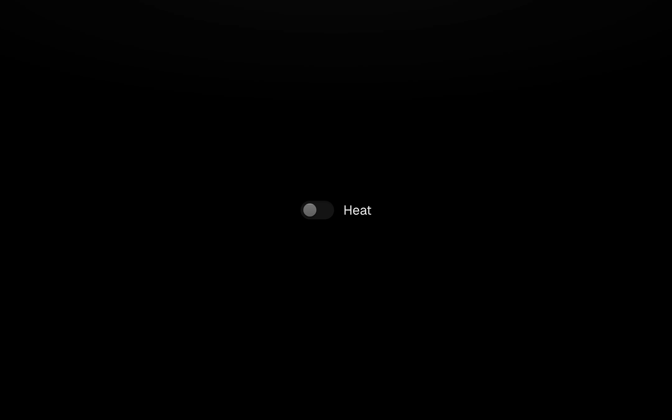
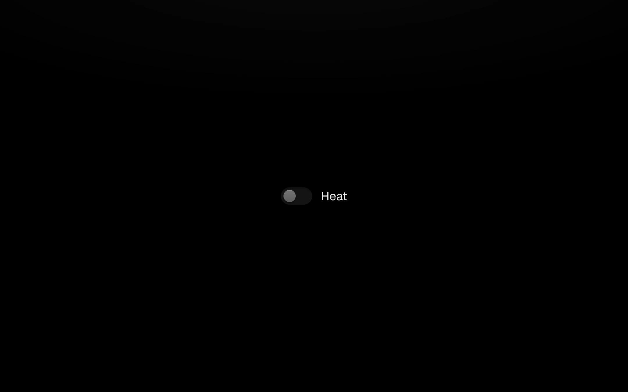
The thumb is a raised bead in a filled well: it widens when pressed, stretches toward where it is going and settles round with a slight squash. Turning on, the accent floods the track from behind the thumb and drains back when turned off. It can be dragged or clicked, and Space toggles it. Three sizes and an optional description line.
Install
npx shadcn@latest add https://obsydeui.com/r/switch.jsonUsage
Import it from where the CLI puts it, or copy the files below by hand.
import { Switch } from '@/components/obsyde/ember/switch/Switch';

export function Example() {
  return (
    <Switch label="Heat" />
  );
}
Files
Plain React, TypeScript and CSS. No dependencies. The download keeps these paths.
ember/switch/Switch.tsxcomponentember/switch/switch-demo.cssstylesember/switch/switch.cssstylesember/switch/SwitchDemo.tsxdemoember/actions-kit/kit.tssharedember/shared/accent.tssharedember/shared/spring.tssharedember/shared/ember.cssshared
API
| Prop | Type | Default |
|---|---|---|
accentAccent | 'ember' | 'volt' | 'arc' | 'ember' |
checkedOn | boolean | false |
labelLabel | string | 'Heat' |
descriptionDescription | string | — |
sizeSize | 'sm' | 'md' | 'lg' | 'md' |
disabledDisabled | boolean | false |