Sections, new
Changelog
Release notes with a version rail held beside them.
$149 once · every Pro piece
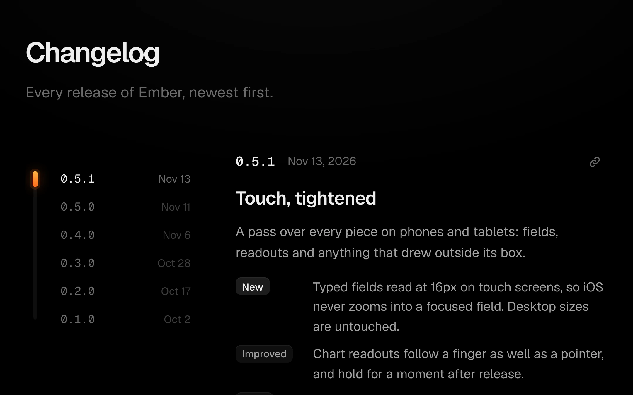
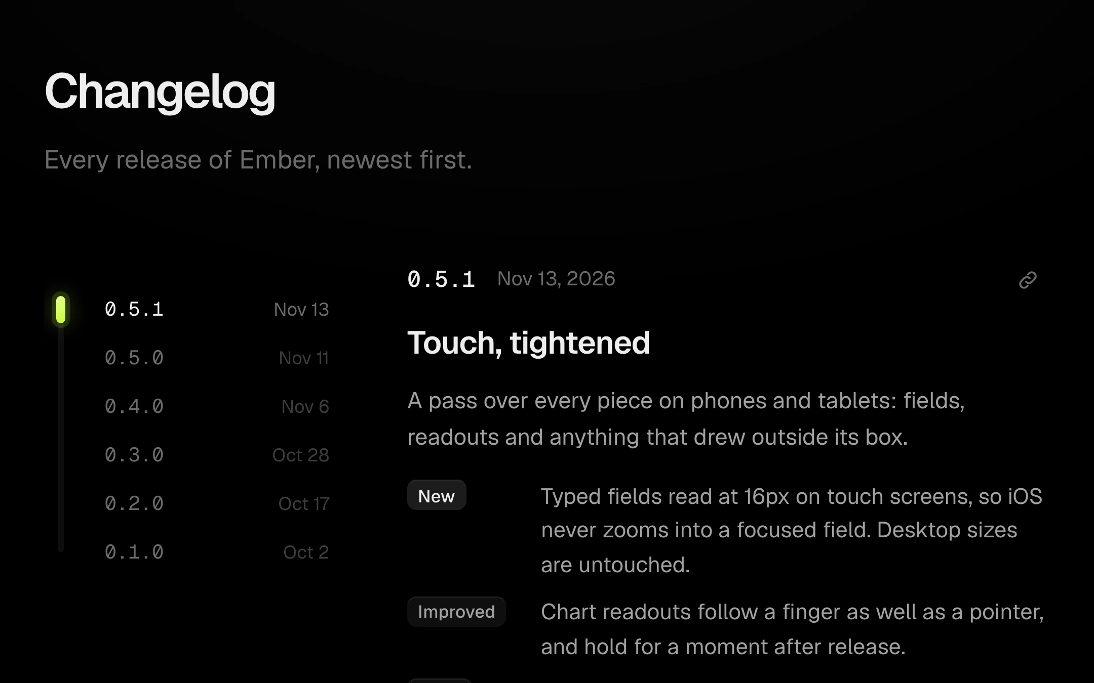
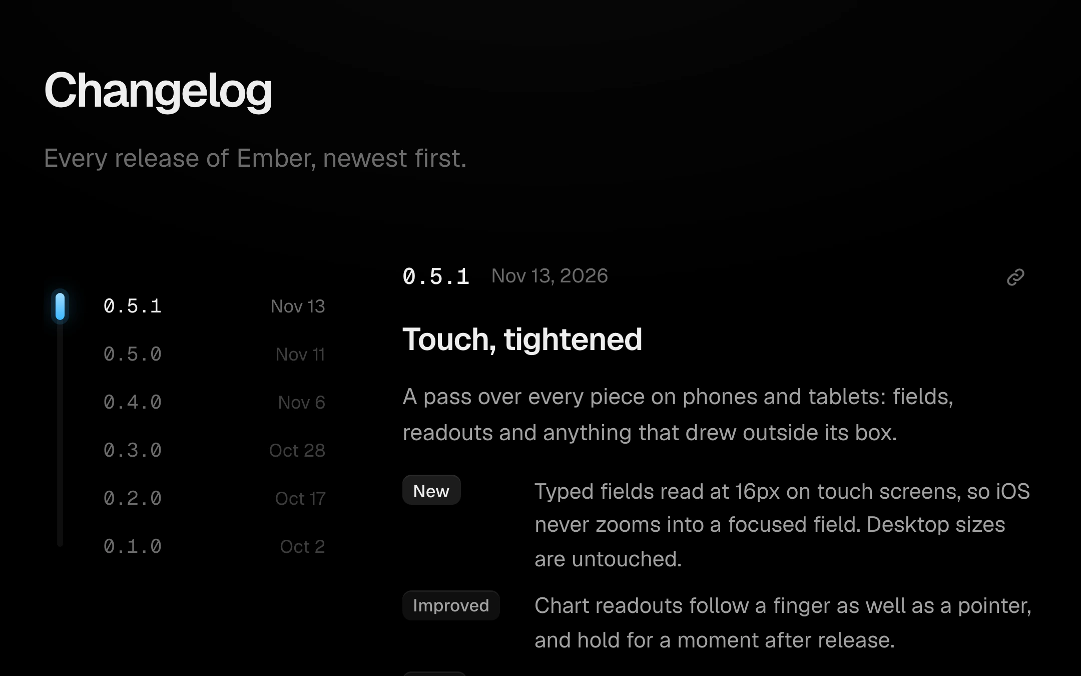
Customize
The rail's marker slides with the reading position, continuously between versions, and the rail is a scrubber: drag along it to run through releases, or pick a version to jump to it. Entries carry quiet New, Improved and Fixed chips, details behind a disclosure that opens on a spring, and a button that copies a link to the entry. The list can scroll inside the section or with the page; loading, empty and error states are built in.
Install
npx shadcn@latest add @obsyde/changelogNeeds your licence key · Get Pro
Usage
Import it from where the CLI puts it, or copy the files below by hand.
import { Changelog } from '@/components/obsyde/ember/changelog/Changelog';

export function Example() {
  return (
    <Changelog />
  );
}
Files
What you get with Pro: plain React, TypeScript and CSS, with no dependencies.
ember/changelog/Changelog.tsxcomponentember/changelog/changelog-demo.cssstylesember/changelog/changelog.cssstylesember/changelog/ChangelogDemo.tsxdemoember/blocks-kit/kit.tsxsharedember/shared/accent.tssharedember/shared/spring.tssharedember/shared/ember.cssshared
API
| Prop | Type | Default |
|---|---|---|
accentAccent | 'ember' | 'volt' | 'arc' | 'ember' |
stateState | 'ready' | 'loading' | 'empty' | 'error' | 'ready' |
detailsNewest details open | boolean | false |
heightList height | number | 600 |