Navbar
A floating pill header: wordmark, links, one action.
$149 once · every Pro piece
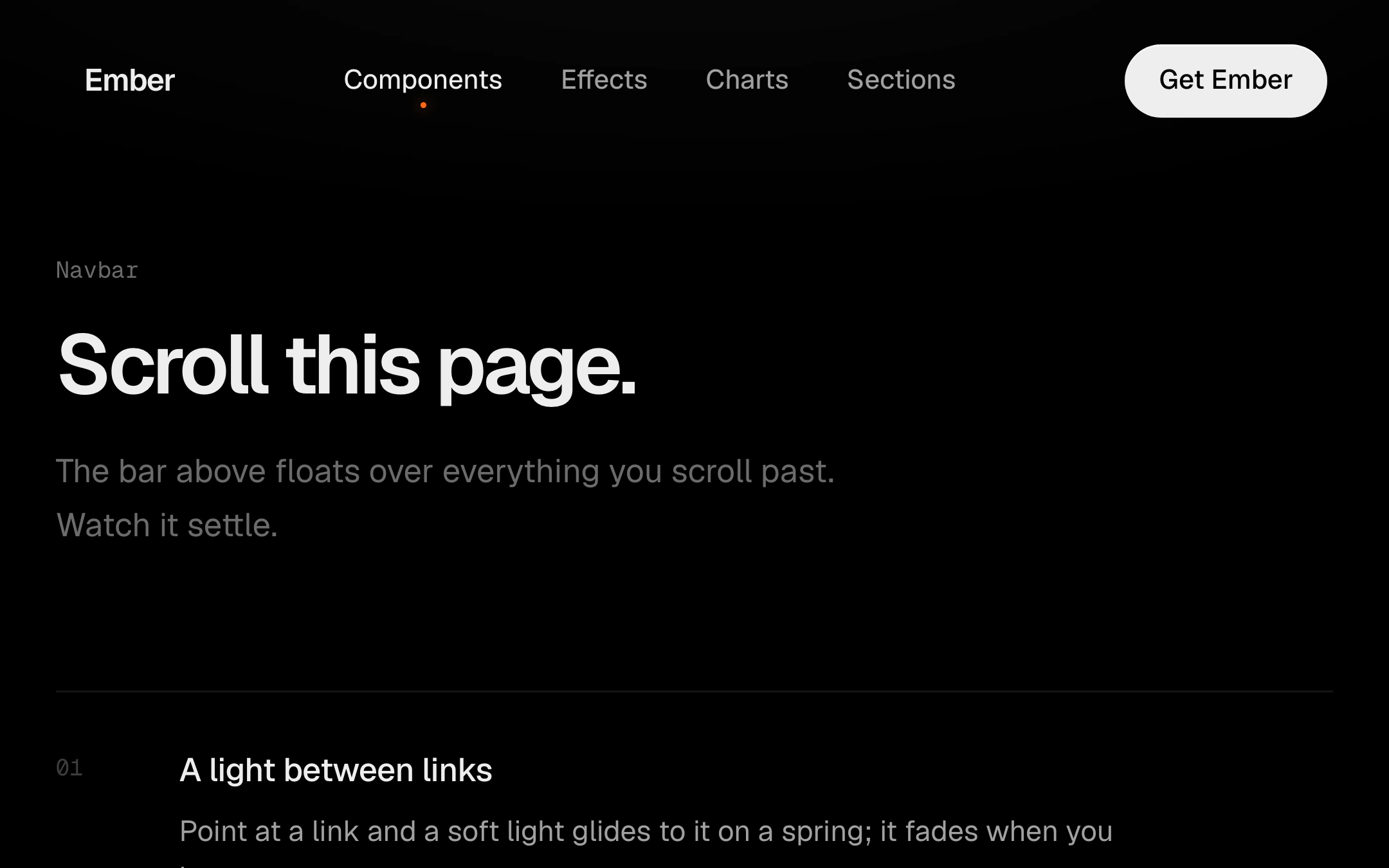
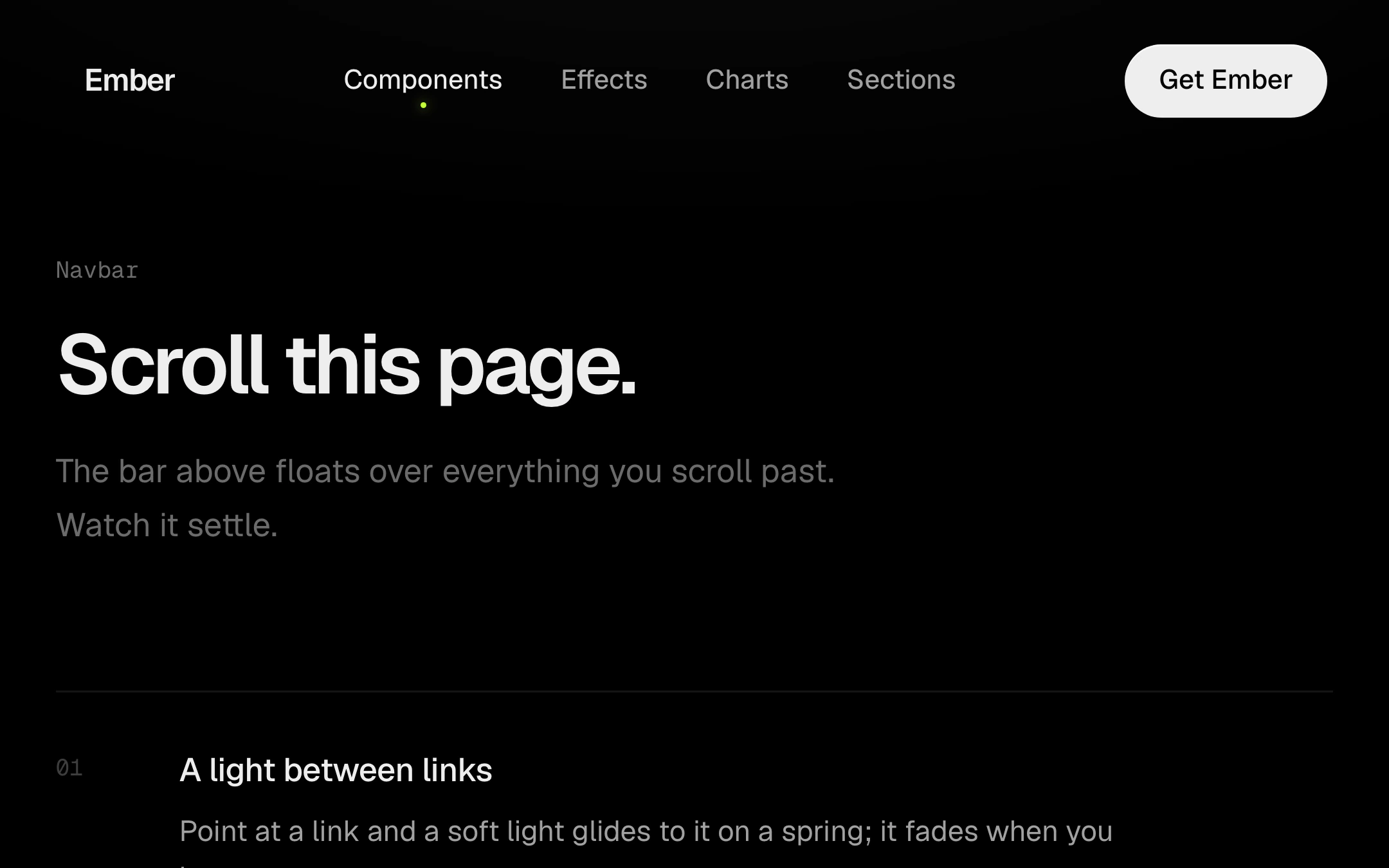
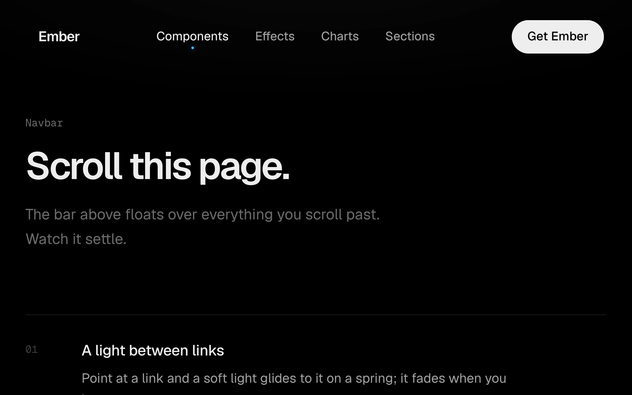
Customize
page
mobile
A soft light glides between the links on a spring as the pointer moves across them, and fades when it leaves. Once the page scrolls, the bar draws in a little and takes a raised dark face; under 640px of width the links fold into a menu button whose borderless sheet grows out of it, its items arriving one after another. Takes your router's link component.
Install
npx shadcn@latest add @obsyde/navbarNeeds your licence key · Get Pro
Usage
Import it from where the CLI puts it, or copy the files below by hand.
import { Navbar } from '@/components/obsyde/ember/navbar/Navbar';

export function Example() {
  return (
    <Navbar />
  );
}
Files
What you get with Pro: plain React, TypeScript and CSS, with no dependencies.
ember/navbar/Navbar.tsxcomponentember/navbar/navbar-demo.cssstylesember/navbar/navbar.cssstylesember/navbar/NavbarDemo.tsxdemoember/blocks-kit/blocks-kit.csssharedember/blocks-kit/kit.tsxsharedember/shared/accent.tssharedember/shared/spring.tssharedember/shared/ember.cssshared
API
| Prop | Type | Default |
|---|---|---|
accentAccent | 'ember' | 'volt' | 'arc' | 'ember' |
frameFrame | 'page' | 'mobile' | 'page' |
scrolledOpen scrolled | boolean | false |
menuOpenMenu open (mobile) | boolean | false |
collapseAtCollapse below (px) | number | 640 |