Pricing
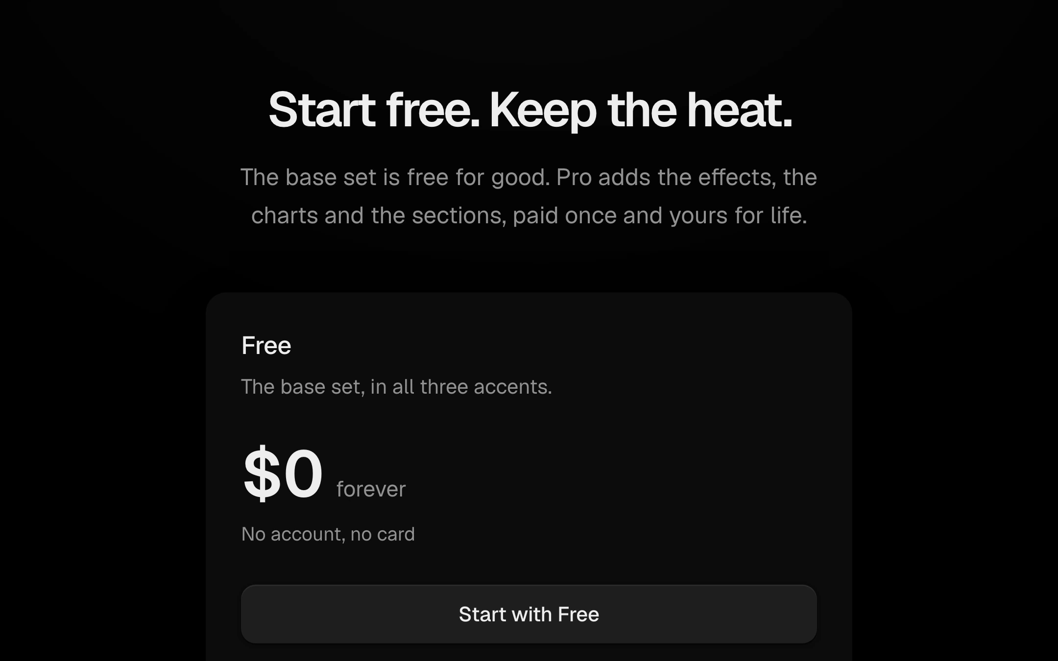
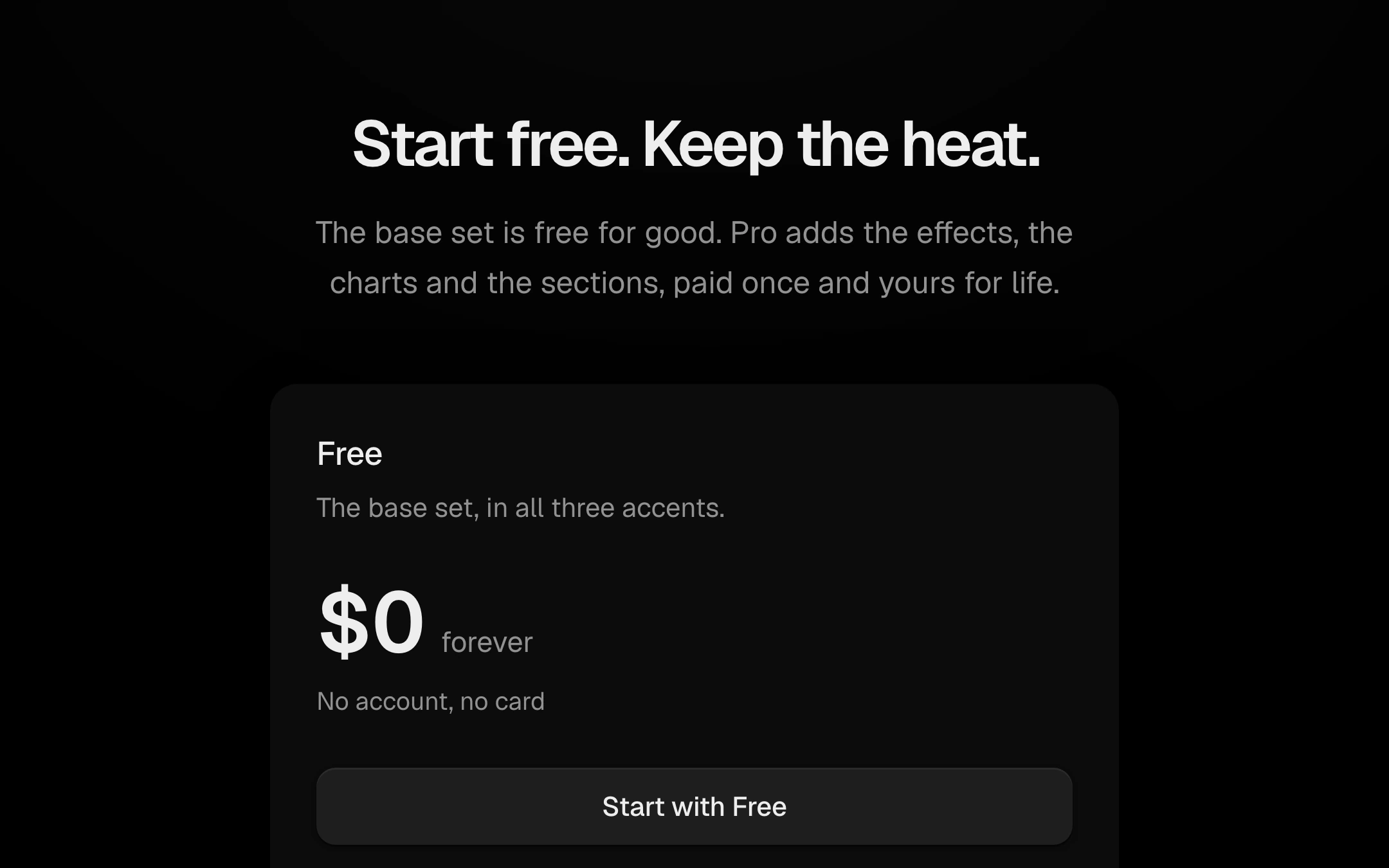
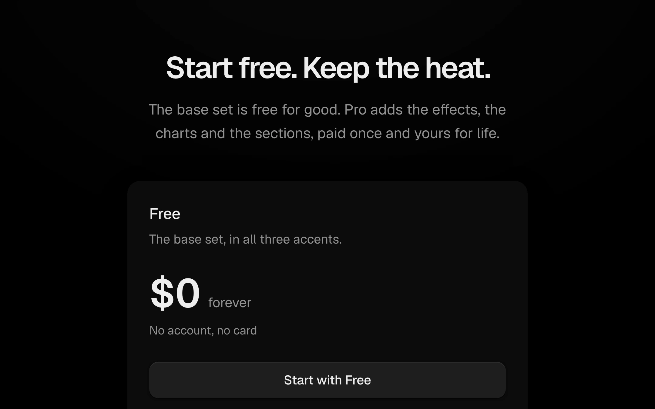
Two or three plans side by side, stacked when narrow.
$149 once · every Pro piece
Customize
ember
placeholder
monthly
yearly
Borderless filled cards share one row grid, so prices, buttons and features line up across them. An optional monthly/yearly switch, shown only when a plan is billed per month, slides a raised thumb on a spring and rolls every price to its new figure digit by digit while the billing line cross-fades; feature lists tick themselves off with drawn checks when the section comes into view. The recommended plan sits on a slightly lifted card with a faint warm light under its top.
Install
npx shadcn@latest add @obsyde/pricingNeeds your licence key · Get Pro
Usage
Import it from where the CLI puts it, or copy the files below by hand.
import { Pricing } from '@/components/obsyde/ember/pricing/Pricing';

export function Example() {
  return (
    <Pricing />
  );
}
Files
What you get with Pro: plain React, TypeScript and CSS, with no dependencies.
ember/pricing/Pricing.tsxcomponentember/pricing/pricing-demo.cssstylesember/pricing/pricing.cssstylesember/pricing/PricingDemo.tsxdemoember/actions-kit/kit.tssharedember/segmented/segmented.csssharedember/segmented/Segmented.tsxsharedember/shared/ember.csssharedember/shared/accent.tssharedember/shared/spring.tssharedember/effects-kit/kit.tssharedember/ticker/ticker.csssharedember/ticker/Ticker.tsxsharedember/blocks-kit/check.csssharedember/blocks-kit/Check.tsxsharedember/blocks-kit/blocks-kit.csssharedember/blocks-kit/kit.tsxshared
API
| Prop | Type | Default |
|---|---|---|
accentAccent | 'ember' | 'volt' | 'arc' | 'ember' |
plansPlans | 'ember' | 'placeholder' | 'ember' |
billingBilling (placeholder plans) | 'monthly' | 'yearly' | 'monthly' |