Sections, new
Comparison Table
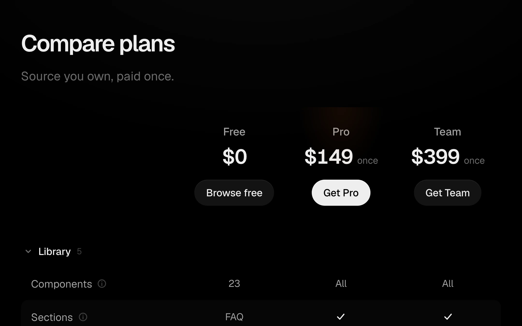
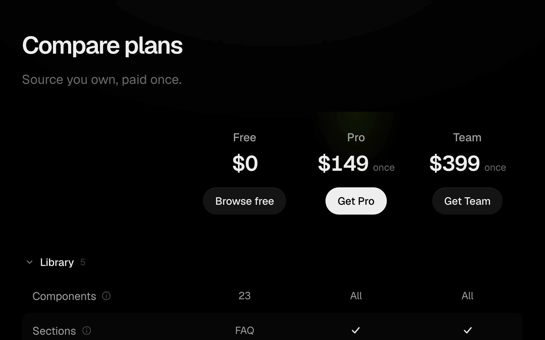
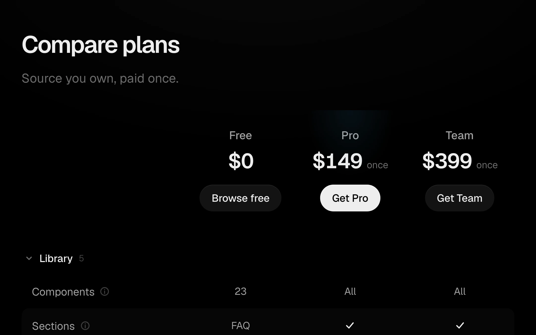
Plans side by side, feature by feature, on filled rows in alternate bands with no borders.
$149 once · every Pro piece
Customize
The plan header condenses into a bar that holds at the top while the table scrolls; the pointer draws a crosshair of row and column washes that glide between cells; a click on a plan focuses its column and dims the others. Categories fold away on a spring, feature names carry tooltips, and values read as a check, a dash or text. On narrow screens the table becomes one swipeable card per plan, kept in step with a segmented plan picker.
Install
npx shadcn@latest add @obsyde/comparisonNeeds your licence key · Get Pro
Usage
Import it from where the CLI puts it, or copy the files below by hand.
import { Comparison } from '@/components/obsyde/ember/comparison/Comparison';

export function Example() {
  return (
    <Comparison />
  );
}
Files
What you get with Pro: plain React, TypeScript and CSS, with no dependencies.
ember/comparison/Comparison.tsxcomponentember/comparison/comparison-demo.cssstylesember/comparison/comparison.cssstylesember/comparison/ComparisonDemo.tsxdemoember/actions-kit/kit.tssharedember/segmented/segmented.csssharedember/segmented/Segmented.tsxsharedember/shared/ember.csssharedember/shared/accent.tssharedember/shared/spring.tssharedember/overlays-kit/kit.tssharedember/tooltip/tooltip.csssharedember/tooltip/Tooltip.tsxsharedember/blocks-kit/check.csssharedember/blocks-kit/Check.tsxsharedember/blocks-kit/blocks-kit.csssharedember/blocks-kit/kit.tsxshared
API
| Prop | Type | Default |
|---|---|---|
accentAccent | 'ember' | 'volt' | 'arc' | 'ember' |
focusFocused plan | 'none' | 'free' | 'pro' | 'team' | 'none' |
collapsedFold support | boolean | false |
heightTable height | number | 600 |