Circle Pack
A hierarchy as nested circles, packed tight with an even gap between siblings and a clear inset inside each parent.
$149 once · every Pro piece
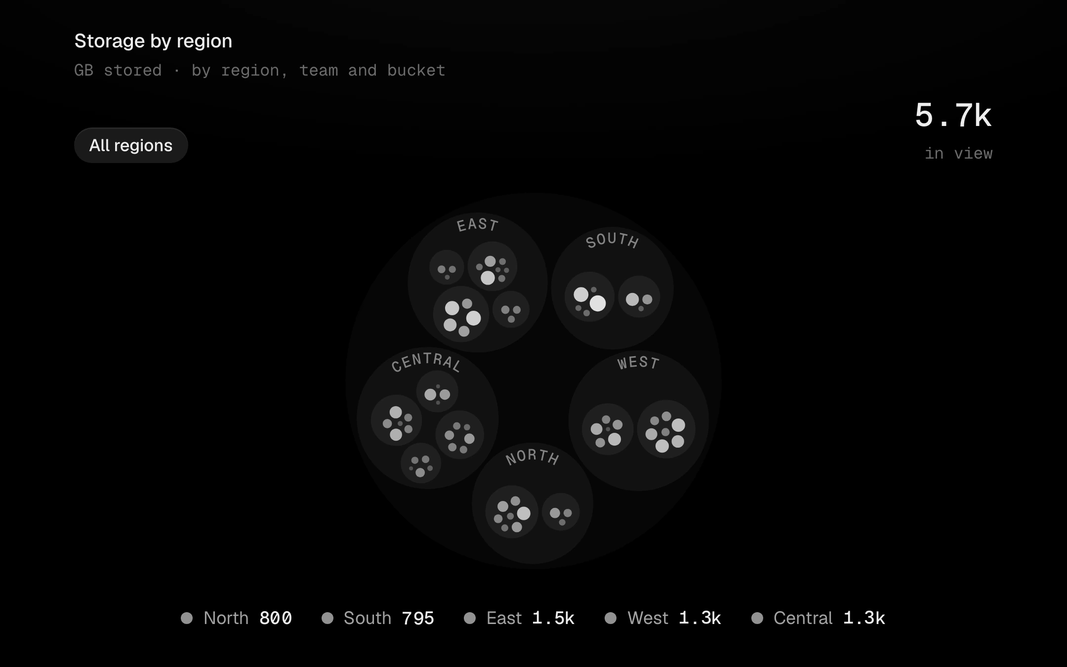
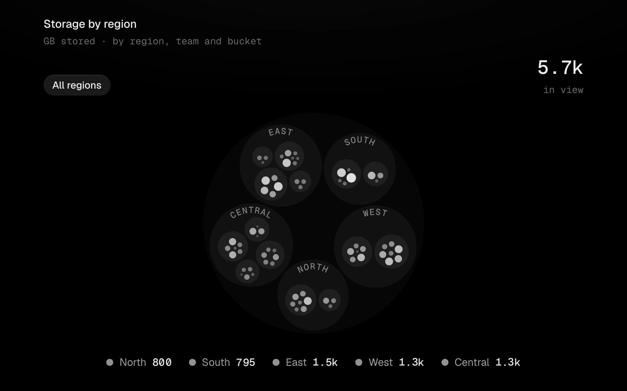
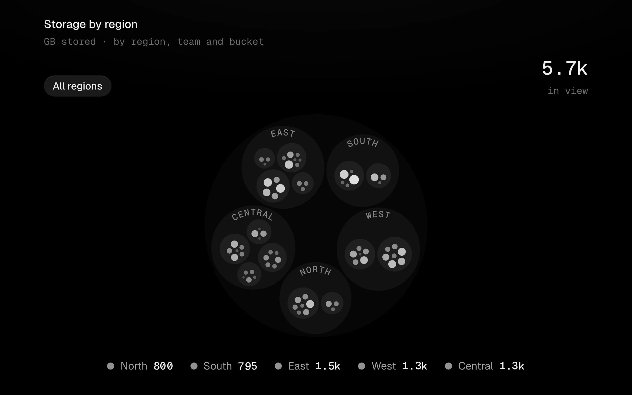
Every group names itself along its top arc, in a band the layout keeps free, so a label never sits on a circle. Leaves take one grey ramp by value across the whole chart, with ink picked for contrast, and show their name (and value, where there is room) only when it fits. Click a circle and the camera springs in until it fills the stage; the breadcrumb, a click on the background, or Esc springs back out one level. Hover a leaf and it lifts hot while everything else steps back; hover a group and the group stays lit. The legend keys the groups: hover isolates, click removes a group and the pack re-settles. Tab in: arrows walk the circles in view, Enter zooms in, Esc zooms out.
Install
npx shadcn@latest add @obsyde/circle-packNeeds your licence key · Get Pro
Usage
Import it from where the CLI puts it, or copy the files below by hand.
import { CirclePack } from '@/components/obsyde/ember/circle-pack/CirclePack';

export function Example() {
  return (
    <CirclePack />
  );
}
Files
What you get with Pro: plain React, TypeScript and CSS, with no dependencies.
ember/circle-pack/CirclePack.tsxcomponentember/circle-pack/circle-pack.cssstylesember/circle-pack/pack.tsmoduleember/circle-pack/CirclePackDemo.tsxdemoember/viz-kit/viz-kit.csssharedember/viz-kit/Tooltip.tsxsharedember/viz-kit/focus.tssharedember/viz-kit/patterns.tsxsharedember/viz-kit/roll.tssharedember/shared/rolling-number.csssharedember/shared/spring.tssharedember/shared/accent.tssharedember/viz-kit/scale.tssharedember/viz-kit/motion.tssharedember/viz-kit/chart.tsxsharedember/shared/ember.csssharedember/viz-kit/touch.tssharedember/viz-kit/keyboard.tssharedember/viz-kit/size.tssharedember/viz-kit/state-messages.tsxsharedember/viz-kit/stage.tsxsharedember/viz-kit/stage.csssharedember/viz-kit/Legend.tsxsharedember/viz-kit/demo.tsxsharedember/viz-kit/demo.cssshared
API
| Prop | Type | Default |
|---|---|---|
accentAccent | 'ember' | 'volt' | 'arc' | 'ember' |
groupsGroups | number | 5 |
depthDepth | number | 3 |
patternPattern | 'none' | 'diagonal-up' | 'diagonal-down' | 'dots' | 'vertical' | 'crosshatch' | 'none' |
labelsLeaf labels | boolean | true |
paddingPadding | number | 3 |
legendLegend | 'row' | 'none' | 'row' |
tooltipTooltip | 'panel' | 'none' | 'panel' |
statusStatus | 'ready' | 'loading' | 'empty' | 'ready' |
heightHeight | number | 440 |
seedSeed | number | 7 |