Half Donut
A segmented half ring for a budget or a quota.
$149 once · every Pro piece
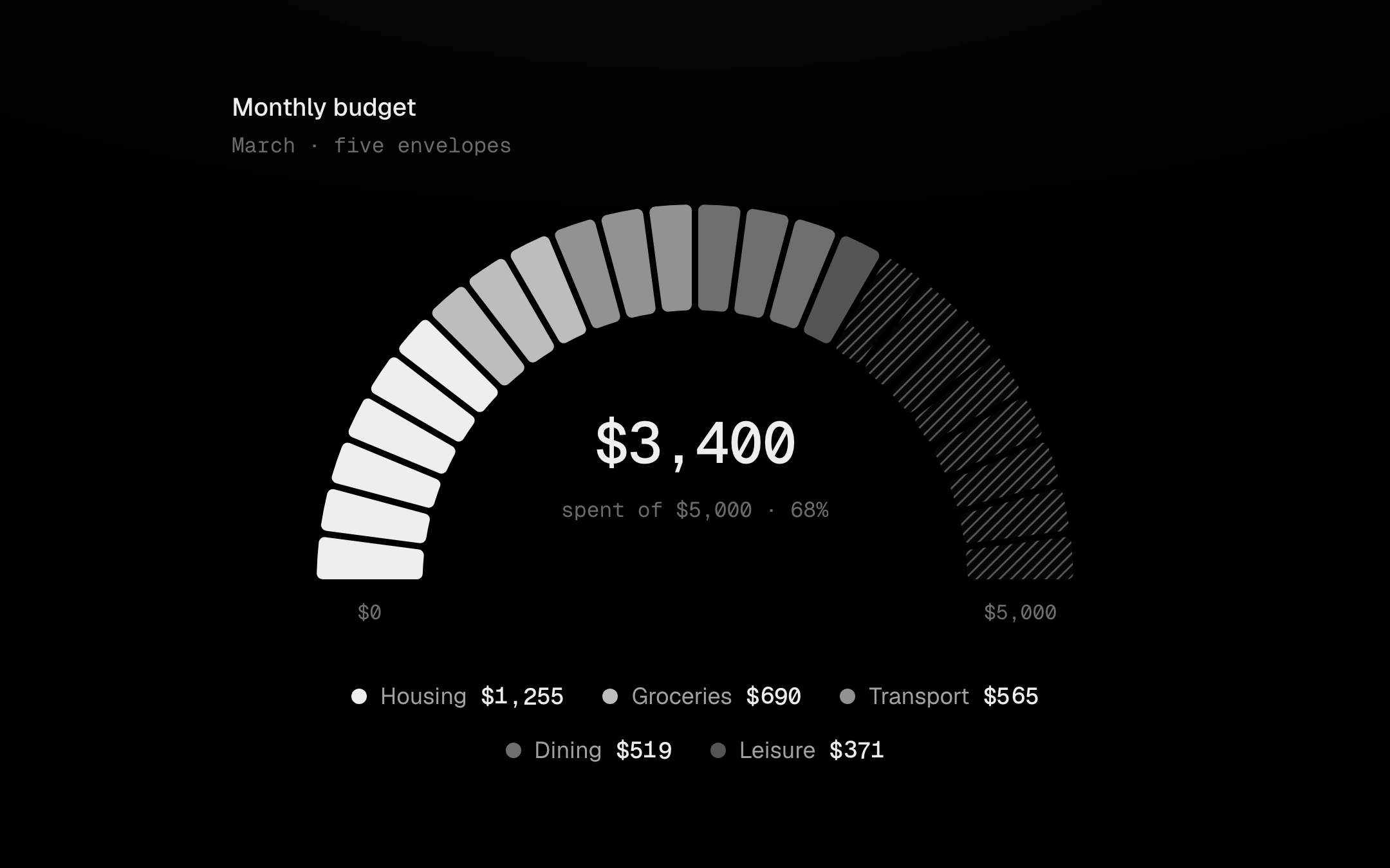
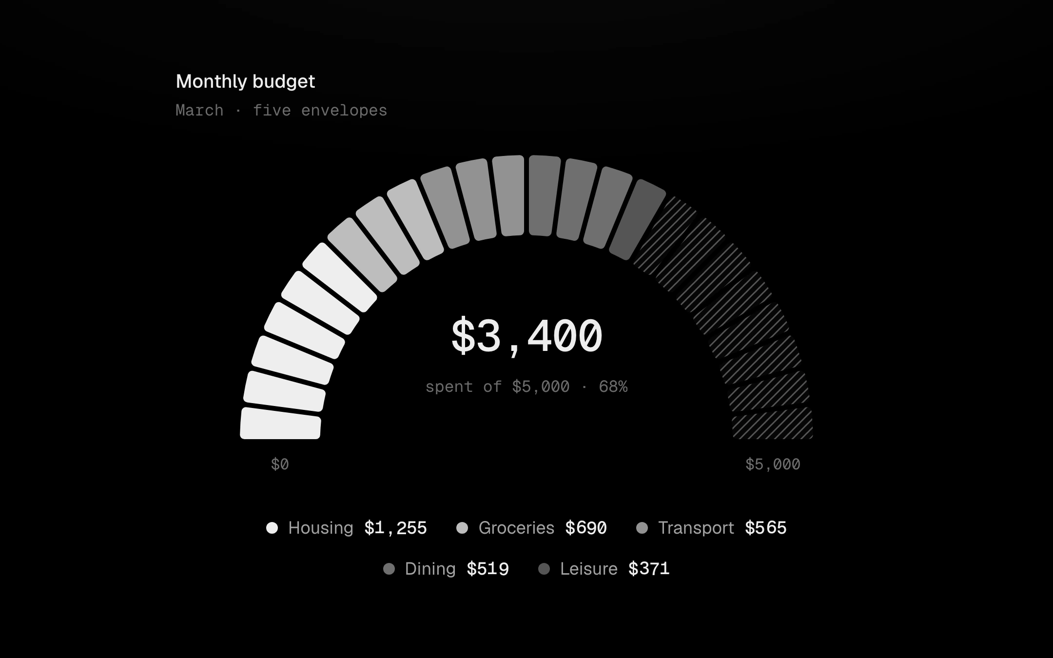
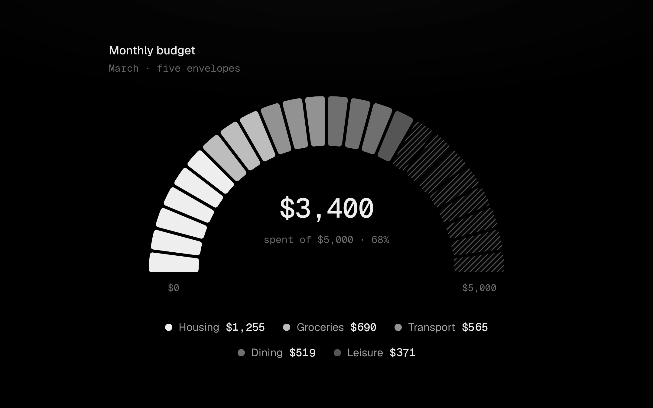
Categories fill equal segments from left to right in the grey ladder, and what is left of the limit is hatched: hatch means remaining. On mount the segments ignite one after another, each flaring in the accent and cooling to its tone, while the centre number counts up with them. Point at a segment, or Tab in and use the arrow keys: its category runs hot, the others step back and the centre rolls to its amount and share; the hatched part reports what is left. An optional target tick sits outside the ring, and the legend is linked both ways.
Install
npx shadcn@latest add @obsyde/half-donutNeeds your licence key · Get Pro
Usage
Import it from where the CLI puts it, or copy the files below by hand.
import { HalfDonut } from '@/components/obsyde/ember/half-donut/HalfDonut';

export function Example() {
  return (
    <HalfDonut segments={24} />
  );
}
Files
What you get with Pro: plain React, TypeScript and CSS, with no dependencies.
ember/half-donut/HalfDonut.tsxcomponentember/half-donut/half-donut.cssstylesember/half-donut/HalfDonutDemo.tsxdemoember/viz-kit/viz-kit.csssharedember/viz-kit/Tooltip.tsxsharedember/viz-kit/focus.tssharedember/viz-kit/patterns.tsxsharedember/viz-kit/roll.tssharedember/shared/rolling-number.csssharedember/shared/spring.tssharedember/shared/accent.tssharedember/viz-kit/scale.tssharedember/viz-kit/motion.tssharedember/viz-kit/chart.tsxsharedember/shared/ember.csssharedember/viz-kit/touch.tssharedember/viz-kit/keyboard.tssharedember/viz-kit/size.tssharedember/viz-kit/state-messages.tsxsharedember/viz-kit/stage.tsxsharedember/viz-kit/stage.csssharedember/viz-kit/shape.tssharedember/viz-kit/Legend.tsxsharedember/viz-kit/demo.tsxsharedember/viz-kit/demo.cssshared
API
| Prop | Type | Default |
|---|---|---|
accentAccent | 'ember' | 'volt' | 'arc' | 'ember' |
presetData | 'budget' | 'storage' | 'budget' |
segmentsSegments | number | 24 |
thicknessThickness | number | 0.28 |
usedUsed | number | 0.68 |
targetTarget | number | 0 |
patternPattern | 'none' | 'diagonal-up' | 'diagonal-down' | 'dots' | 'vertical' | 'crosshatch' | 'diagonal-up' |
legendLegend | 'row' | 'list' | 'none' | 'row' |
tooltipTooltip | 'panel' | 'none' | 'none' |
statusStatus | 'ready' | 'loading' | 'empty' | 'ready' |
seedSeed | number | 2 |