Donut Chart
Ring segments in grey steps, cut apart by 2px gaps, that sweep on clockwise on the shared reveal curve.
$149 once · every Pro piece
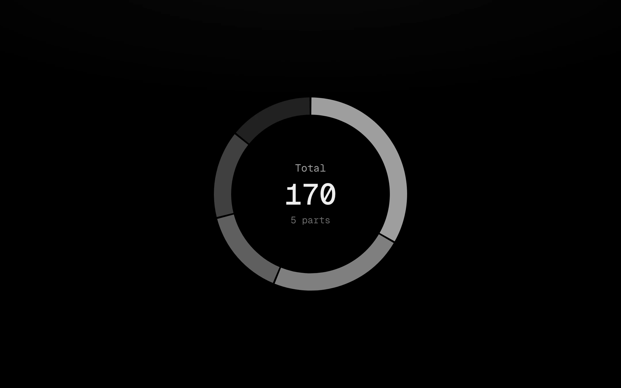
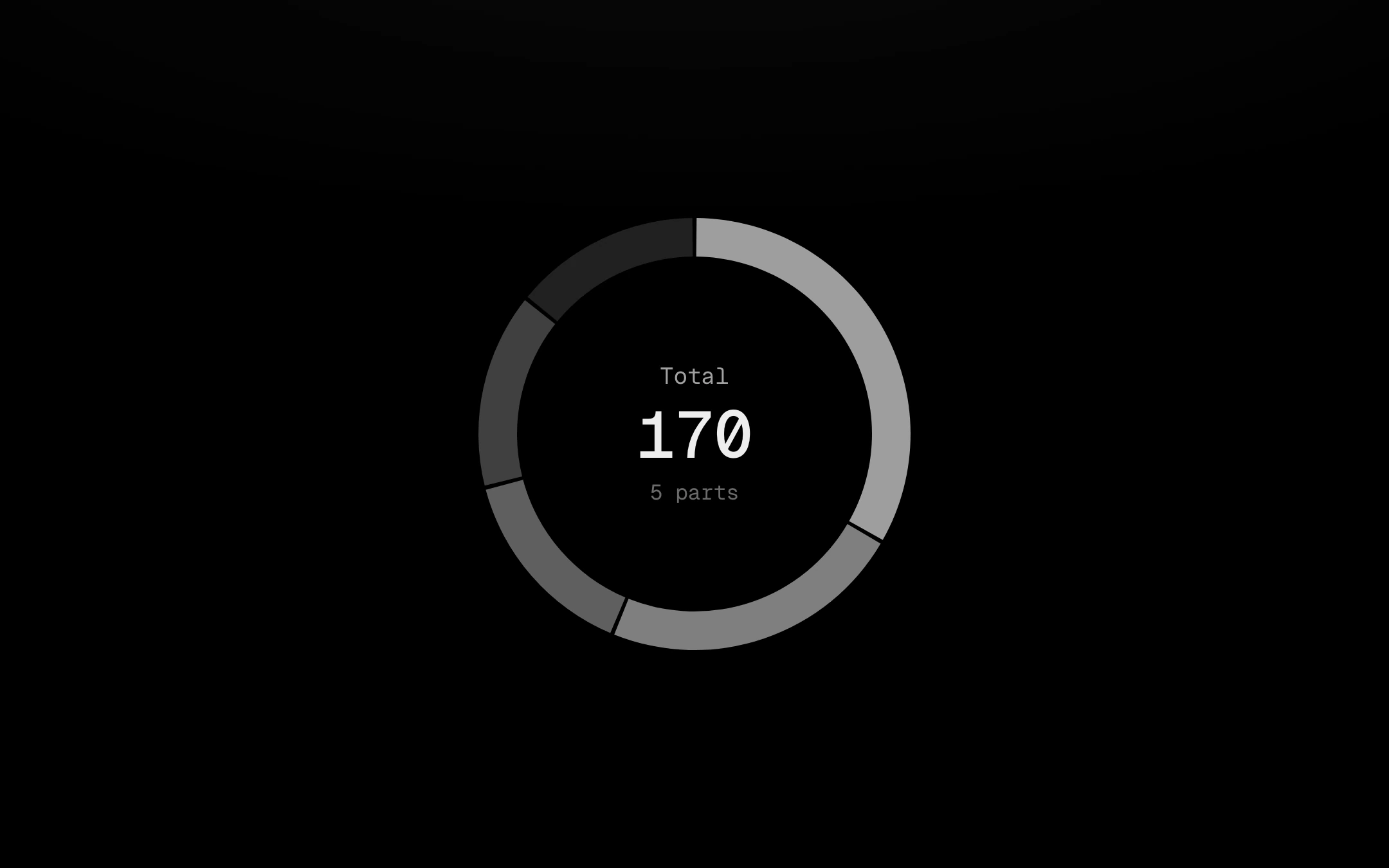
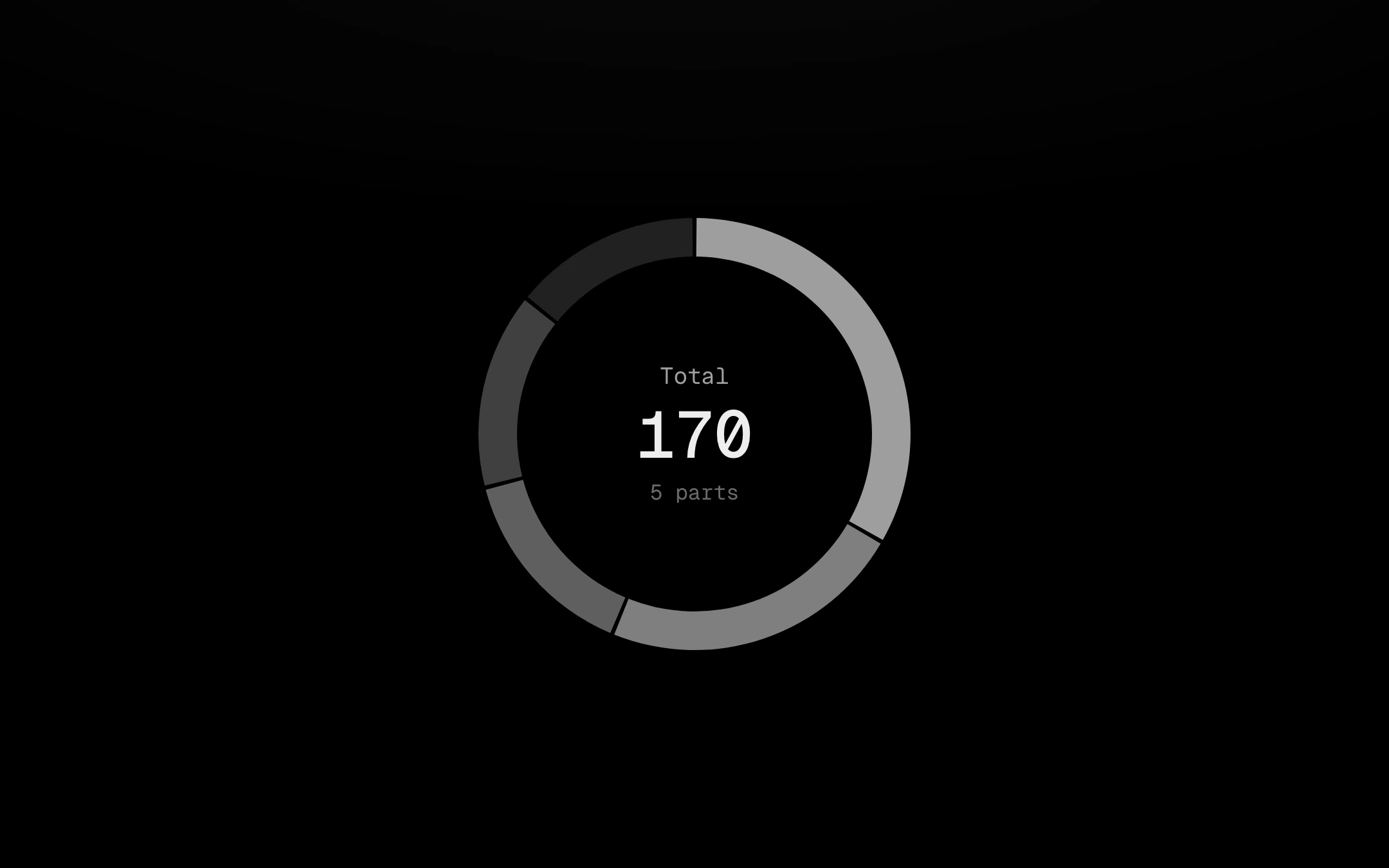
Point at a segment, step with the arrow keys or hover its legend row: it slides out (or grows outward) on a spring and heats to the accent while the others step back, and the centre rolls its digits on per-digit mass and rewrites its caption as a sentence (“24% of total · 2nd of 5”). Options: a linked legend (row, list with shares, or progress rows; click hides a segment and the ring re-proportions, press and hold locks it), a hatch per segment so it reads without colour, a tick-ring style whose ticks shoot out under the pointer and settle slowly into a cooling trail, outside labels on elbow leaders, one segment selected at rest, rounded ends, and loading and empty states.
Install
npx shadcn@latest add @obsyde/donut-chartNeeds your licence key · Get Pro
Usage
Import it from where the CLI puts it, or copy the files below by hand.
import { DonutChart } from '@/components/obsyde/ember/donut-chart/DonutChart';

export function Example() {
  return (
    <DonutChart label="Total" />
  );
}
Files
What you get with Pro: plain React, TypeScript and CSS, with no dependencies.
ember/donut-chart/DonutChart.tsxcomponentember/donut-chart/donut-chart.cssstylesember/donut-chart/DonutChartDemo.tsxdemoember/viz-kit/viz-kit.csssharedember/viz-kit/size.tssharedember/viz-kit/shape.tssharedember/viz-kit/scale.tssharedember/viz-kit/roll.tssharedember/shared/rolling-number.csssharedember/shared/spring.tssharedember/shared/accent.tssharedember/viz-kit/patterns.tsxsharedember/viz-kit/motion.tssharedember/viz-kit/Legend.tsxsharedember/viz-kit/focus.tssharedember/viz-kit/demo.tsxsharedember/viz-kit/demo.csssharedember/shared/ember.csssharedember/viz-kit/touch.tsshared
API
| Prop | Type | Default |
|---|---|---|
accentAccent | 'ember' | 'volt' | 'arc' | 'ember' |
variantStyle | 'ring' | 'ticks' | 'ring' |
hoverHover | 'offset' | 'grow' | 'offset' |
segmentsSegments | number | 5 |
thicknessThickness | number | 20 |
cornerCorner | number | 0 |
sizeSize | number | 240 |
labelsLabels | 'none' | 'outside' | 'none' |
centerMetricCentre shows | 'value' | 'share' | 'value' |
selectedSelected | number | -1 |
labelLabel | string | 'Total' |
centerLabelCentre label | string | — |
centerValueCentre value | string | — |
centerCaptionCentre caption | string | — |
legendLegend | 'none' | 'row' | 'list' | 'progress' | 'none' |
patternPattern | 'none' | 'per-slice' | 'diagonal-up' | 'diagonal-down' | 'dots' | 'vertical' | 'crosshatch' | 'none' |
statusStatus | 'ready' | 'loading' | 'empty' | 'ready' |
seedSeed | number | 4 |