Tick Ring
A donut drawn as fine radial ticks. Every slice shares one sweep of ticks with an empty slot between neighbours, and on mount the ring lights up like a gauge with a crest running ahead of the sweep.
$149 once · every Pro piece
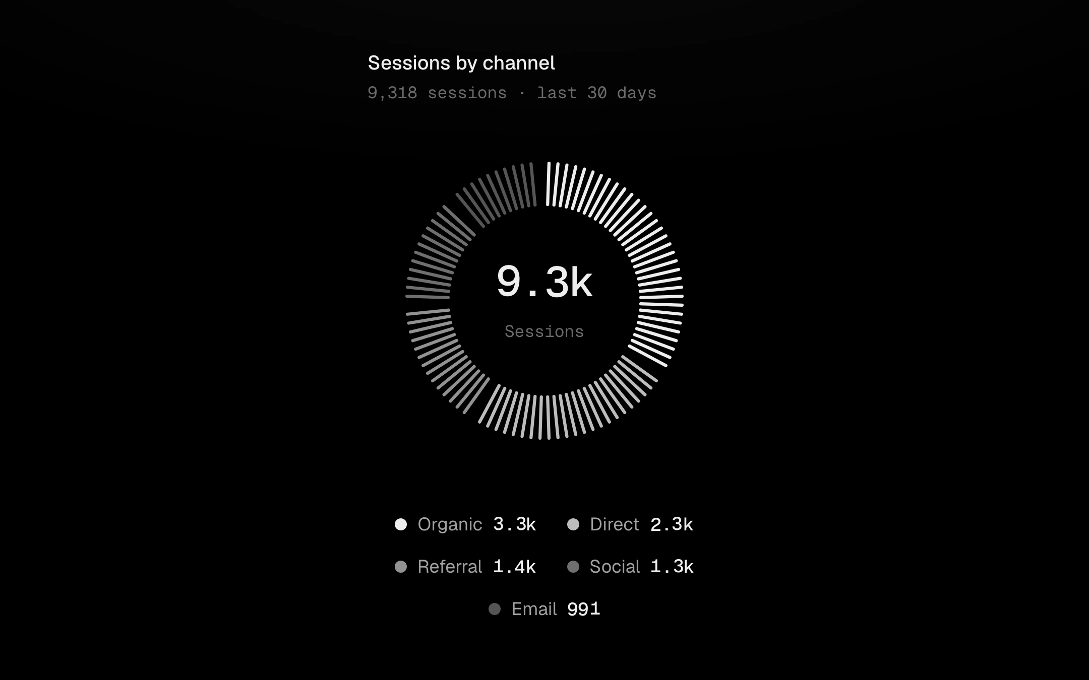
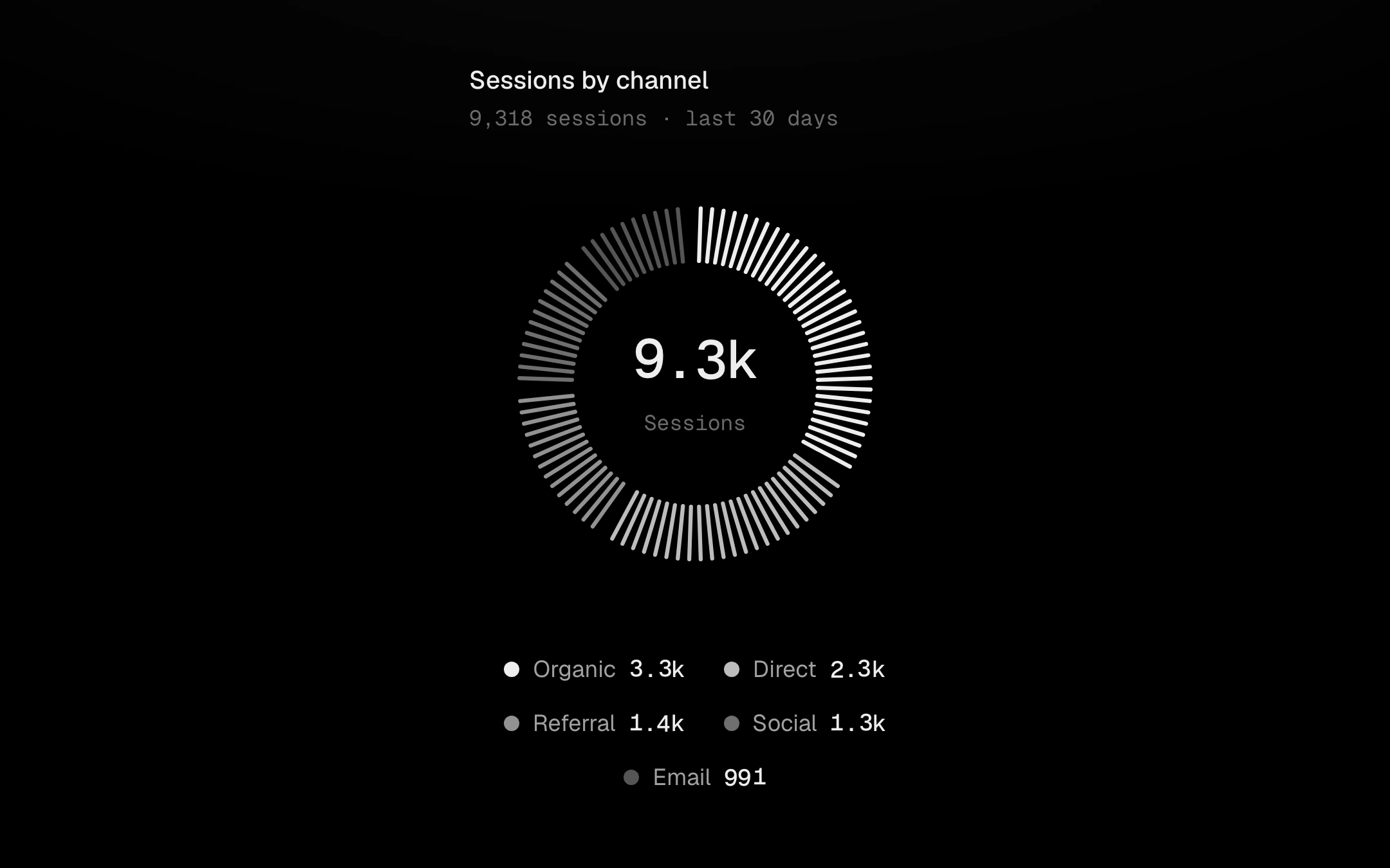
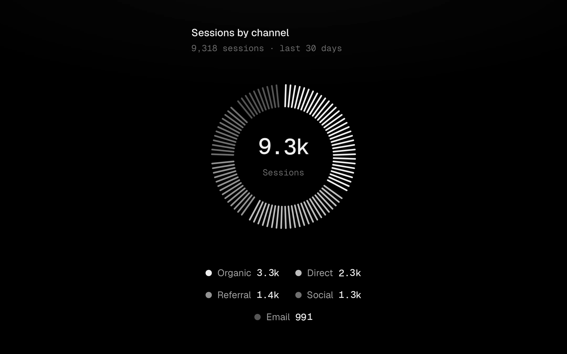
Point at the ring and the tick under the pointer shoots out and thickens while its neighbours lift; it settles slowly, so sweeping round the ring leaves a trail. The hovered slice runs hot and the others step back; the centre rolls from the total at rest to the slice's share or value. The legend is linked both ways: hover isolates, click switches a slice off and the ticks re-deal, hold locks. Tab in and use the arrow keys to step through slices.
Install
npx shadcn@latest add @obsyde/tick-ringNeeds your licence key · Get Pro
Usage
Import it from where the CLI puts it, or copy the files below by hand.
import { TickRing } from '@/components/obsyde/ember/tick-ring/TickRing';

export function Example() {
  return (
    <TickRing ticks={96} legend="row" center="percent" />
  );
}
Files
What you get with Pro: plain React, TypeScript and CSS, with no dependencies.
ember/tick-ring/TickRing.tsxcomponentember/tick-ring/tick-ring.cssstylesember/tick-ring/TickRingDemo.tsxdemoember/viz-kit/viz-kit.csssharedember/viz-kit/Tooltip.tsxsharedember/viz-kit/focus.tssharedember/viz-kit/patterns.tsxsharedember/viz-kit/roll.tssharedember/shared/rolling-number.csssharedember/shared/spring.tssharedember/shared/accent.tssharedember/viz-kit/scale.tssharedember/viz-kit/motion.tssharedember/viz-kit/chart.tsxsharedember/shared/ember.csssharedember/viz-kit/touch.tssharedember/viz-kit/keyboard.tssharedember/viz-kit/size.tssharedember/viz-kit/state-messages.tsxsharedember/viz-kit/stage.tsxsharedember/viz-kit/stage.csssharedember/viz-kit/shape.tssharedember/viz-kit/Legend.tsxsharedember/viz-kit/demo.tsxsharedember/viz-kit/demo.cssshared
API
| Prop | Type | Default |
|---|---|---|
accentAccent | 'ember' | 'volt' | 'arc' | 'ember' |
slicesSlices | number | 5 |
ticksTicks | number | 96 |
thicknessTick length | number | 0.3 |
centerCentre | 'percent' | 'value' | 'percent' |
trailTick trail | boolean | true |
legendLegend | 'row' | 'list' | 'none' | 'row' |
tooltipTooltip | 'panel' | 'none' | 'none' |
statusStatus | 'ready' | 'loading' | 'empty' | 'ready' |
seedSeed | number | 3 |