Pareto
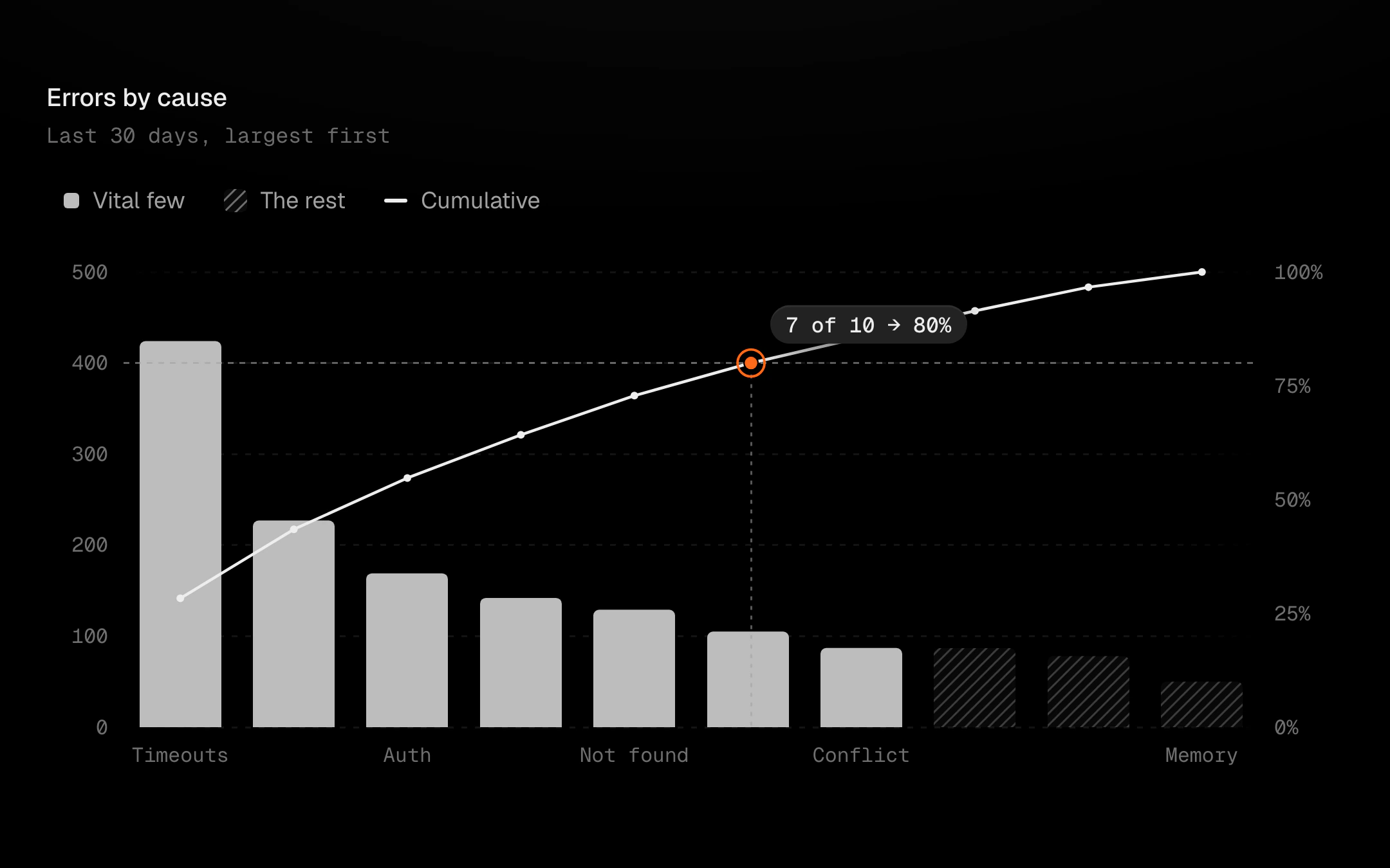
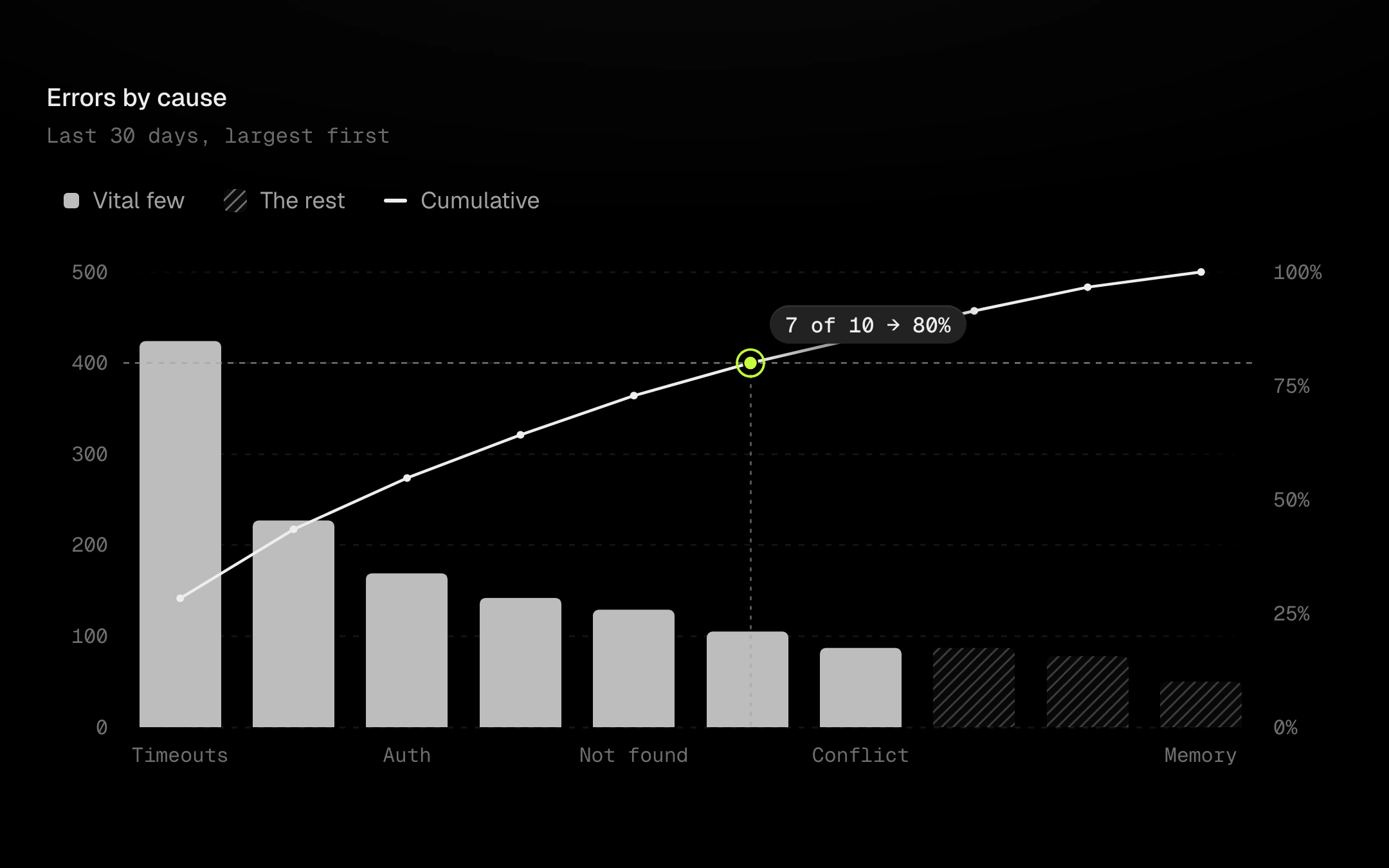
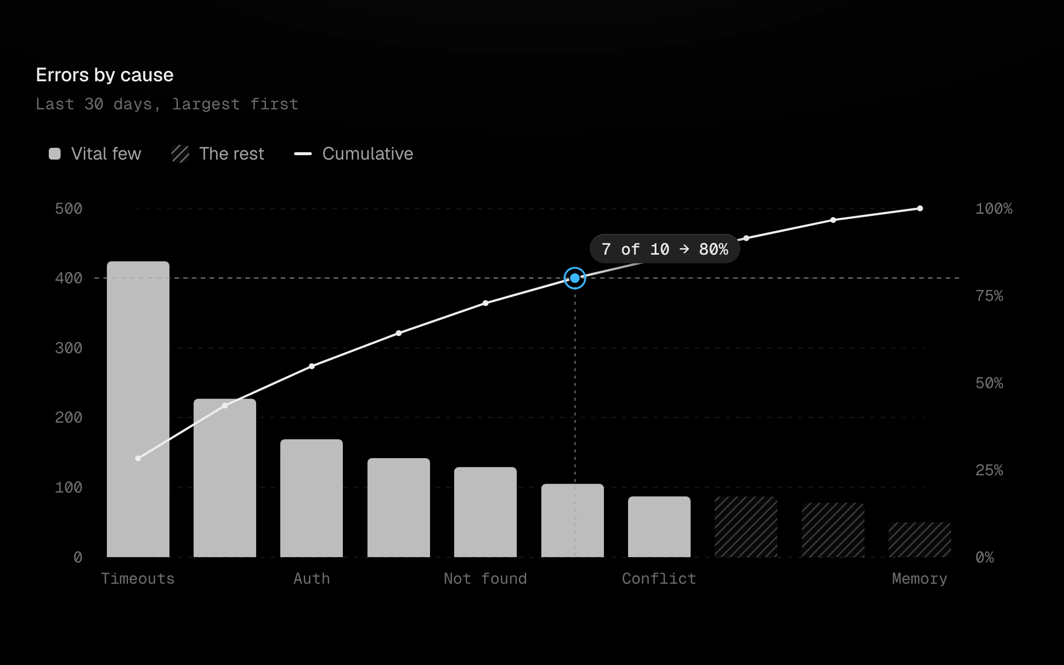
Causes sorted largest first as bars, with the cumulative share as a line on a 0 to 100% axis.
$149 once · every Pro piece
Customize
row
none
panel
none
halo
ring
none
grid
dots
none
linear
monotone
step
ready
loading
empty
A dashed reference marks the cutoff, 80% by default, and where the line crosses it a hot ring lands with a quiet dashed drop to the axis and a badge reading how many causes it takes. Bars past the crossing are ghosted, hatched and dim: the trivial many. Point at a bar or step with the arrow keys (Shift jumps to the crossing): the rest step back, a dot rides the cumulative line and a panel reads count, share and cumulative share.
Install
npx shadcn@latest add @obsyde/paretoNeeds your licence key · Get Pro
Usage
Import it from where the CLI puts it, or copy the files below by hand.
import { Pareto } from '@/components/obsyde/ember/pareto/Pareto';

export function Example() {
  return (
    <Pareto />
  );
}
Files
What you get with Pro: plain React, TypeScript and CSS, with no dependencies.
ember/pareto/Pareto.tsxcomponentember/pareto/pareto.cssstylesember/pareto/ParetoDemo.tsxdemoember/viz-kit/viz-kit.csssharedember/viz-kit/Tooltip.tsxsharedember/viz-kit/focus.tssharedember/viz-kit/patterns.tsxsharedember/viz-kit/roll.tssharedember/shared/rolling-number.csssharedember/shared/spring.tssharedember/shared/accent.tssharedember/viz-kit/scale.tssharedember/viz-kit/motion.tssharedember/viz-kit/chart.tsxsharedember/shared/ember.csssharedember/viz-kit/touch.tssharedember/viz-kit/keyboard.tssharedember/viz-kit/size.tssharedember/viz-kit/States.tsxsharedember/viz-kit/shape.tssharedember/viz-kit/series.tsxsharedember/viz-kit/Legend.tsxsharedember/viz-kit/Grid.tsxsharedember/viz-kit/demo.tsxsharedember/viz-kit/demo.csssharedember/viz-kit/Axis.tsxsharedember/viz-kit/annotations.tsxshared
API
| Prop | Type | Default |
|---|---|---|
accentAccent | 'ember' | 'volt' | 'arc' | 'ember' |
cutoffCutoff % | number | 80 |
ghostGhost the rest | boolean | true |
categoriesCategories | number | 10 |
legendLegend | 'row' | 'none' | 'row' |
tooltipTooltip | 'panel' | 'none' | 'panel' |
dotsDots | 'halo' | 'ring' | 'none' | 'halo' |
patternPattern | 'none' | 'diagonal-up' | 'diagonal-down' | 'dots' | 'vertical' | 'crosshatch' | 'diagonal-up' |
backgroundBackground | 'grid' | 'dots' | 'none' | 'grid' |
curveCurve | 'linear' | 'monotone' | 'step' | 'linear' |
statusStatus | 'ready' | 'loading' | 'empty' | 'ready' |
valueLabelsValue labels | boolean | false |
heightHeight | number | 280 |
seedSeed | number | 5 |