Unit Columns
Columns counted out in rounded squares, one per unit, over a faded hatched track that shows how far the scale goes.
$149 once · every Pro piece
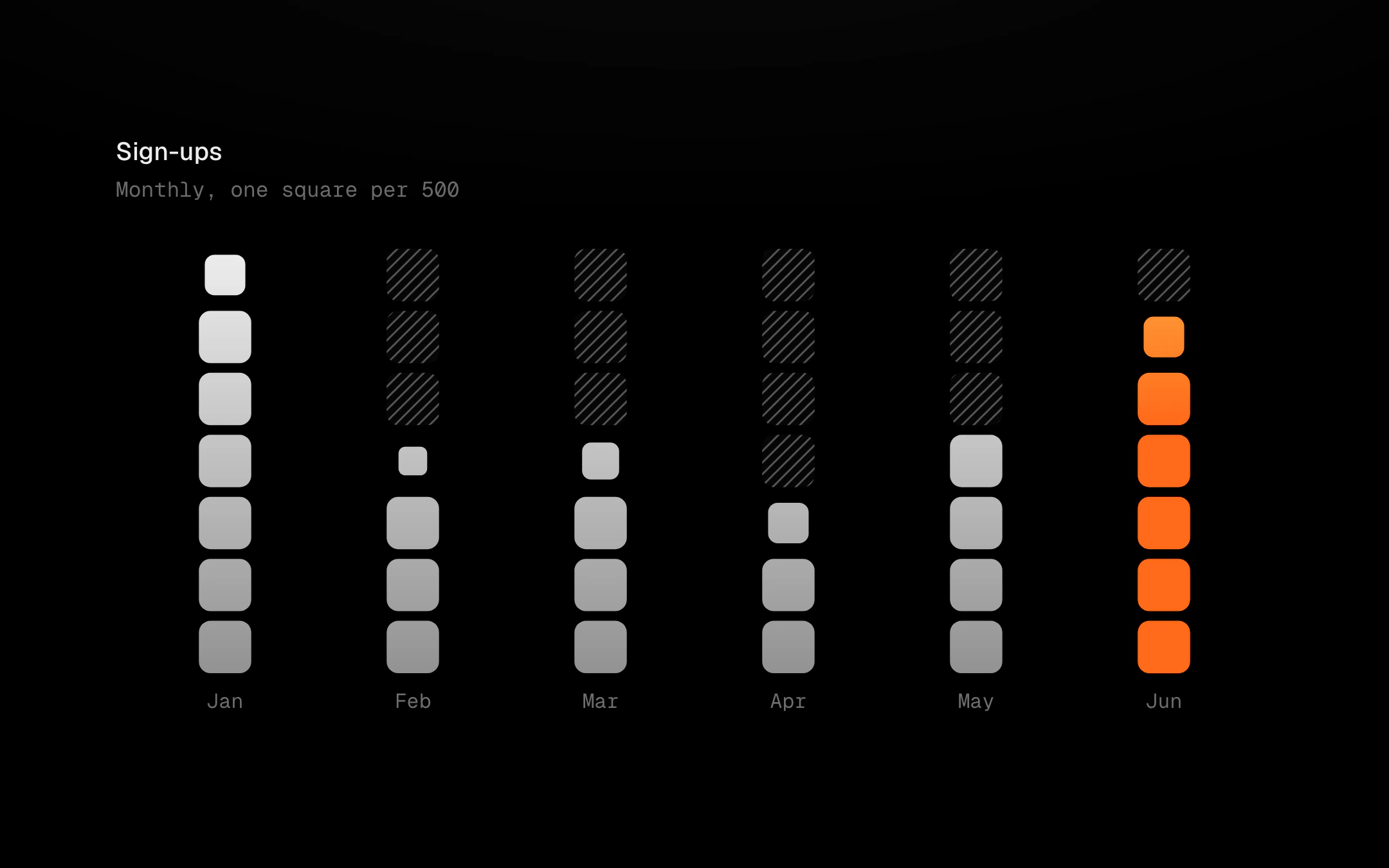
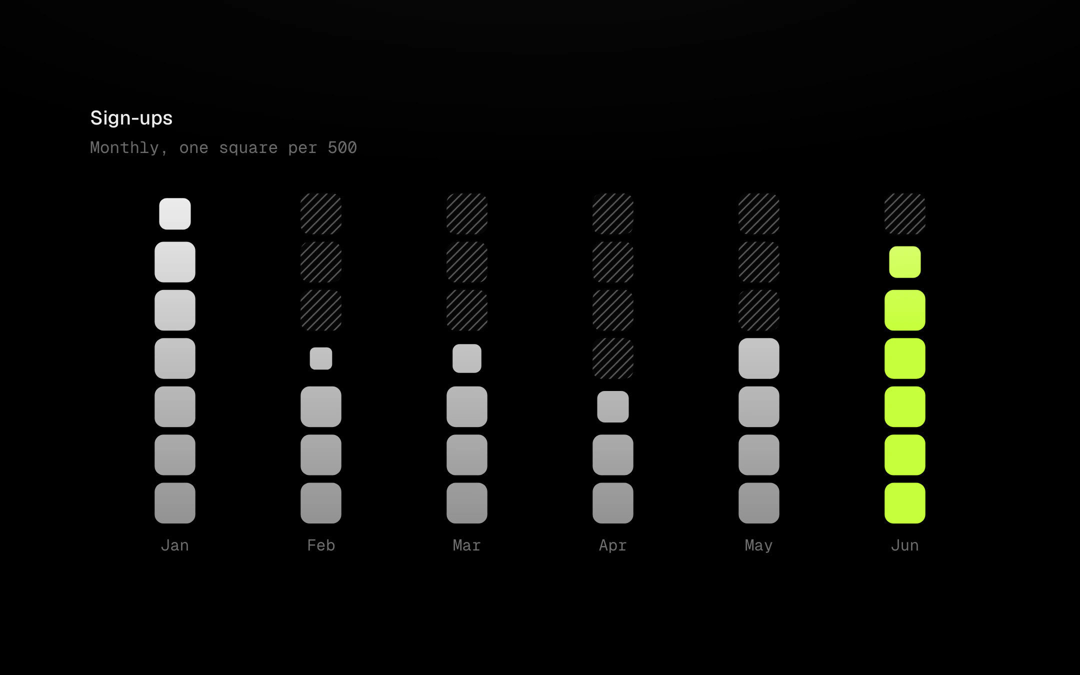
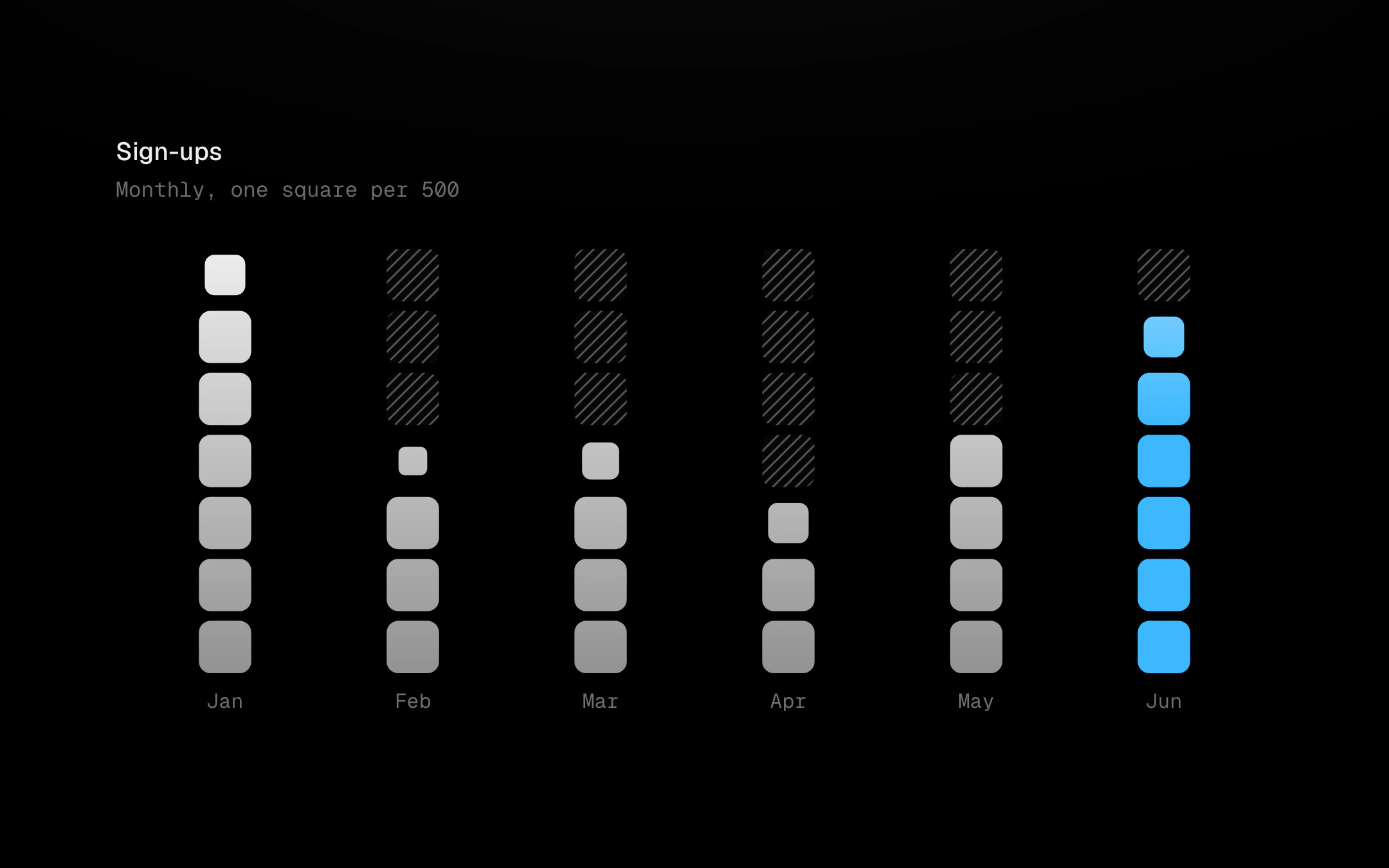
A part-unit on top is drawn as a smaller square, so nothing is rounded away. Filled squares share one vertical gradient across the plot, bone at the top, and the latest (or largest) column carries the accent. On entry the squares cascade up column by column with mass by value: tall columns arrive later and settle heavier while the track gives way square by square. Point at a column and a thin ring hugs its top square on a spring while the other columns step back; with several series, pointing at one series isolates it.
Install
npx shadcn@latest add @obsyde/unit-columnsNeeds your licence key · Get Pro
Usage
Import it from where the CLI puts it, or copy the files below by hand.
import { UnitColumns } from '@/components/obsyde/ember/unit-columns/UnitColumns';

export function Example() {
  return (
    <UnitColumns />
  );
}
Files
What you get with Pro: plain React, TypeScript and CSS, with no dependencies.
ember/unit-columns/UnitColumns.tsxcomponentember/unit-columns/unit-columns.cssstylesember/unit-columns/UnitColumnsDemo.tsxdemoember/viz-kit/viz-kit.csssharedember/viz-kit/Tooltip.tsxsharedember/viz-kit/focus.tssharedember/viz-kit/patterns.tsxsharedember/viz-kit/roll.tssharedember/shared/rolling-number.csssharedember/shared/spring.tssharedember/shared/accent.tssharedember/viz-kit/scale.tssharedember/viz-kit/motion.tssharedember/viz-kit/chart.tsxsharedember/shared/ember.csssharedember/viz-kit/touch.tssharedember/viz-kit/keyboard.tssharedember/viz-kit/size.tssharedember/viz-kit/States.tsxsharedember/viz-kit/shape.tssharedember/viz-kit/marks.tsxsharedember/viz-kit/Legend.tsxsharedember/viz-kit/Grid.tsxsharedember/viz-kit/demo.tsxsharedember/viz-kit/demo.csssharedember/viz-kit/Axis.tsxshared
API
| Prop | Type | Default |
|---|---|---|
accentAccent | 'ember' | 'volt' | 'arc' | 'ember' |
shapeShape | 'rounded' | 'squircle' | 'square' | 'dot' | 'rounded' |
seriesSeries | number | 1 |
columnsColumns | number | 6 |
highlightHighlight | 'last' | 'max' | 'none' | 'last' |
patternPattern | 'diagonal-up' | 'diagonal-down' | 'dots' | 'vertical' | 'crosshatch' | 'none' | 'off' | 'diagonal-up' |
tooltipTooltip | 'panel' | 'none' | 'panel' |
backgroundBackground | 'none' | 'grid' | 'dots' | 'none' |
statusStatus | 'ready' | 'loading' | 'empty' | 'ready' |
valueLabelsValue labels | boolean | false |
heightHeight | number | 260 |
seedSeed | number | 2 |