Live Line
A streaming line that never ticks. Time glides left at a constant speed a beat behind the stream, like a seismograph, so batches land unseen ahead of the tip and the line simply keeps flowing; or switch to the tide, where the axis swells forward once per batch.
$149 once · every Pro piece
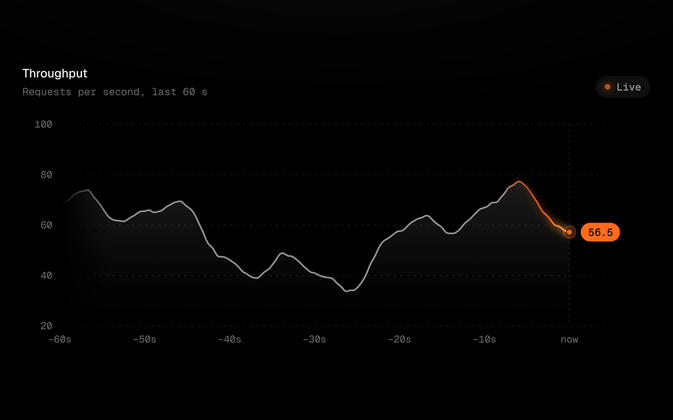
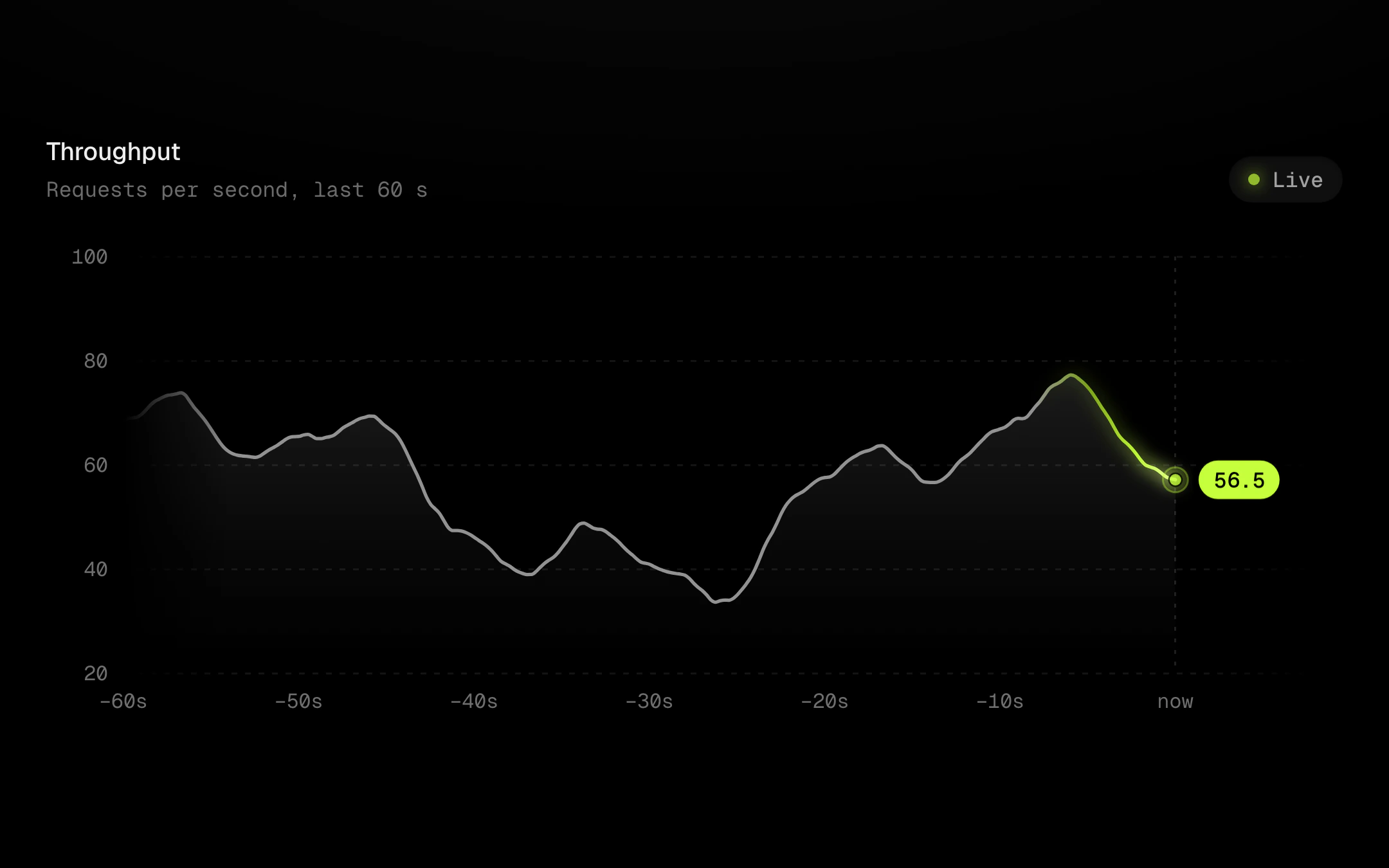
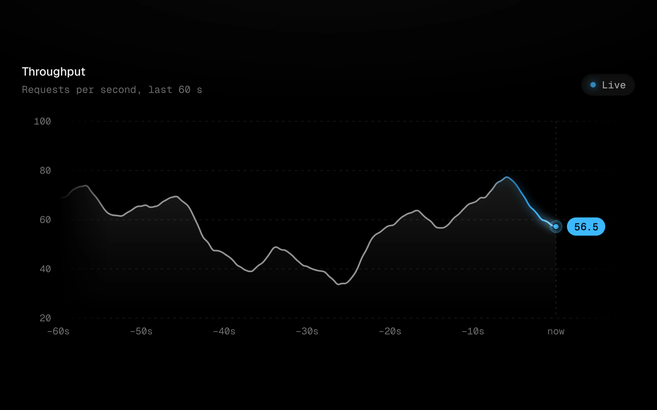
Either way the line is drawn up to now and never past it: new samples are revealed by the motion itself. Optional smoothing turns a noisy signal into a calm monotone curve, while the tooltip keeps reading the real samples. Heat follows recency: the newest seconds glow white-hot at the tip and cool through the accent ramp back to grey behind it, with a soft bloom under the hot stretch. A pilot light breathes on the tip, and a rolling value badge sits in the now-gap to its right. The y scale tweens as the range shifts and new labels fade in. Point at it and the stream holds still under the cursor; let go and it catches up in one swell. When the stream stops, the heat drains out and the pilot goes ash.
Install
npx shadcn@latest add @obsyde/live-lineNeeds your licence key · Get Pro
Usage
Import it from where the CLI puts it, or copy the files below by hand.
import { LiveLine } from '@/components/obsyde/ember/live-line/LiveLine';

export function Example() {
  return (
    <LiveLine tide="glide" window={60} fill="gradient" glow badge />
  );
}
Files
What you get with Pro: plain React, TypeScript and CSS, with no dependencies.
ember/live-line/LiveLine.tsxcomponentember/live-line/live-line.cssstylesember/live-line/LiveLineDemo.tsxdemoember/viz-kit/viz-kit.csssharedember/viz-kit/Tooltip.tsxsharedember/viz-kit/focus.tssharedember/viz-kit/patterns.tsxsharedember/viz-kit/roll.tssharedember/shared/rolling-number.csssharedember/shared/spring.tssharedember/shared/accent.tssharedember/viz-kit/scale.tssharedember/viz-kit/motion.tssharedember/viz-kit/chart.tsxsharedember/shared/ember.csssharedember/viz-kit/touch.tssharedember/viz-kit/keyboard.tssharedember/viz-kit/size.tssharedember/viz-kit/States.tsxsharedember/viz-kit/shape.tssharedember/viz-kit/Grid.tsxsharedember/viz-kit/demo.tsxsharedember/viz-kit/demo.csssharedember/viz-kit/Axis.tsxshared
API
| Prop | Type | Default |
|---|---|---|
accentAccent | 'ember' | 'volt' | 'arc' | 'ember' |
tideMotion | 'glide' | 'calm' | 'brisk' | 'glide' |
smoothingSmoothing | 'none' | 'light' | 'strong' | 'light' |
cadenceBatch every (ms) | number | 1200 |
windowWindow (s) | number | 60 |
coolingHot seconds | number | 8 |
fillFill | 'gradient' | 'pattern' | 'none' | 'gradient' |
badgeValue badge | boolean | true |
glowBloom | boolean | true |
liveLive | boolean | true |
tooltipTooltip | 'panel' | 'corner' | 'none' | 'panel' |
crosshairCrosshair | 'solid' | 'dashed' | 'gradient' | 'none' | 'solid' |
dotsDots | 'halo' | 'ring' | 'none' | 'halo' |
patternPattern | 'none' | 'diagonal-up' | 'diagonal-down' | 'dots' | 'vertical' | 'crosshatch' | 'none' |
backgroundBackground | 'grid' | 'dots' | 'hatch' | 'none' | 'grid' |
revealReveal | 'sweep' | 'cool' | 'rise' | 'fade' | 'none' | 'sweep' |
statusStatus | 'ready' | 'loading' | 'empty' | 'ready' |
heightHeight | number | 260 |
seedSeed | number | 4 |