Step Line
Honest steps for tiers, plans and prices: values that hold until they change.
$149 once · every Pro piece
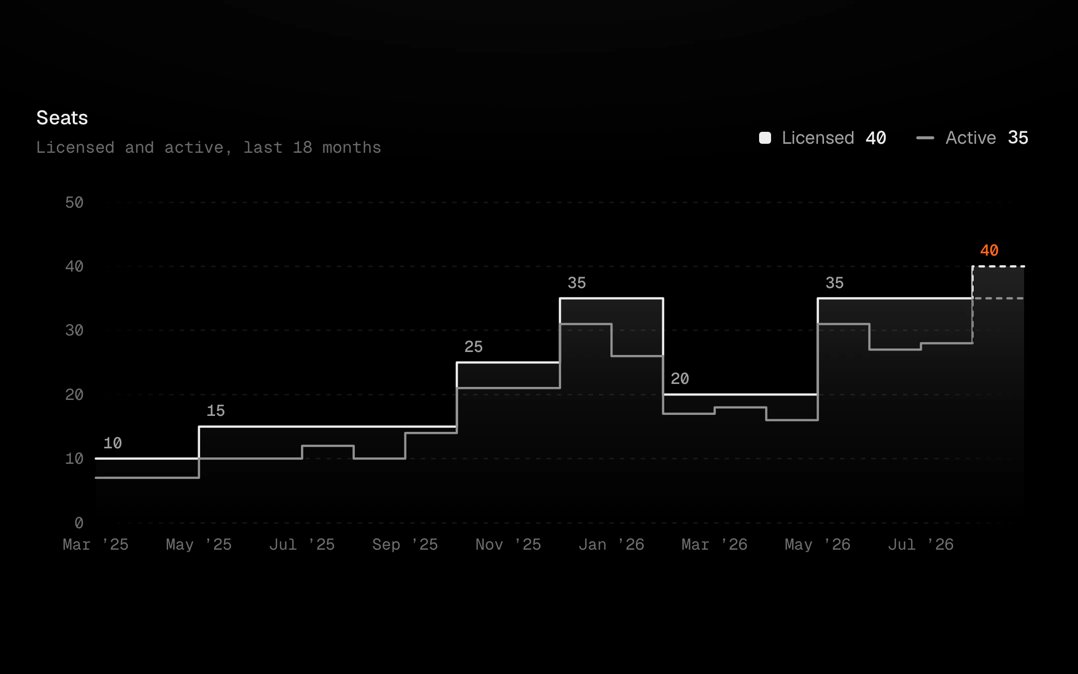
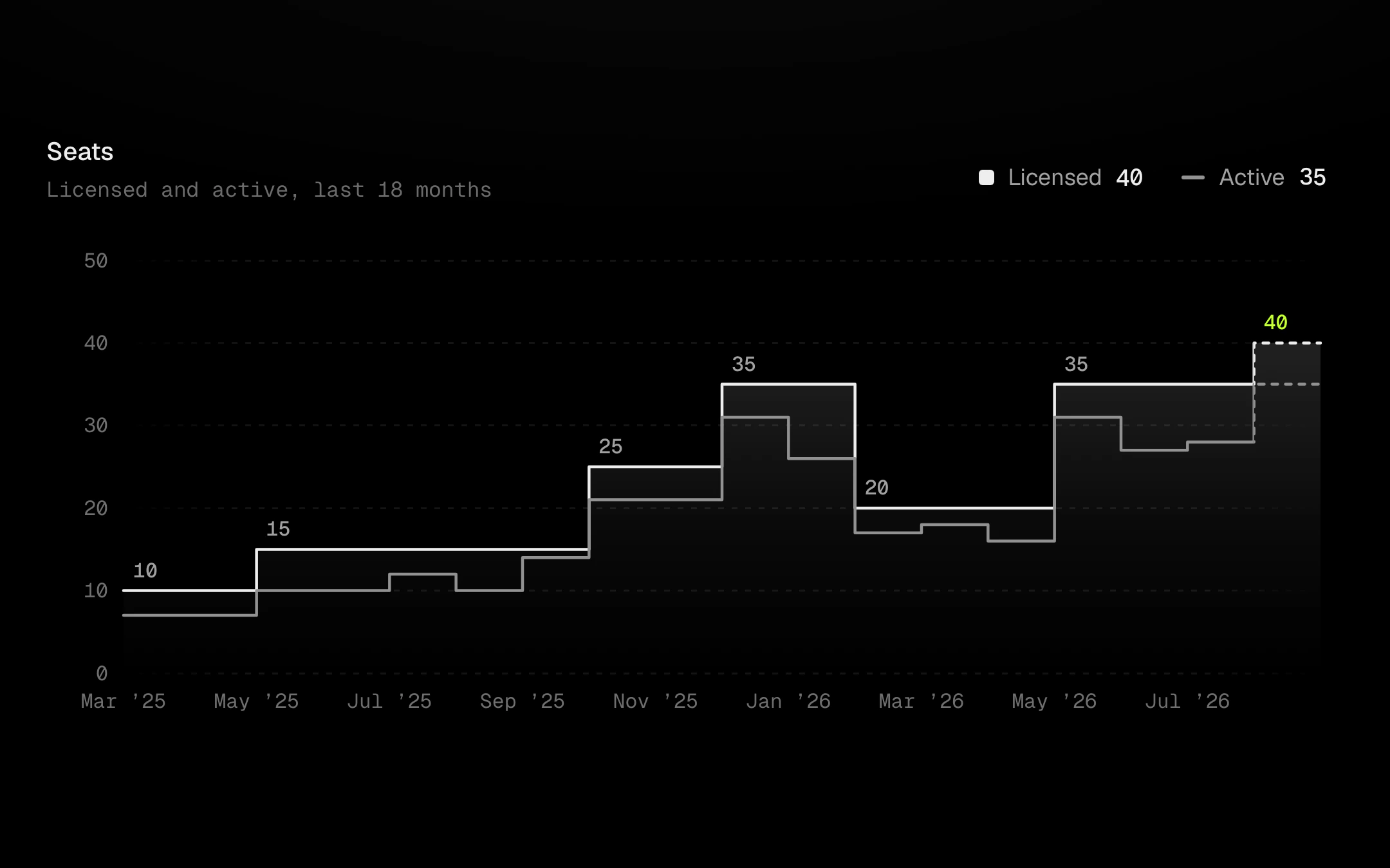
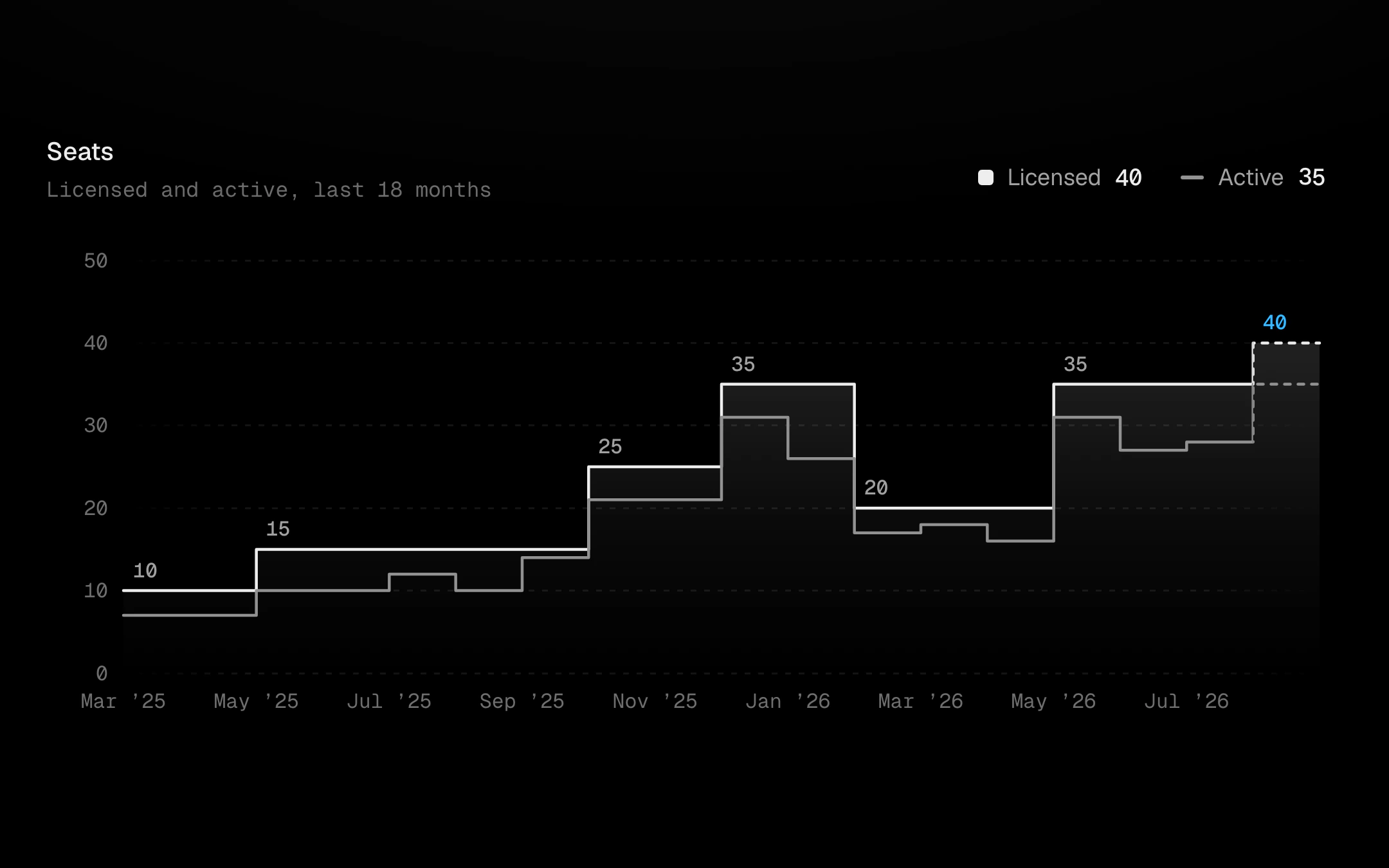
Each value owns a period, and its step can sit at the start of the period, its end or its middle. The period still running is dashed, and its label carries the accent. Labels sit once per step on the plateau they name, and drop out when a plateau is too short to hold one. Scrub it and the plateau under the cursor lifts as a shelf: a faint column down to the baseline and a brighter tread that springs from plateau to plateau. The tooltip says how long the tier held and how far the last step moved. A second series (active against licensed, use against quota) runs as a plain grey step line, linked to the legend.
Install
npx shadcn@latest add @obsyde/step-lineNeeds your licence key · Get Pro
Usage
Import it from where the CLI puts it, or copy the files below by hand.
import { StepLine } from '@/components/obsyde/ember/step-line/StepLine';

export function Example() {
  return (
    <StepLine step="after" fill="gradient" open valueLabels shelf />
  );
}
Files
What you get with Pro: plain React, TypeScript and CSS, with no dependencies.
ember/step-line/StepLine.tsxcomponentember/step-line/step-line.cssstylesember/step-line/StepLineDemo.tsxdemoember/viz-kit/viz-kit.csssharedember/viz-kit/Tooltip.tsxsharedember/viz-kit/focus.tssharedember/viz-kit/patterns.tsxsharedember/viz-kit/roll.tssharedember/shared/rolling-number.csssharedember/shared/spring.tssharedember/shared/accent.tssharedember/viz-kit/scale.tssharedember/viz-kit/motion.tssharedember/viz-kit/chart.tsxsharedember/shared/ember.csssharedember/viz-kit/touch.tssharedember/viz-kit/keyboard.tssharedember/viz-kit/size.tssharedember/viz-kit/States.tsxsharedember/viz-kit/shape.tssharedember/viz-kit/series.tsxsharedember/viz-kit/Legend.tsxsharedember/viz-kit/Grid.tsxsharedember/viz-kit/demo.tsxsharedember/viz-kit/demo.csssharedember/viz-kit/Axis.tsxshared
API
| Prop | Type | Default |
|---|---|---|
accentAccent | 'ember' | 'volt' | 'arc' | 'ember' |
viewData | 'seats' | 'price' | 'quota' | 'seats' |
stepStep at | 'after' | 'before' | 'mid' | 'after' |
fillFill | 'gradient' | 'solid' | 'pattern' | 'none' | 'gradient' |
openOpen period | boolean | true |
shelfShelf on hover | boolean | true |
legendLegend | 'row' | 'list' | 'none' | 'row' |
tooltipTooltip | 'panel' | 'corner' | 'none' | 'panel' |
crosshairCrosshair | 'solid' | 'dashed' | 'gradient' | 'none' | 'solid' |
dotsDots | 'halo' | 'ring' | 'none' | 'halo' |
patternPattern | 'none' | 'diagonal-up' | 'diagonal-down' | 'dots' | 'vertical' | 'crosshatch' | 'none' |
backgroundBackground | 'grid' | 'dots' | 'hatch' | 'none' | 'grid' |
revealReveal | 'sweep' | 'cool' | 'rise' | 'fade' | 'none' | 'sweep' |
statusStatus | 'ready' | 'loading' | 'empty' | 'ready' |
valueLabelsValue labels | boolean | true |
heightHeight | number | 260 |
pointsPoints | number | 18 |
seedSeed | number | 3 |