Kiln Gauge
A vertical segmented gauge lit like a kiln.
$149 once · every Pro piece
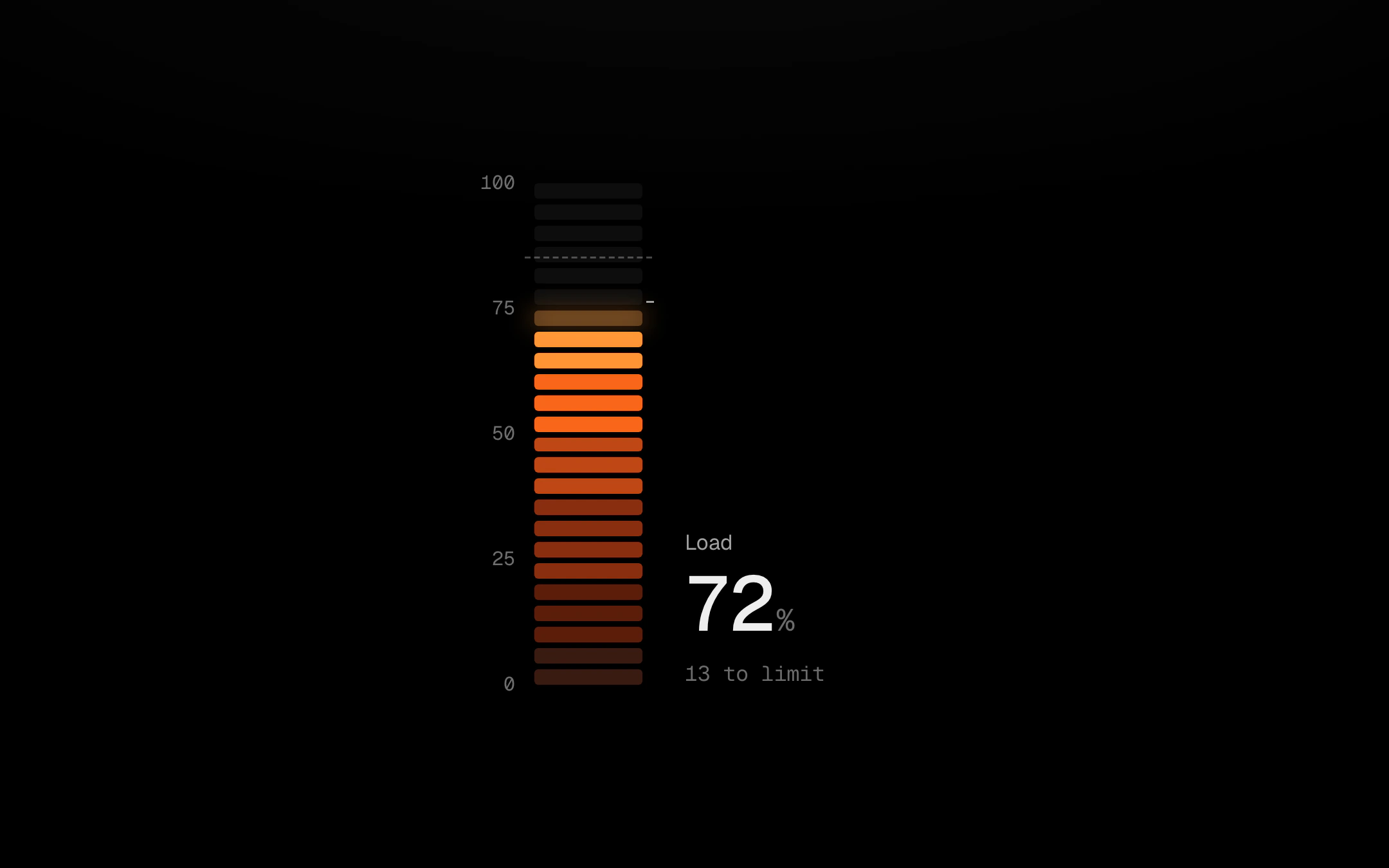
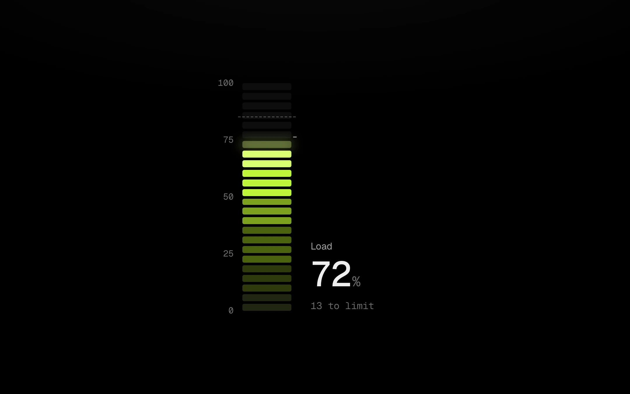
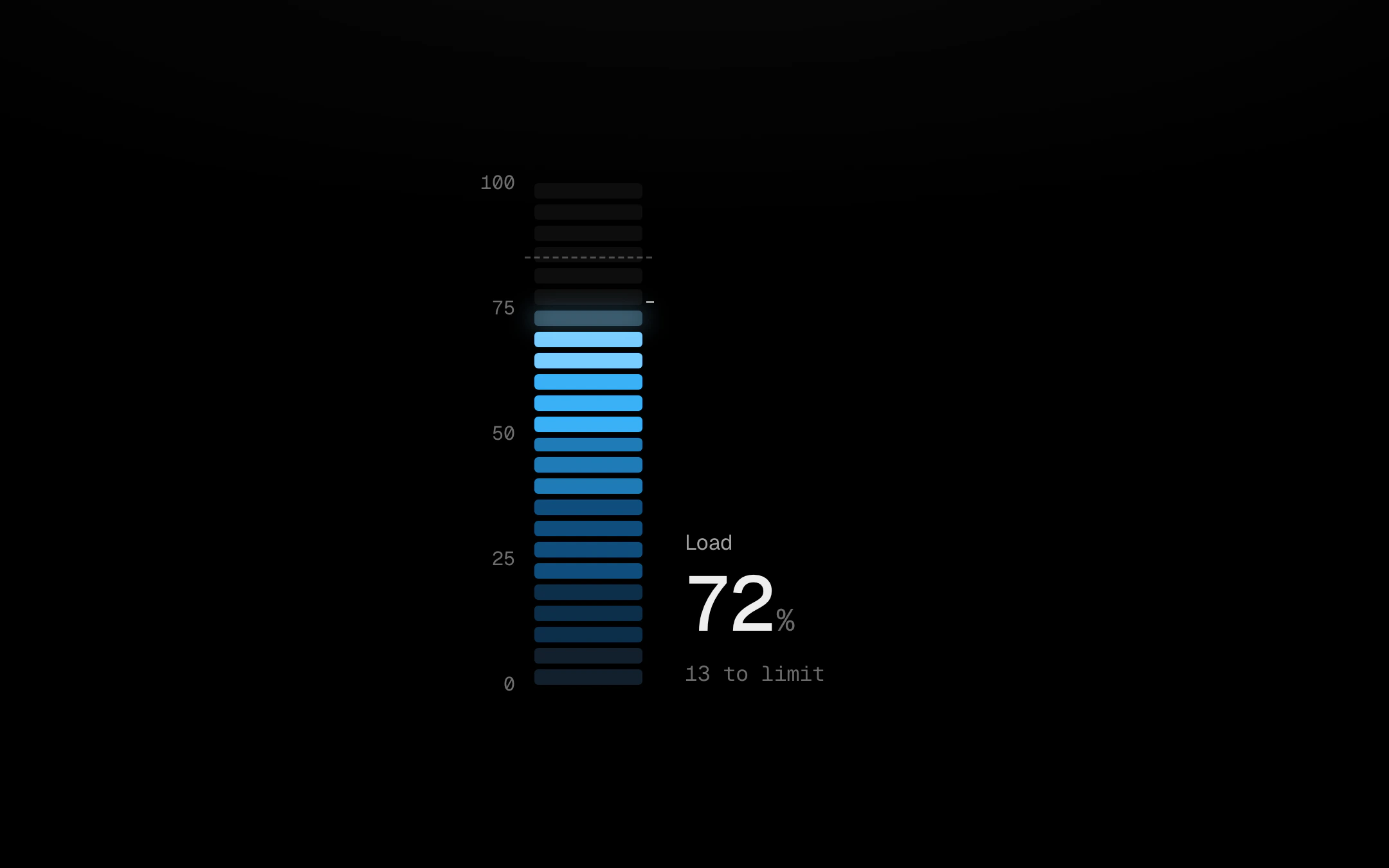
Lit segments follow a blackbody ramp, deep red at the bottom through ember and amber to near-white at the top; unlit ones are ash. Only the topmost lit segment glows, with a soft bloom, and it lights in proportion so the level reads between segments. Past the limit that segment flickers subtly, still under reduced motion. The level rides a spring with no bounce and re-sweeps from wherever it is when a new reading lands, and the value rolls with heavier high digits. Several kilns make a bank with a shared scale and limit: point at one, or Tab in and use the arrow keys, and the others step back while its headroom reads out.
Install
npx shadcn@latest add @obsyde/kiln-gaugeNeeds your licence key · Get Pro
Usage
Import it from where the CLI puts it, or copy the files below by hand.
import { KilnGauge } from '@/components/obsyde/ember/kiln-gauge/KilnGauge';

export function Example() {
  return (
    <KilnGauge units={1} />
  );
}
Files
What you get with Pro: plain React, TypeScript and CSS, with no dependencies.
ember/kiln-gauge/KilnGauge.tsxcomponentember/kiln-gauge/kiln-gauge.cssstylesember/kiln-gauge/KilnGaugeDemo.tsxdemoember/viz-kit/viz-kit.csssharedember/viz-kit/scale.tssharedember/viz-kit/roll.tssharedember/shared/rolling-number.csssharedember/shared/spring.tssharedember/shared/accent.tssharedember/viz-kit/motion.tssharedember/viz-kit/keyboard.tssharedember/viz-kit/focus.tssharedember/viz-kit/demo.tsxsharedember/viz-kit/demo.csssharedember/shared/ember.csssharedember/viz-kit/touch.tsshared
API
| Prop | Type | Default |
|---|---|---|
accentAccent | 'ember' | 'volt' | 'arc' | 'ember' |
unitsKilns | number | 1 |
valueValue | number | 72 |
limitLimit | number | 85 |
segmentsSegments | number | 24 |
heightHeight | number | 260 |
scaleScale | boolean | true |
liveLive | boolean | false |
statusStatus | 'ready' | 'loading' | 'empty' | 'ready' |
seedSeed | number | 3 |