Dial Gauge
One dial, four faces. Notched: fine notches round the rim over a numbered inner ruler, brightening as the sweep passes them with a short glow just behind the needle.
$149 once · every Pro piece
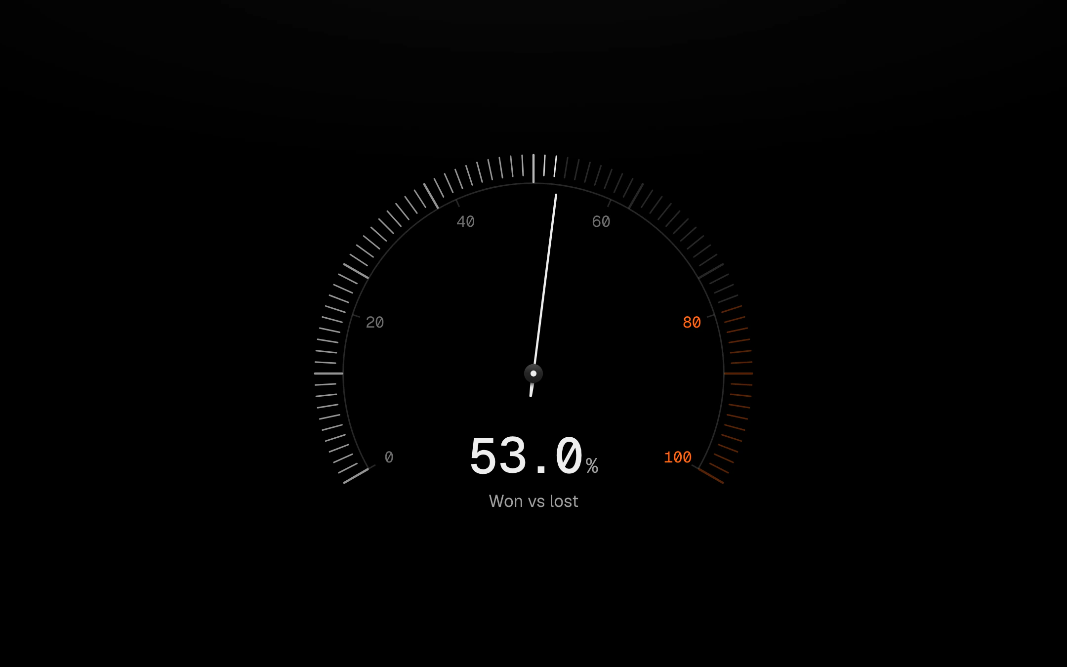
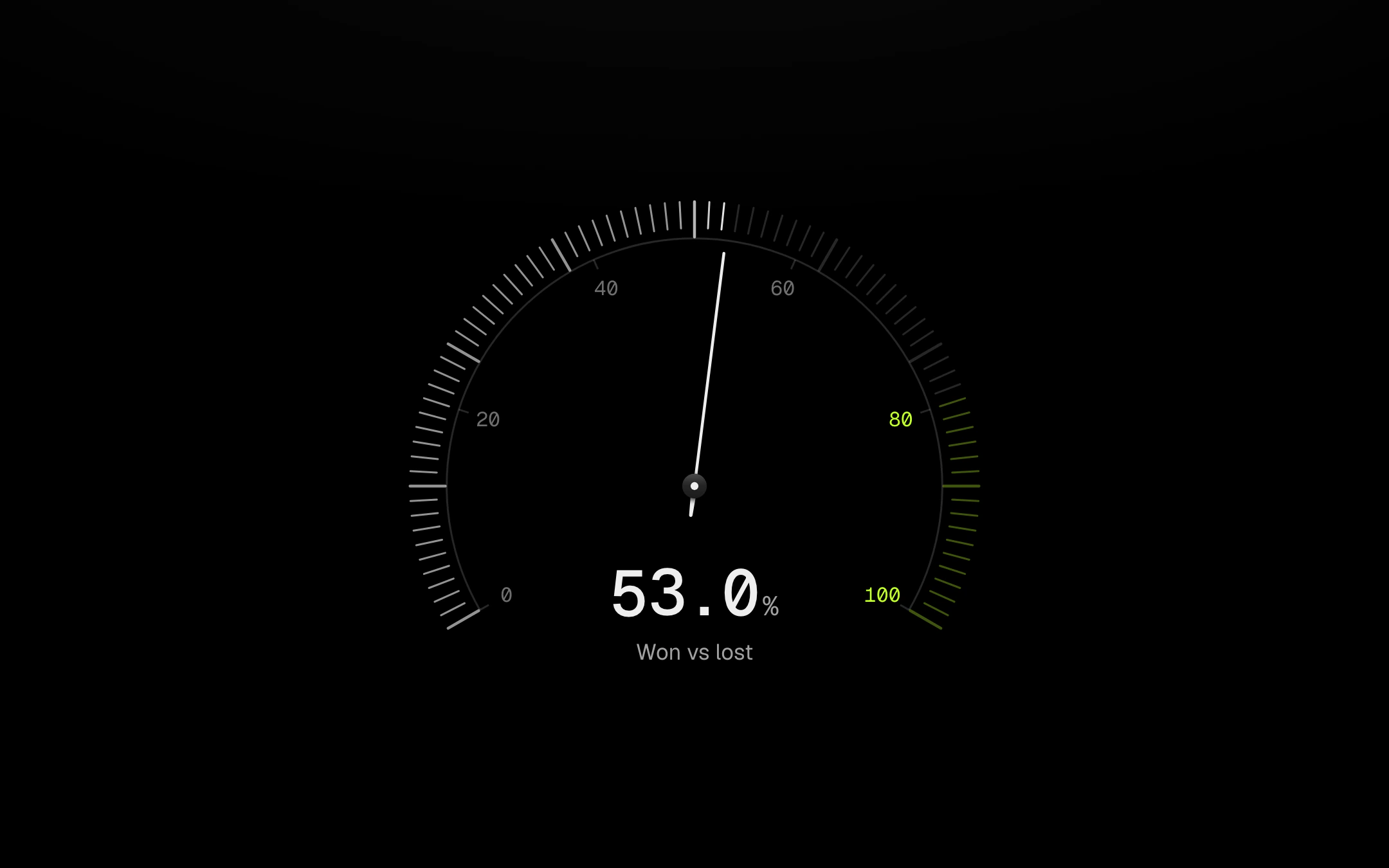
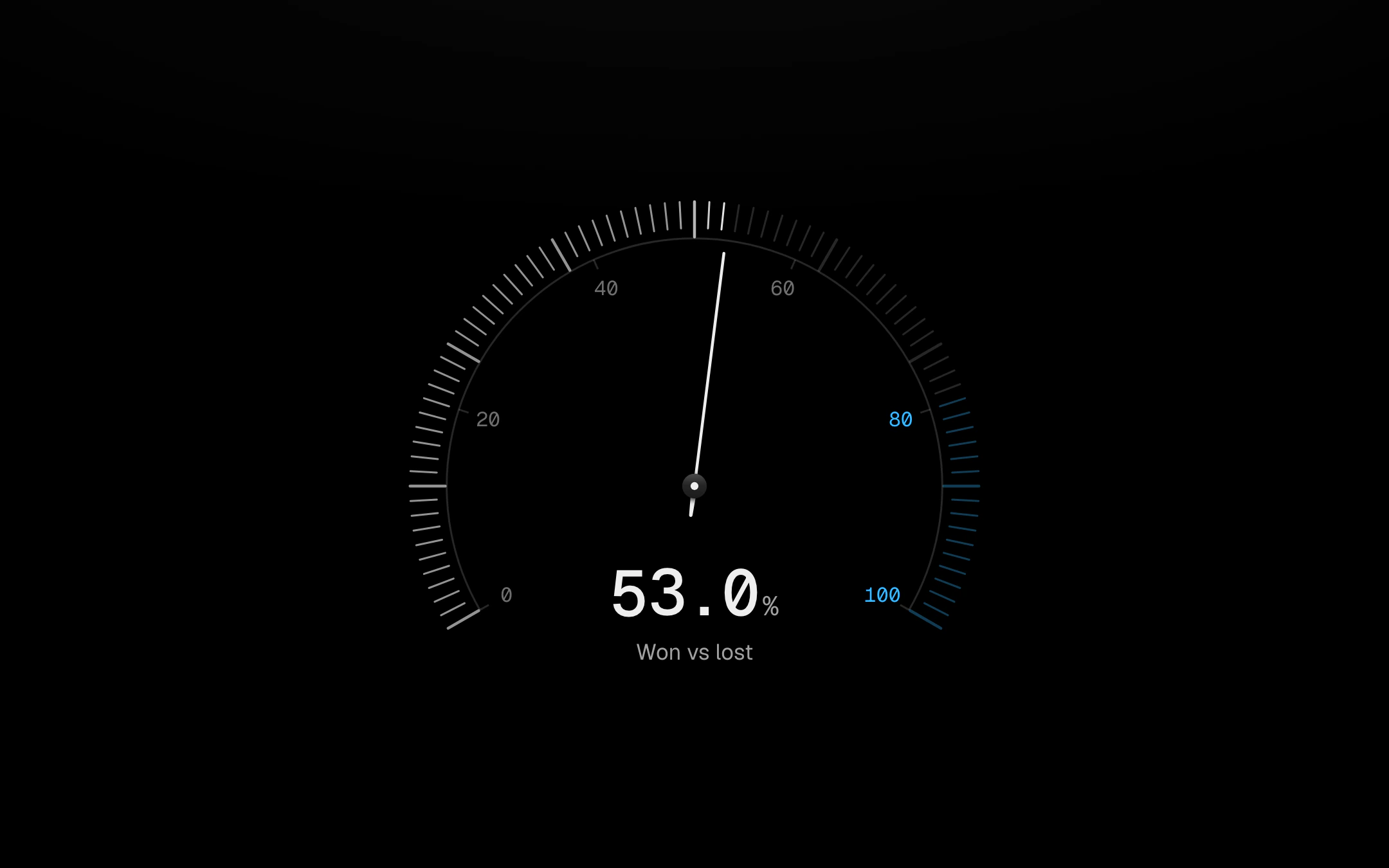
Conic: no track, a conic wedge that brightens toward the value inside a thin progress ring, with a raised centre disc holding the number. Speedometer: heavier notches and an outside scale, with a red zone past the redline whose notches glow in the accent once lit, and rings of dots lighting behind. Dots: seven rings of dots lighting to the score and fading toward the centre. Needles come as a line, a tapered gradient, a triangle or a diamond; the line and tapered ones turn on a raised cap with a short tapered counterweight. The needle rides a spring with no bounce and re-sweeps from wherever it is when a new sample lands; the value rolls. The accent appears only past the redline. Point at the dial, or Tab in and use the arrow keys, to probe the scale: a small mark rides the rim, the centre number rolls to the probed value and the caption gives its distance from the reading.
Install
npx shadcn@latest add @obsyde/dial-gaugeNeeds your licence key · Get Pro
Usage
Import it from where the CLI puts it, or copy the files below by hand.
import { DialGauge } from '@/components/obsyde/ember/dial-gauge/DialGauge';

export function Example() {
  return (
    <DialGauge variant="notched" needle="line" value={53} />
  );
}
Files
What you get with Pro: plain React, TypeScript and CSS, with no dependencies.
ember/dial-gauge/DialGauge.tsxcomponentember/dial-gauge/dial-gauge.cssstylesember/dial-gauge/DialGaugeDemo.tsxdemoember/viz-kit/viz-kit.csssharedember/viz-kit/state-messages.tsxsharedember/viz-kit/size.tssharedember/viz-kit/shape.tssharedember/viz-kit/scale.tssharedember/viz-kit/roll.tssharedember/shared/rolling-number.csssharedember/shared/spring.tssharedember/shared/accent.tssharedember/viz-kit/radial.tsxsharedember/viz-kit/radial.csssharedember/shared/ember.csssharedember/viz-kit/touch.tssharedember/viz-kit/motion.tssharedember/viz-kit/focus.tssharedember/viz-kit/keyboard.tssharedember/viz-kit/demo.tsxsharedember/viz-kit/demo.cssshared
API
| Prop | Type | Default |
|---|---|---|
accentAccent | 'ember' | 'volt' | 'arc' | 'ember' |
variantVariant | 'notched' | 'conic' | 'speedometer' | 'dots' | 'notched' |
needleNeedle | 'line' | 'tapered' | 'triangle' | 'diamond' | 'none' | 'line' |
valueValue % | number | 62 |
redlineRedline % | number | 80 |
liveLive | boolean | false |
sizeSize | number | 320 |
statusStatus | 'ready' | 'loading' | 'empty' | 'ready' |