Tabs
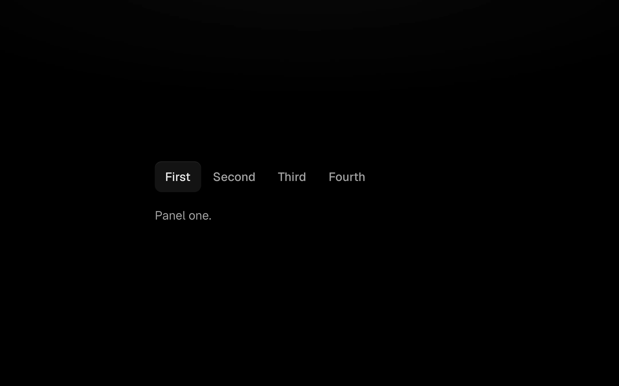
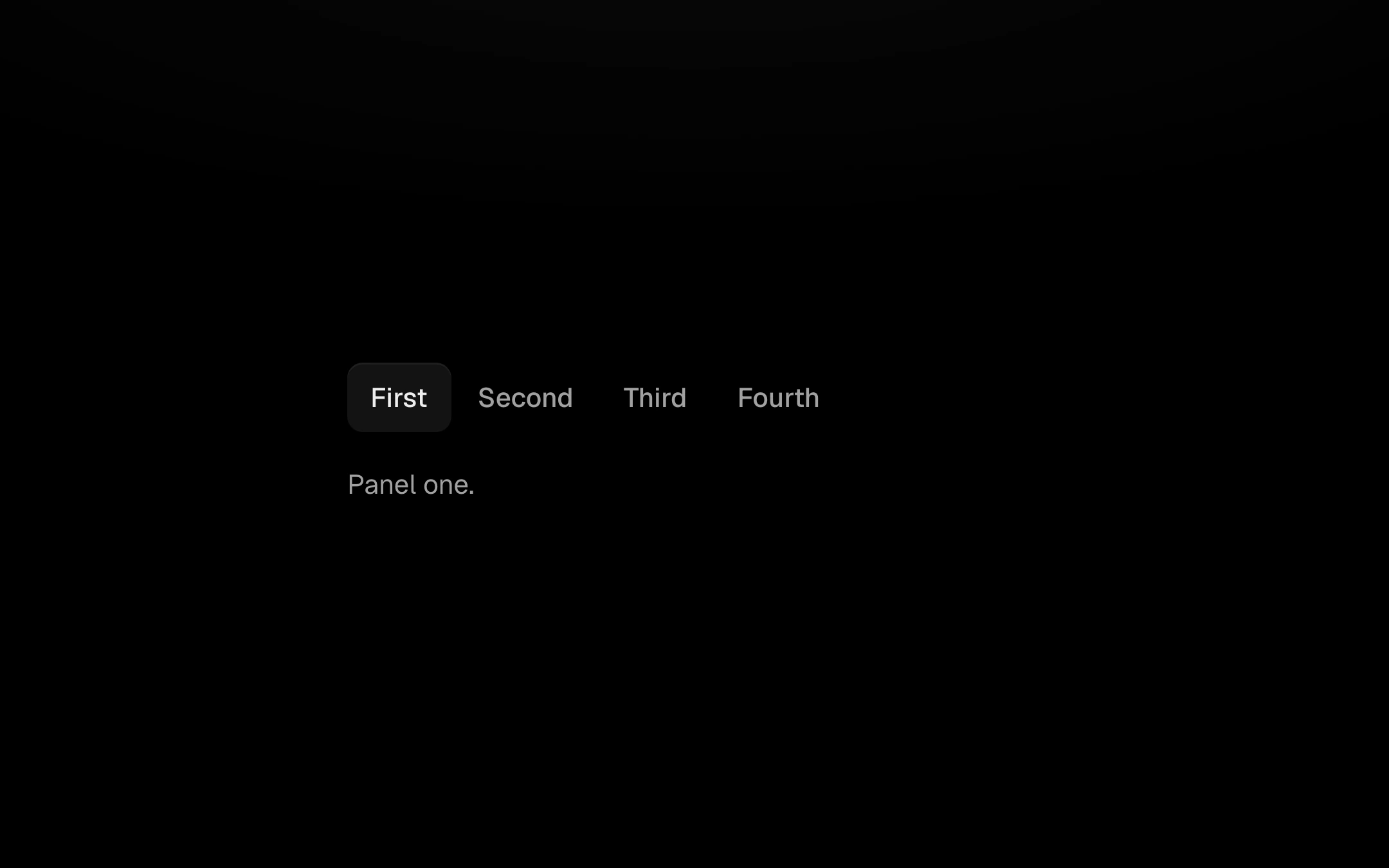
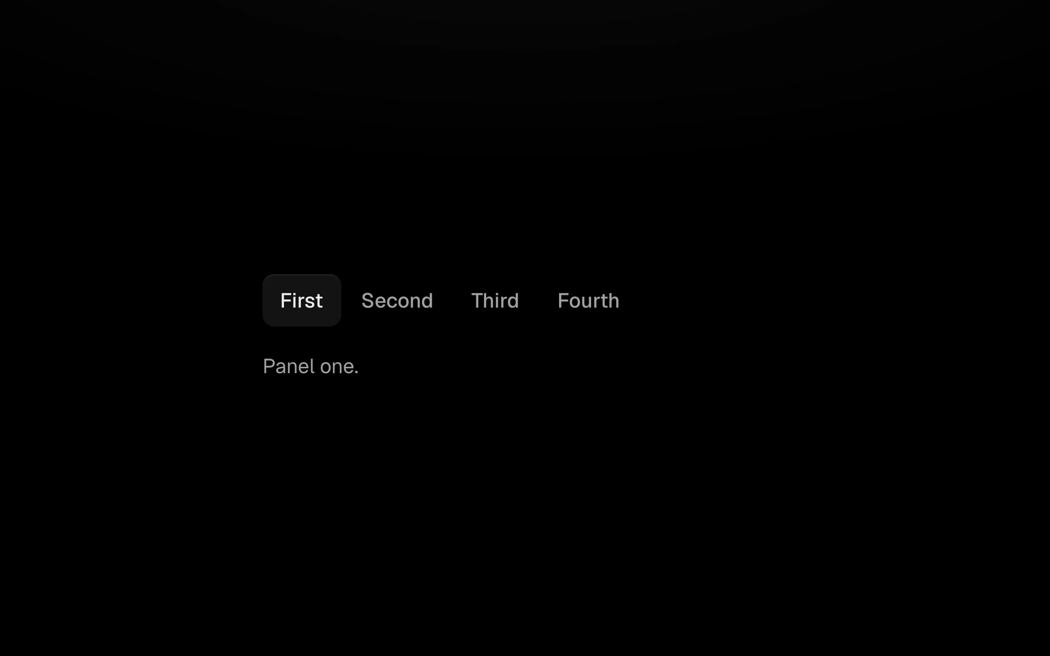
Text tabs with one raised, borderless fill that slides to the active tab on springs, stretching a little in flight; panels cross over and the height follows.
import { useEffect, useId, useLayoutEffect, useMemo, useRef, useState } from 'react';
import type { KeyboardEvent, ReactNode } from 'react';
import { SPRING, Spring } from '../shared/spring';
import { resolveAccent, type Accent } from '../shared/accent';
import { Travel, clamp, snap, useMotion } from '../nav-kit/motion';
import '../shared/ember.css';
import './tabs.css';

export interface TabsProps {
  /** Tab labels: an array, or one comma-separated string. Labels are also the values. */
  tabs: string | string[];
  value?: string;
  defaultValue?: string;
  onChange?: (value: string) => void;
  /** One panel per tab, or a function that renders the panel for a tab. */
  children?: ReactNode[] | ((tab: string, index: number) => ReactNode);
  accent?: Accent;
  'aria-label'?: string;
  className?: string;
}

const FADE = 24; // overflow mask width
const SHIFT = 8; // panel travel

interface PanelSim {
  x: Spring;
  o: Spring;
}

export function Tabs({
  tabs: tabsProp,
  value,
  defaultValue,
  onChange,
  children,
  accent: accentProp,
  'aria-label': ariaLabel,
  className,
}: TabsProps) {
  const accent = resolveAccent(accentProp);
  const uid = useId();
  const tabs = useMemo(
    () =>
      Array.from(
        new Set((Array.isArray(tabsProp) ? tabsProp : tabsProp.split(',')).map((t) => t.trim()).filter(Boolean)),
      ),
    [tabsProp],
  );

  const [inner, setInner] = useState(() => (defaultValue && tabs.includes(defaultValue) ? defaultValue : tabs[0]));
  const controlled = value !== undefined;
  const currentValue = controlled ? value : inner;
  const active = Math.max(0, tabs.indexOf(currentValue ?? ''));

  const rowRef = useRef<HTMLDivElement>(null);
  const scrollerRef = useRef<HTMLDivElement>(null);
  const indRef = useRef<HTMLDivElement>(null);
  const panelsRef = useRef<HTMLDivElement>(null);
  const tabEls = useRef<(HTMLButtonElement | null)[]>([]);
  const labelEls = useRef<(HTMLSpanElement | null)[]>([]);
  const panelEls = useRef<(HTMLDivElement | null)[]>([]);

  const sim = useRef({
    ind: new Travel(0, 0),
    height: new Spring(0, SPRING.soft),
    panels: [] as PanelSim[],
    active,
    measured: false,
  });
  {
    const s = sim.current;
    while (s.panels.length < tabs.length) {
      const i = s.panels.length;
      s.panels.push({ x: new Spring(0, SPRING.soft), o: new Spring(i === active ? 1 : 0, SPRING.soft) });
    }
  }

  const apply = () => {
    const s = sim.current;
    const ind = indRef.current;
    if (ind) {
      const a = snap(s.ind.start);
      const b = snap(s.ind.end);
      ind.style.left = `${a}px`;
      ind.style.width = `${Math.max(0, b - a)}px`;
    }
    if (panelsRef.current && s.measured) panelsRef.current.style.height = `${Math.max(0, s.height.value).toFixed(2)}px`;
    s.panels.forEach((p, i) => {
      const el = panelEls.current[i];
      if (!el) return;
      const o = clamp(p.o.value, 0, 1);
      const shown = i === s.active || o > 0.005;
      el.style.display = shown ? 'block' : 'none';
      el.style.opacity = o.toFixed(3);
      el.style.transform = Math.abs(p.x.value) < 0.01 ? '' : `translate3d(${p.x.value.toFixed(2)}px,0,0)`;
    });
  };

  const motion = useMotion(
    (dt) => {
      const s = sim.current;
      let moving = s.ind.step(dt);
      if (s.height.step(dt)) moving = true;
      for (const p of s.panels) {
        if (p.x.step(dt)) moving = true;
        if (p.o.step(dt)) moving = true;
      }
      apply();
      return moving;
    },
    (r) => {
      if (!r) return;
      const s = sim.current;
      s.ind.set(s.ind.a.target, s.ind.b.target);
      s.height.set(s.height.target);
      for (const p of s.panels) {
        p.x.set(p.x.target);
        p.o.set(p.o.target);
      }
    },
  );

  /* ------------------------------------------------------------------ measuring */

  /** The active tab's span in the row: the raised fill covers the whole tab, not just its label. */
  const labelSpan = (i: number): [number, number] | null => {
    const row = rowRef.current;
    const tab = tabEls.current[i];
    if (!row || !tab) return null;
    const r = row.getBoundingClientRect();
    const l = tab.getBoundingClientRect();
    return [l.left - r.left, l.right - r.left];
  };

  const placeIndicator = (instant: boolean) => {
    const span = labelSpan(sim.current.active);
    if (!span) return;
    sim.current.ind.to(span[0], span[1], instant || motion.reduced);
    apply();
    motion.wake();
  };

  const measurePanel = (instant: boolean) => {
    const s = sim.current;
    const el = panelEls.current[s.active];
    if (!el) return;
    const h = el.offsetHeight;
    s.height.target = h;
    if (instant || !s.measured || motion.reduced) s.height.set(h);
    s.measured = true;
    apply();
    motion.wake();
  };

  const updateMasks = () => {
    const sc = scrollerRef.current;
    if (!sc) return;
    const max = sc.scrollWidth - sc.clientWidth;
    const left = clamp(sc.scrollLeft, 0, FADE);
    const right = clamp(max - sc.scrollLeft, 0, FADE);
    sc.style.setProperty('--fl', `${max > 0.5 ? left : 0}px`);
    sc.style.setProperty('--fr', `${max > 0.5 ? right : 0}px`);
  };

  const revealActive = (smooth: boolean) => {
    const sc = scrollerRef.current;
    const tab = tabEls.current[sim.current.active];
    if (!sc || !tab) return;
    const l = tab.offsetLeft;
    const r = l + tab.offsetWidth;
    let target: number | null = null;
    if (l - FADE < sc.scrollLeft) target = l - FADE;
    else if (r + FADE > sc.scrollLeft + sc.clientWidth) target = r + FADE - sc.clientWidth;
    if (target === null) return;
    sc.scrollTo({ left: Math.max(0, target), behavior: smooth && !motion.reduced ? 'smooth' : 'auto' });
  };

  useLayoutEffect(() => {
    placeIndicator(true);
    measurePanel(true);
    updateMasks();
    revealActive(false);
    const ro = new ResizeObserver(() => {
      // Only a real change of geometry (resize, font swap) snaps the indicator; a panel swap
      // also triggers this observer and must not cut short a travel in progress.
      const span = labelSpan(sim.current.active);
      const ind = sim.current.ind;
      if (span && (Math.abs(span[0] - ind.a.target) > 0.5 || Math.abs(span[1] - ind.b.target) > 0.5)) placeIndicator(true);
      measurePanel(false);
      updateMasks();
    });
    if (rowRef.current) ro.observe(rowRef.current);
    if (scrollerRef.current) ro.observe(scrollerRef.current);
    panelEls.current.forEach((el) => el && ro.observe(el));
    // Web fonts change label widths once they load.
    document.fonts?.ready.then(() => placeIndicator(true));
    return () => ro.disconnect();
    // eslint-disable-next-line react-hooks/exhaustive-deps
  }, [tabs.length]);

  /* ------------------------------------------------------------------ switching */

  useLayoutEffect(() => {
    const s = sim.current;
    const prev = s.active;
    if (prev === active) return;
    s.active = active;
    const dir = active > prev ? 1 : -1;
    const out = s.panels[prev];
    const inc = s.panels[active];
    if (out) {
      out.x.target = -SHIFT * dir;
      out.o.target = 0;
    }
    if (inc) {
      // A panel still fading out keeps its place and turns round; a hidden one enters from the far side.
      if (inc.o.value < 0.02) {
        inc.x.set(SHIFT * dir);
        inc.o.set(0);
      }
      inc.x.target = 0;
      inc.o.target = 1;
    }
    for (const [i, p] of s.panels.entries()) {
      if (i !== active && i !== prev) {
        p.o.target = 0;
        p.x.target = -SHIFT * dir;
      }
    }
    if (motion.reduced) for (const p of s.panels) (p.x.set(p.x.target), p.o.set(p.o.target));
    placeIndicator(false);
    measurePanel(false);
    revealActive(true);
    // eslint-disable-next-line react-hooks/exhaustive-deps
  }, [active]);

  const select = (i: number, focus: boolean) => {
    const v = tabs[i];
    if (v === undefined) return;
    if (focus) tabEls.current[i]?.focus();
    if (i === active) return;
    if (!controlled) setInner(v);
    onChange?.(v);
  };

  const onKeyDown = (e: KeyboardEvent<HTMLDivElement>) => {
    const n = tabs.length;
    let next: number | null = null;
    if (e.key === 'ArrowRight') next = (active + 1) % n;
    else if (e.key === 'ArrowLeft') next = (active - 1 + n) % n;
    else if (e.key === 'Home') next = 0;
    else if (e.key === 'End') next = n - 1;
    if (next === null) return;
    e.preventDefault();
    select(next, true);
  };

  useEffect(() => {
    updateMasks();
  });

  const panelFor = (tab: string, i: number): ReactNode =>
    typeof children === 'function' ? children(tab, i) : Array.isArray(children) ? children[i] : null;

  return (
    <div className={`ember em-tabs${className ? ` ${className}` : ''}`} data-accent={accent}>
      <div className="em-tabs__bar">
        <div ref={scrollerRef} className="em-tabs__scroller" onScroll={updateMasks}>
          <div
            ref={rowRef}
            className="em-tabs__row"
            role="tablist"
            aria-label={ariaLabel}
            aria-orientation="horizontal"
            onKeyDown={onKeyDown}
          >
            {tabs.map((t, i) => (
              <button
                key={t}
                ref={(el) => {
                  tabEls.current[i] = el;
                }}
                type="button"
                role="tab"
                id={`${uid}-tab-${i}`}
                aria-selected={i === active}
                aria-controls={`${uid}-panel-${i}`}
                tabIndex={i === active ? 0 : -1}
                className={`em-tabs__tab${i === active ? ' is-active' : ''}`}
                onClick={() => select(i, false)}
              >
                <span
                  ref={(el) => {
                    labelEls.current[i] = el;
                  }}
                  className="em-tabs__label"
                >
                  {t}
                </span>
              </button>
            ))}
            <div ref={indRef} className="em-tabs__ind" aria-hidden="true" />
          </div>
        </div>
      </div>
      <div ref={panelsRef} className="em-tabs__panels">
        {tabs.map((t, i) => (
          <div
            key={t}
            ref={(el) => {
              panelEls.current[i] = el;
            }}
            role="tabpanel"
            id={`${uid}-panel-${i}`}
            aria-labelledby={`${uid}-tab-${i}`}
            aria-hidden={i === active ? undefined : true}
            inert={i !== active}
            tabIndex={i === active ? 0 : -1}
            className={`em-tabs__panel${i === active ? ' is-active' : ''}`}
          >
            {panelFor(t, i)}
          </div>
        ))}
      </div>
    </div>
  );
}

export default Tabs;
Customize
Install
npx shadcn@latest add https://obsydeui.com/r/tabs.jsonUsage
Import it from where the CLI puts it, or copy the files below by hand.
import { Tabs } from '@/components/obsyde/ember/tabs/Tabs';

export function Example() {
  return (
    <Tabs tabs="First, Second, Third, Fourth" />
  );
}
Files
Plain React, TypeScript and CSS. No dependencies. The download keeps these paths.
ember/tabs/Tabs.tsxcomponentember/tabs/tabs.cssstylesember/tabs/TabsDemo.tsxdemoember/nav-kit/motion.tssharedember/shared/spring.tssharedember/shared/accent.tssharedember/shared/ember.cssshared
API
| Prop | Type | Default |
|---|---|---|
accentAccent | 'ember' | 'volt' | 'arc' | 'ember' |
tabsTabs | string | 'First, Second, Third, Fourth' |
valueActive tab | string | — |