Morph Card
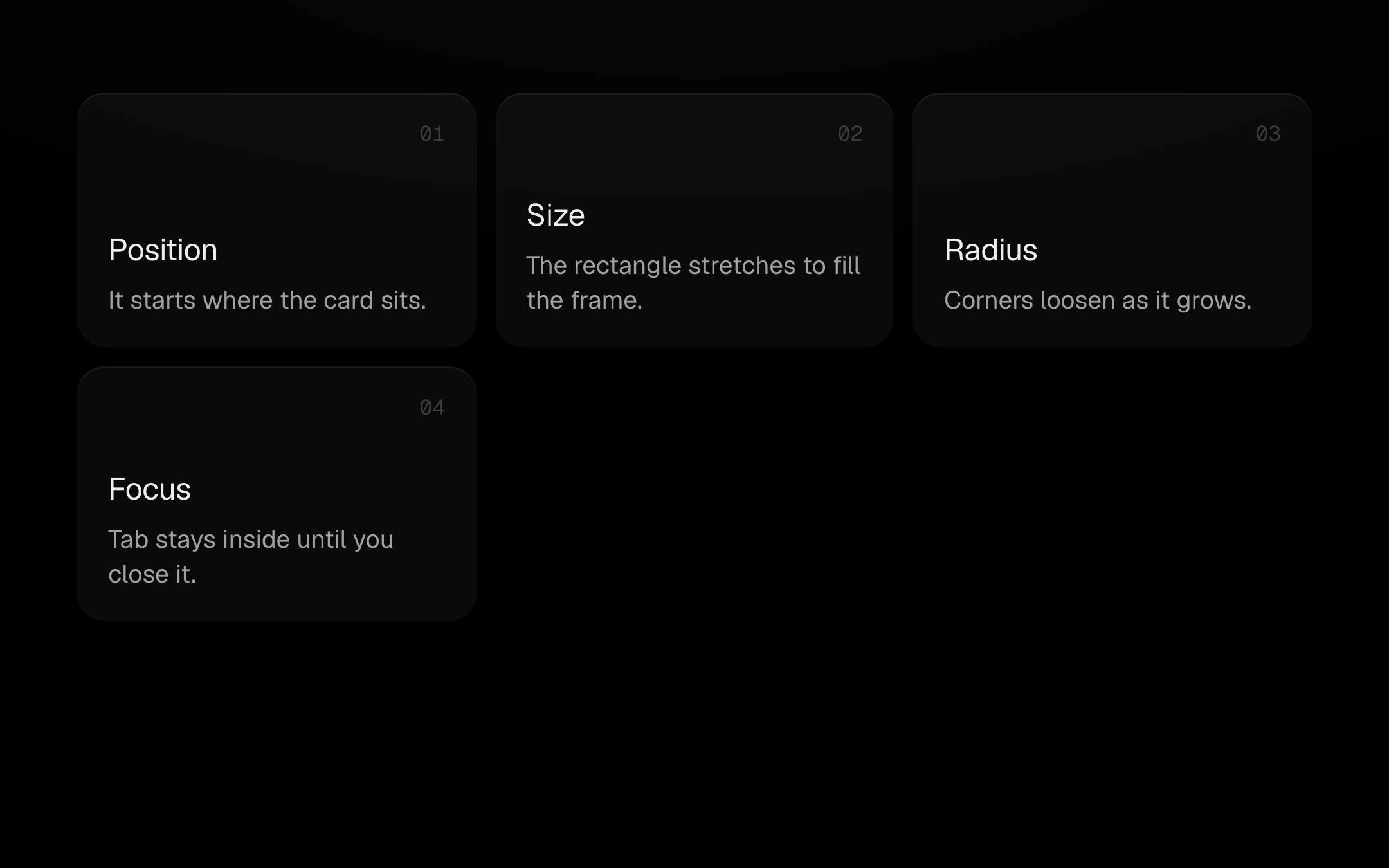
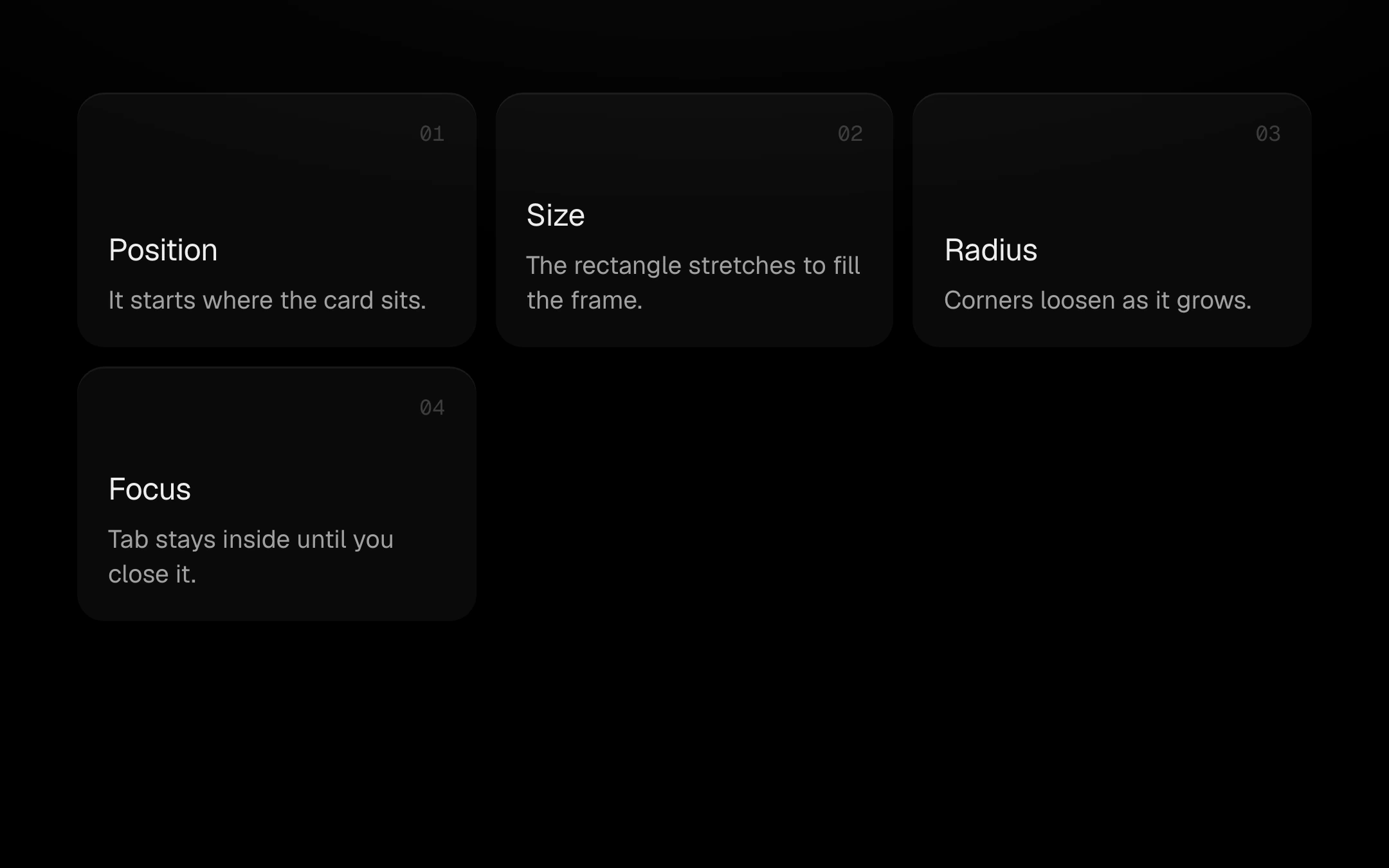
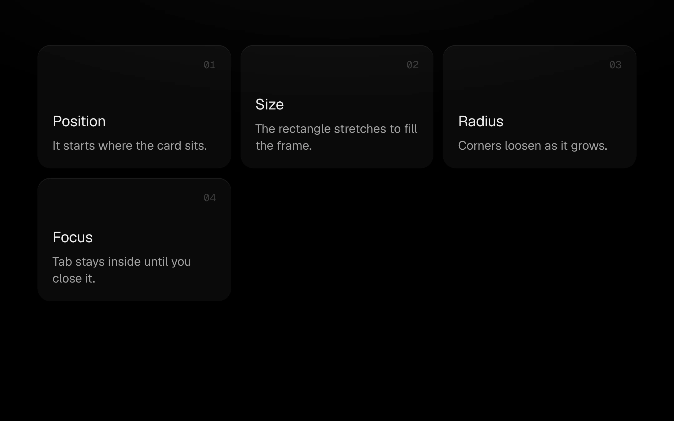
Small cards that open in place into a large panel.
$149 once · every Pro piece
Customize
The panel is revealed through a clip that springs from the card's own rectangle to the frame, corners and all, with a hairline that runs hot only while it moves; the title travels from the card into the panel and the rest staggers in behind it. Escape or Close folds it back into the exact spot and returns focus to the card.
Install
npx shadcn@latest add @obsyde/morph-cardNeeds your licence key · Get Pro
Usage
Import it from where the CLI puts it, or copy the files below by hand.
import { MorphCard } from '@/components/obsyde/ember/morph-card/MorphCard';

export function Example() {
  return (
    <MorphCard />
  );
}
Files
What you get with Pro: plain React, TypeScript and CSS, with no dependencies.
ember/morph-card/MorphCard.tsxcomponentember/morph-card/morph-card-demo.cssstylesember/morph-card/morph-card.cssstylesember/morph-card/MorphCardDemo.tsxdemoember/kit2-kit/kit.tssharedember/shared/spring.tssharedember/shared/accent.tssharedember/shared/ember.cssshared
API
| Prop | Type | Default |
|---|---|---|
accentAccent | 'ember' | 'volt' | 'arc' | 'ember' |
minCardCard min width | number | 180 |
minHeightFrame height | number | 420 |