Combobox
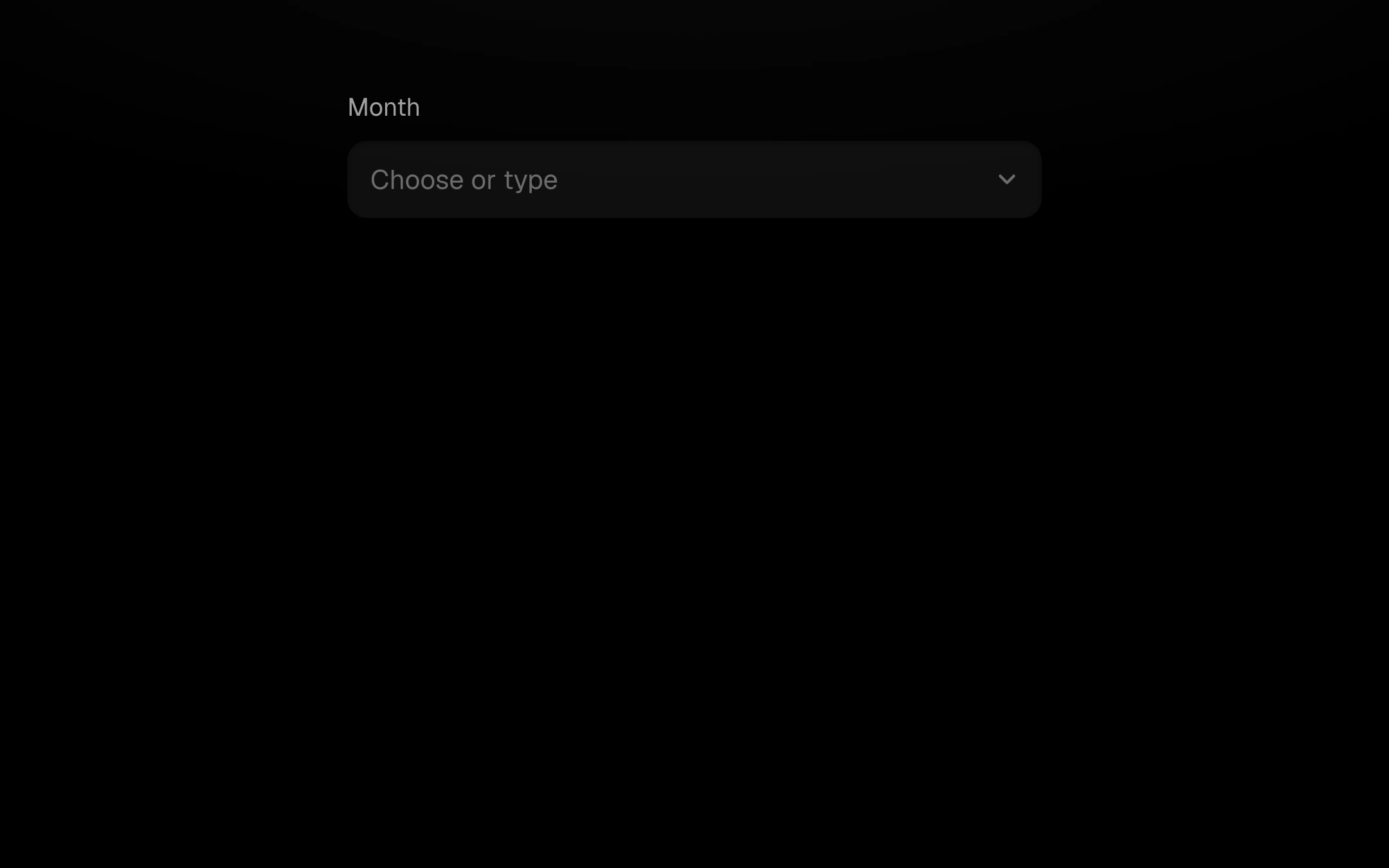
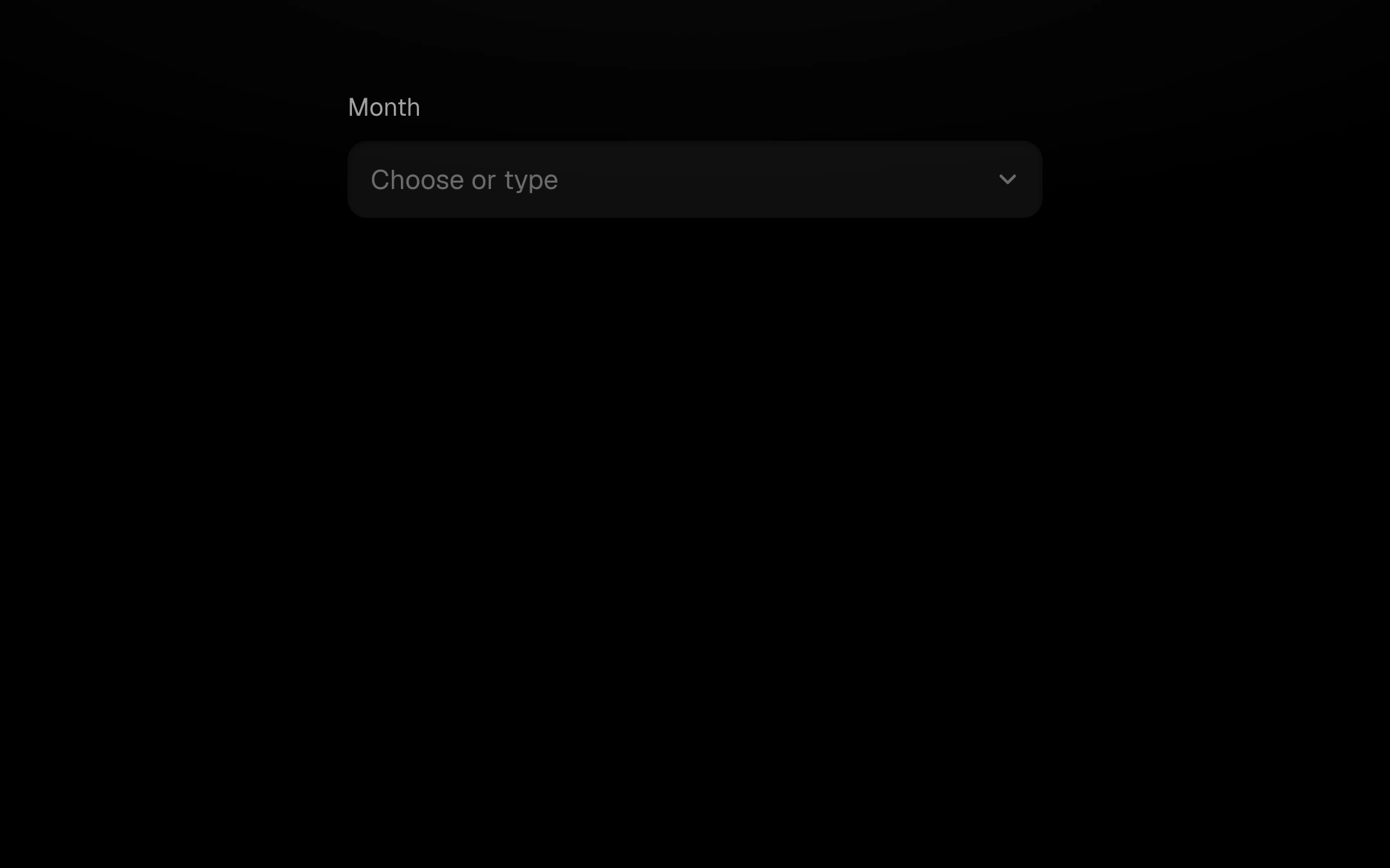
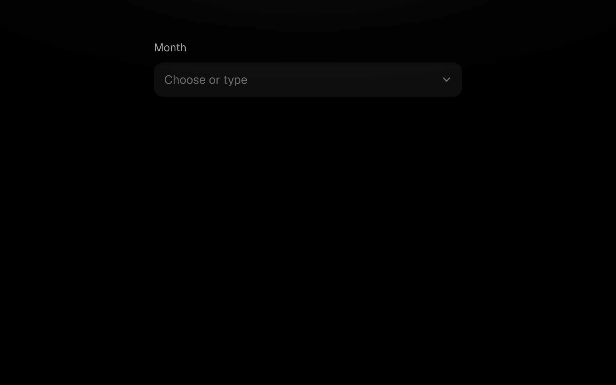
A select you can type into. The list opens below (or above when there is no room); typing filters it, matched text brightens, filtered rows collapse and the rest glide into place.
$149 once · every Pro piece
Customize
One highlight slides between rows; the chosen option carries an accent dot. Full ARIA combobox pattern.
Install
npx shadcn@latest add @obsyde/comboboxNeeds your licence key · Get Pro
Usage
Import it from where the CLI puts it, or copy the files below by hand.
import { Combobox } from '@/components/obsyde/ember/combobox/Combobox';

export function Example() {
  return (
    <Combobox
      label="Month"
      options="January, February, March, April, May, June, July, August, September, October, November, December"
    />
  );
}
Files
What you get with Pro: plain React, TypeScript and CSS, with no dependencies.
ember/combobox/Combobox.tsxcomponentember/combobox/combobox.cssstylesember/combobox/ComboboxDemo.tsxdemoember/forms-kit/kit.tsxsharedember/shared/spring.tssharedember/shared/accent.tssharedember/shared/ember.cssshared
API
| Prop | Type | Default |
|---|---|---|
accentAccent | 'ember' | 'volt' | 'arc' | 'ember' |
labelLabel | string | 'Month' |
optionsOptions (comma-separated) | string | 'January, February, March, A…' |
valueValue | string | — |
placeholderPlaceholder | string | 'Choose or type' |
disabledDisabled | boolean | false |