Color Picker
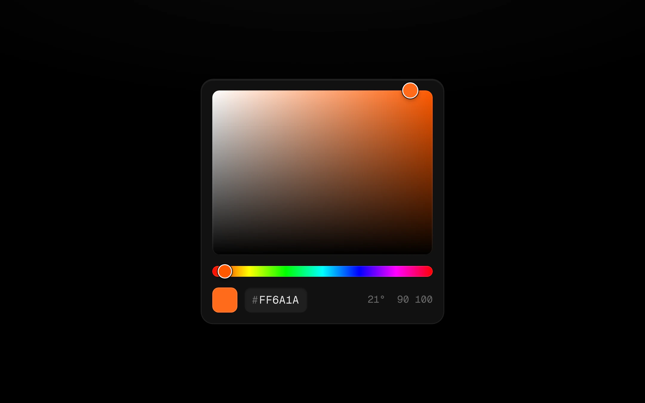
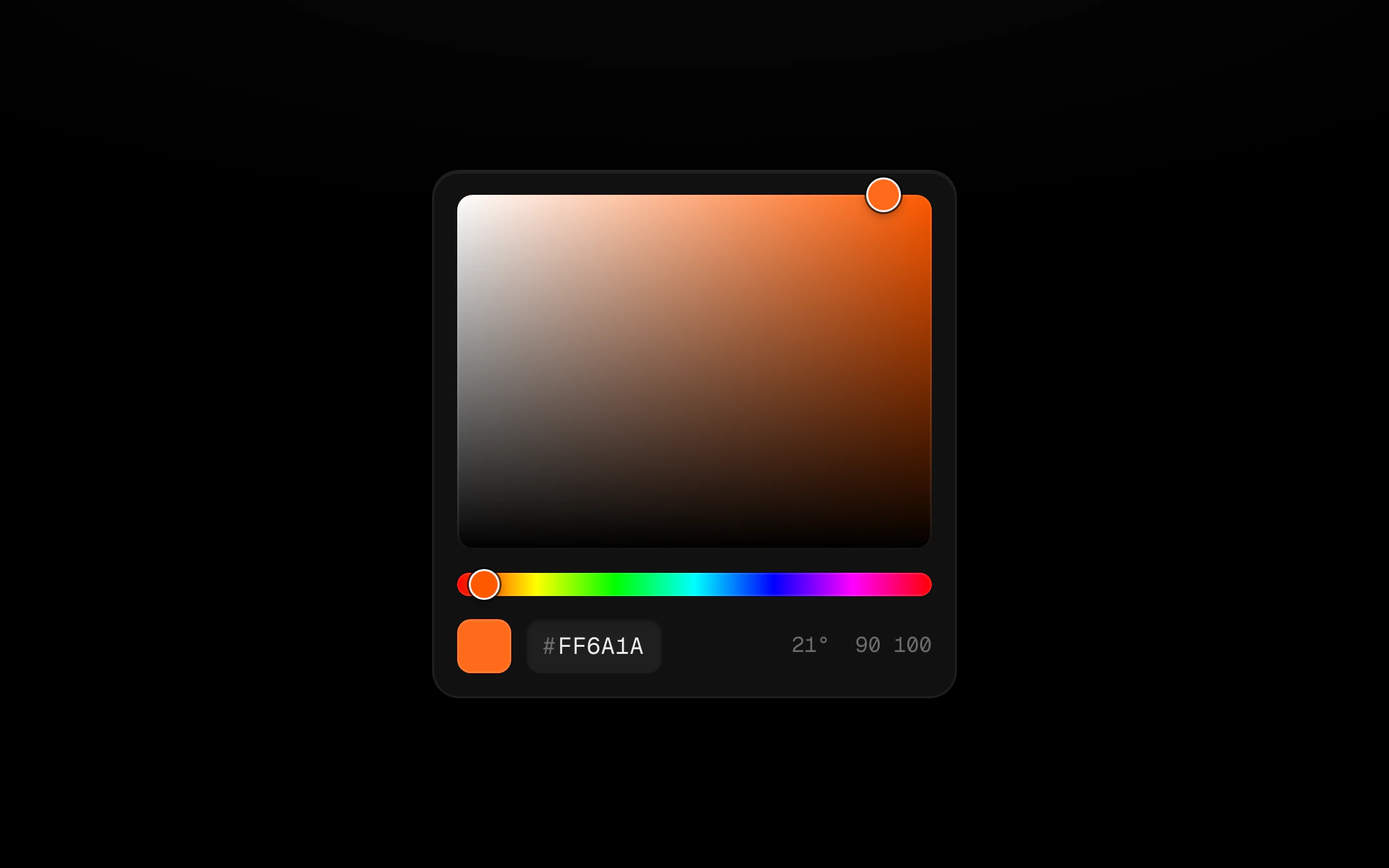
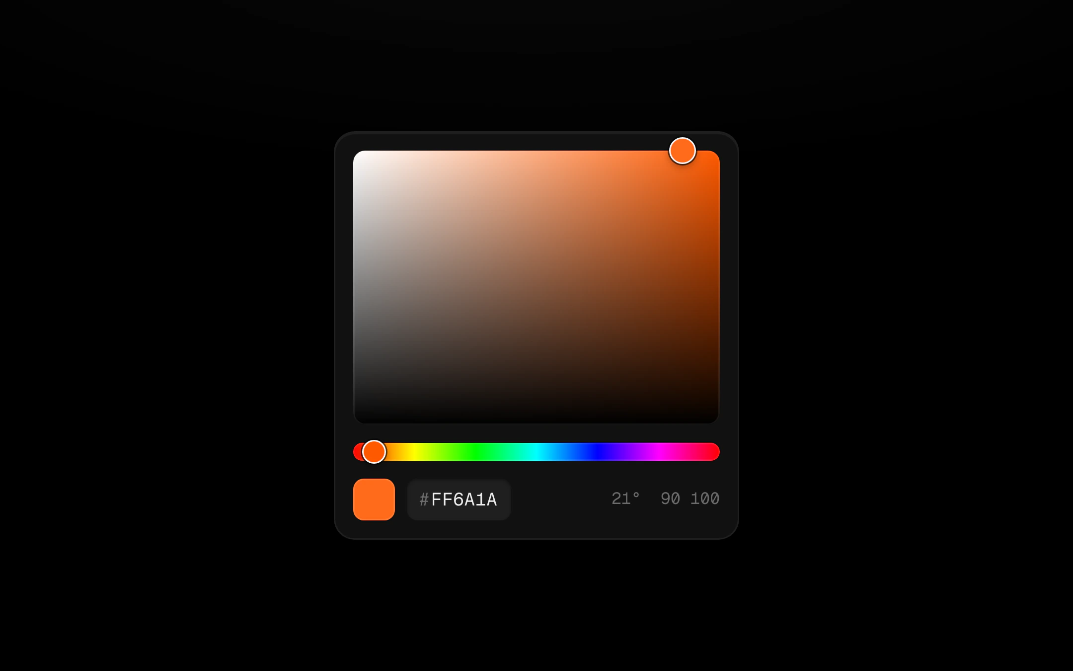
A saturation and brightness square, a hue strip and a mono hex field, controlled by one hex value.
$149 once · every Pro piece
Customize
The thumbs are rings with a light and a dark edge, so they read on white and on black; they follow the pointer on a short spring and grow while held. Both sliders take arrow keys, Shift for bigger steps.
Install
npx shadcn@latest add @obsyde/color-pickerNeeds your licence key · Get Pro
Usage
Import it from where the CLI puts it, or copy the files below by hand.
import { ColorPicker } from '@/components/obsyde/ember/color-picker/ColorPicker';

export function Example() {
  return (
    <ColorPicker />
  );
}
Files
What you get with Pro: plain React, TypeScript and CSS, with no dependencies.
ember/color-picker/ColorPicker.tsxcomponentember/color-picker/color-picker.cssstylesember/color-picker/ColorPickerDemo.tsxdemoember/basics-kit/kit.tssharedember/shared/spring.tssharedember/shared/accent.tssharedember/shared/ember.cssshared
API
| Prop | Type | Default |
|---|---|---|
accentAccent | 'ember' | 'volt' | 'arc' | 'ember' |
valueValue | string | '#ff6a1a' |
swatchesSwatches | boolean | false |
compactCompact | boolean | false |