Button
The base button, pressed like a key into a warm surface.
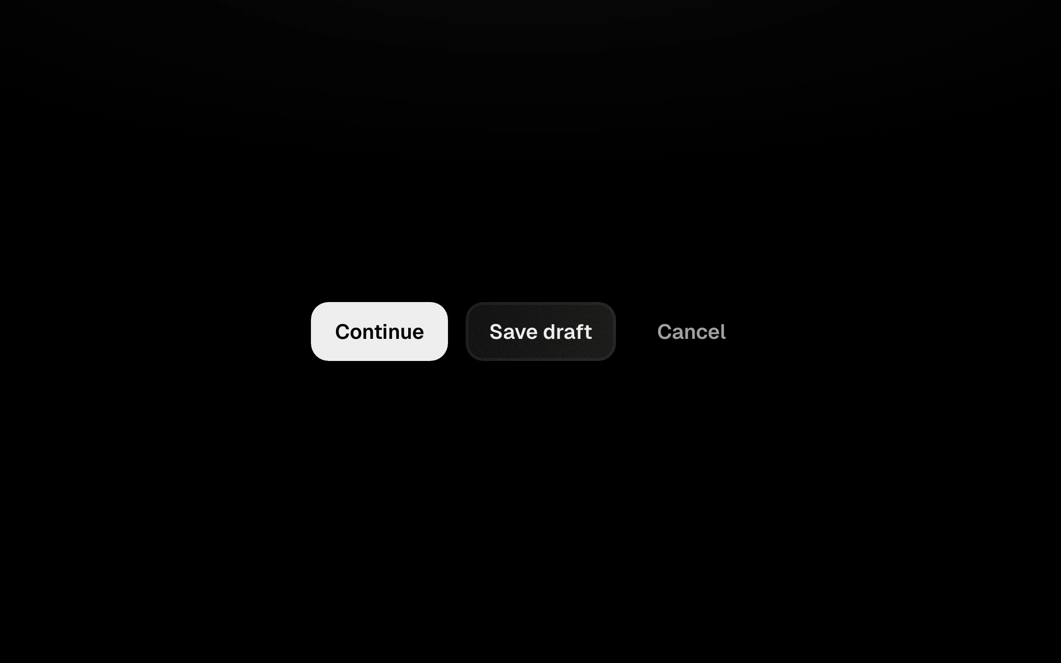
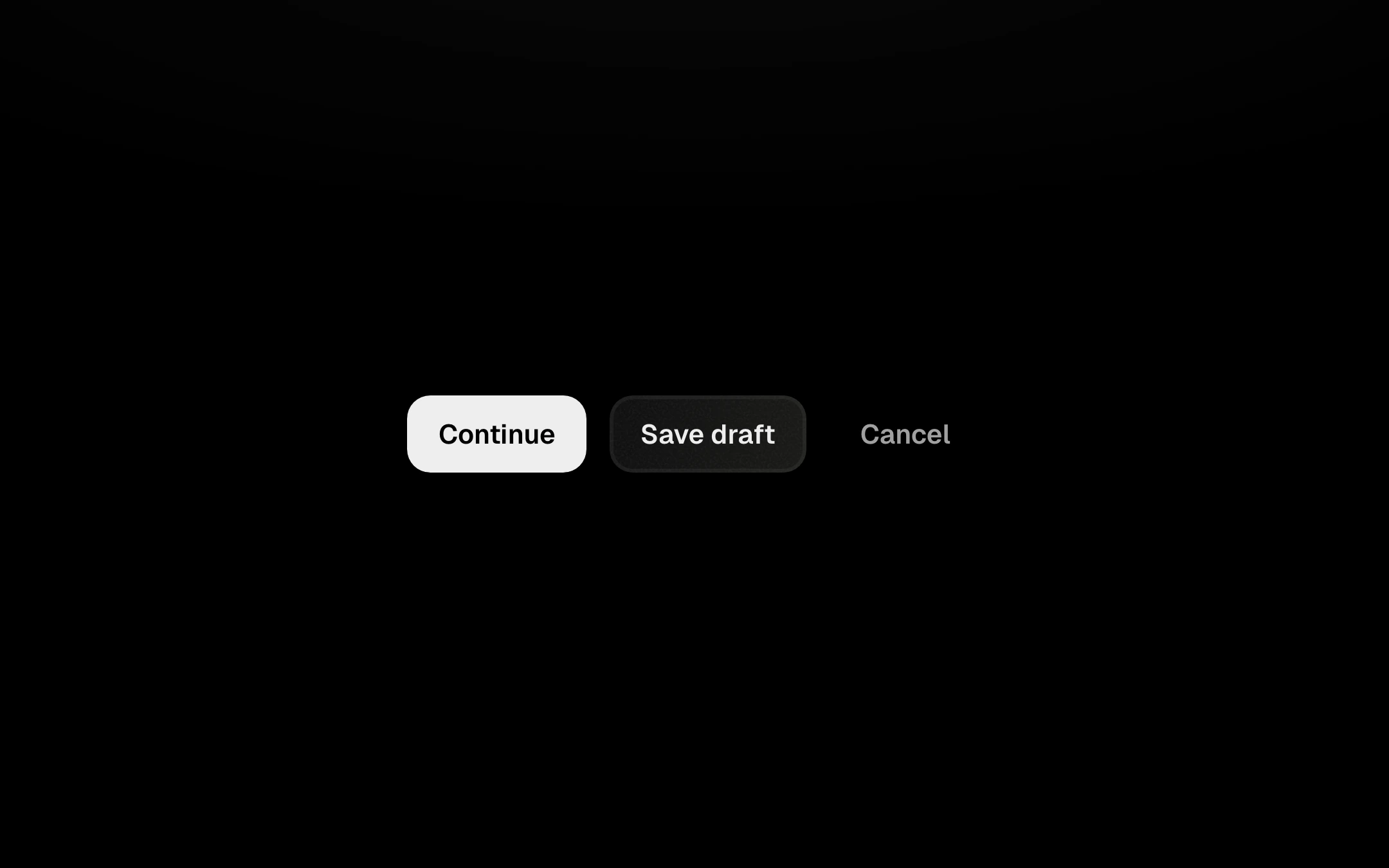
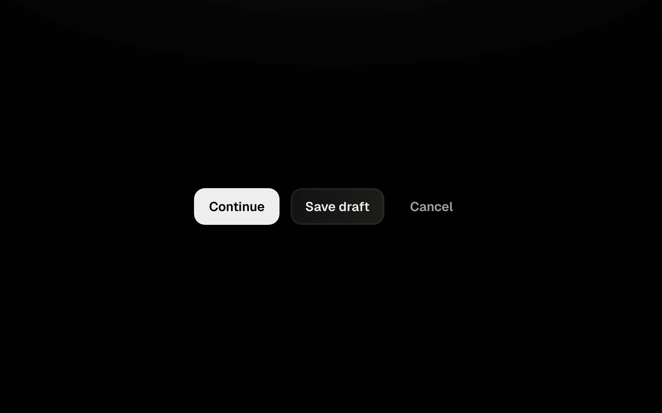
// Button: a key pressed into a warm surface. On press it sinks on a spring, its top light gives way
// to a faint inner shadow and a soft bloom of heat gathers inside it under the contact point. On
// release it springs back with a small overshoot while the bloom spreads out and cools, and the
// whole fill holds a faint warmth for a moment. No borders, no lines: all of it lives inside. Loading crossfades the label to a small comet spinner
// in the same box, so the width never changes.
//
// Secondary is glass: a faint diagonal sheen with a fine grain and a barely-there edge. Hover (or
// keyboard focus) floods it to bone with a soft halo, and the label and icon invert to near-black
// in step with the fill. Pressing the flooded button darkens the bone a touch and pulls the halo in.
//
// Every frame writes only transforms and opacities, straight to the DOM. React renders on prop
// changes, never per frame.

import { useEffect, useRef, useState } from 'react';
import type { KeyboardEvent, MouseEvent, PointerEvent, ReactNode } from 'react';
import { SPRING, Spring, createLoop, onReducedMotionChange, prefersReducedMotion, type SpringConfig } from '../shared/spring';
import { resolveAccent, type Accent } from '../shared/accent';
import '../shared/ember.css';
import './button.css';

export interface ButtonProps {
  label?: string;
  variant?: 'primary' | 'secondary' | 'ghost' | 'danger';
  size?: 'sm' | 'md' | 'lg';
  loading?: boolean;
  disabled?: boolean;
  /** A key hint shown faintly at the right, e.g. "⌘S". */
  shortcut?: string;
  /** A leading icon, drawn in currentColor so it follows the label (e.g. an inline SVG). */
  icon?: ReactNode;
  /** Stretch to fill the parent's width. */
  fullWidth?: boolean;
  onClick?: (event: MouseEvent<HTMLButtonElement>) => void;
  type?: 'button' | 'submit' | 'reset';
  accent?: Accent;
  className?: string;
}

/* Motion. Depth is 0 at rest and 1 fully pressed; the button scales by 1 - DEPTH × depth. */
const DEPTH = 0.03;
const PRESS: SpringConfig = SPRING.snappy;
/** Under-damped, so the key overshoots its rest a hair on the way back up. */
const RELEASE: SpringConfig = { stiffness: 400, damping: 21 };
/** A click shorter than this still plays a full press before it lets go. */
const MIN_HOLD = 90;
/* The bloom, in ms. */
const GATHER = 70; // fades in under the finger
const COOL = 450; // spreads and cools after release
const HURRY = 140; // an older bloom clears this fast when a new press lands
const SLOTS = 3;
/* Glass (secondary): how far a full press darkens the flooded bone, and how much halo it pulls in. */
const DIM = 1; // opacity of the dim layer at full depth; its colour sets the strength in CSS
const HALO_IN = 0.55;
/** The spinner keeps turning this long after loading ends, while it fades. */
const SPIN_TAIL = 260;

const clamp01 = (v: number) => (v < 0 ? 0 : v > 1 ? 1 : v);
const easeOut = (t: number) => 1 - Math.pow(1 - clamp01(t), 3);

interface Bloom {
  el: HTMLSpanElement | null;
  alive: boolean;
  x: number;
  y: number;
  /** Radius of the bloom element, px; it is scaled to the radius it needs. */
  R: number;
  /** Height of the button when pressed, px: the bloom's sizes are in these units. */
  H: number;
  /** Distance from the contact point to the farthest corner. */
  far: number;
  down: number;
  up: number; // -1 while held
  rUp: number;
  aUp: number;
  hurry: number; // -1 unless a newer press is clearing it
}

const newBloom = (): Bloom => ({ el: null, alive: false, x: 0, y: 0, R: 1, H: 1, far: 1, down: 0, up: -1, rUp: 0, aUp: 0, hurry: -1 });

/** Keyboard names for aria-keyshortcuts, from the symbols people write on buttons. */
function toKeyShortcuts(hint: string): string | undefined {
  const map: Record<string, string> = { '⌘': 'Meta', '⇧': 'Shift', '⌥': 'Alt', '⌃': 'Control', '↵': 'Enter' };
  const parts: string[] = [];
  for (const ch of Array.from(hint.replace(/\s+/g, ''))) parts.push(map[ch] ?? ch.toUpperCase());
  return parts.length ? parts.join('+') : undefined;
}

export function Button({
  label = 'Continue',
  variant = 'secondary',
  size = 'md',
  loading = false,
  disabled = false,
  shortcut,
  icon,
  fullWidth = false,
  onClick,
  type = 'button',
  accent: accentProp,
  className,
}: ButtonProps) {
  const accent = resolveAccent(accentProp);

  const btnRef = useRef<HTMLButtonElement>(null);
  const lightRef = useRef<HTMLSpanElement>(null);
  const shadeRef = useRef<HTMLSpanElement>(null);
  const warmRef = useRef<HTMLSpanElement>(null);
  const dimRef = useRef<HTMLSpanElement>(null);
  const glowRef = useRef<HTMLSpanElement>(null);
  const glass = variant === 'secondary';

  const sim = useRef({
    depth: new Spring(0, PRESS),
    blooms: Array.from({ length: SLOTS }, newBloom),
    active: -1, // the bloom under the current press
    held: false,
    releaseAt: -1, // a pending release, held back until MIN_HOLD
    reduced: false,
    lifted: false, // will-change is on
  });
  const live = useRef({ loading, disabled });
  live.current = { loading, disabled };

  // The spinner turns only while it can be seen.
  const [spinning, setSpinning] = useState(loading);
  useEffect(() => {
    if (loading) {
      setSpinning(true);
      return;
    }
    const t = window.setTimeout(() => setSpinning(false), SPIN_TAIL);
    return () => window.clearTimeout(t);
  }, [loading]);

  /* ---------------------------------------------------------------- the frame */

  const loopRef = useRef<ReturnType<typeof createLoop> | null>(null);

  const letGo = (now: number) => {
    const s = sim.current;
    s.releaseAt = -1;
    s.depth.config = RELEASE;
    s.depth.target = 0;
    const b = s.blooms[s.active];
    if (b && b.alive && b.up < 0) {
      const { r, a } = bloomAt(b, now);
      b.up = now;
      b.rUp = r;
      b.aUp = a;
    }
  };

  /** Radius in px and opacity (0..1) of a bloom, plus how warm it leaves the whole fill. */
  const bloomAt = (b: Bloom, now: number) => {
    const H = b.H;
    let r: number;
    let a: number;
    let warmth = 0;
    let done = false;
    if (b.up < 0) {
      const t = now - b.down;
      // Contact, then a slow spread while held.
      r = H * (0.5 + 0.45 * easeOut(t / 160) + 0.55 * easeOut(t / 1400));
      a = easeOut(t / GATHER);
    } else {
      const k = clamp01((now - b.up) / COOL);
      const end = Math.max(b.rUp * 1.8, b.far);
      r = b.rUp + (end - b.rUp) * easeOut(k);
      a = b.aUp * Math.pow(1 - k, 2.2);
      warmth = clamp01((now - b.up) / 60) * Math.pow(1 - k, 1.8);
      done = k >= 1;
    }
    if (b.hurry >= 0) {
      const h = 1 - clamp01((now - b.hurry) / HURRY);
      a *= h;
      warmth *= h;
      if (h <= 0) done = true;
    }
    return { r, a, warmth, done };
  };

  const frame = (dt: number, now: number): boolean => {
    const s = sim.current;
    const btn = btnRef.current;
    if (!btn) return false;

    if (s.releaseAt >= 0 && now >= s.releaseAt) letGo(now);

    // The key.
    const moving = s.depth.step(dt);
    const d = s.depth.value;
    if (moving !== s.lifted) {
      // will-change only while moving, so the label is re-rastered crisp wherever it settles.
      btn.style.willChange = moving ? 'transform' : '';
      s.lifted = moving;
    }
    btn.style.transform = d === 0 ? '' : `scale(${(1 - DEPTH * d).toFixed(5)})`;
    if (lightRef.current) lightRef.current.style.opacity = (1 - clamp01(d)).toFixed(3);
    if (shadeRef.current) shadeRef.current.style.opacity = clamp01(d).toFixed(3);
    if (dimRef.current) dimRef.current.style.opacity = (DIM * clamp01(d)).toFixed(3);
    if (glowRef.current) glowRef.current.style.opacity = (1 - HALO_IN * clamp01(d)).toFixed(3);

    // The heat.
    let warmth = 0;
    let warm = false;
    for (const b of s.blooms) {
      if (!b.alive || !b.el) continue;
      const { r, a, warmth: w, done } = bloomAt(b, now);
      warmth = Math.max(warmth, w);
      if (done) {
        b.alive = false;
        b.el.style.opacity = '0';
        b.el.style.willChange = '';
        continue;
      }
      warm = true;
      if (!s.reduced) {
        b.el.style.transform = `translate(${b.x.toFixed(2)}px,${b.y.toFixed(2)}px) scale(${(r / b.R).toFixed(4)})`;
        b.el.style.opacity = a.toFixed(3);
      }
    }
    if (warmRef.current) warmRef.current.style.opacity = warmth.toFixed(3);

    return moving || warm || s.releaseAt >= 0;
  };

  useEffect(() => {
    const s = sim.current;
    s.reduced = prefersReducedMotion();
    const loop = createLoop(frame);
    loopRef.current = loop;
    const unsub = onReducedMotionChange((r) => {
      s.reduced = r;
      if (r) {
        s.depth.set(s.held ? 1 : 0);
        for (const b of s.blooms) if (b.el) b.el.style.opacity = '0';
      }
      loop.wake();
    });
    return () => {
      loop.stop();
      unsub();
    };
    // `frame` reads everything through refs.
    // eslint-disable-next-line react-hooks/exhaustive-deps
  }, []);

  /* ---------------------------------------------------------------- input */

  const press = (clientX: number | null, clientY: number | null) => {
    const { loading, disabled } = live.current;
    const btn = btnRef.current;
    if (loading || disabled || !btn) return;
    const s = sim.current;
    const now = performance.now();
    const W = btn.offsetWidth;
    const H = btn.offsetHeight;
    // The contact point in the button's own (unscaled) box; keyboard presses land in the centre.
    let x = W / 2;
    let y = H / 2;
    if (clientX !== null && clientY !== null) {
      const rect = btn.getBoundingClientRect();
      const k = rect.width / W || 1;
      x = Math.min(W, Math.max(0, (clientX - rect.left) / k));
      y = Math.min(H, Math.max(0, (clientY - rect.top) / k));
    }

    // Older blooms clear quickly instead of stacking under the new one.
    for (const b of s.blooms) {
      if (!b.alive) continue;
      if (b.up < 0) {
        const { r, a } = bloomAt(b, now);
        b.up = now;
        b.rUp = r;
        b.aUp = a;
      }
      if (b.hurry < 0) b.hurry = now;
    }
    // Take the free slot, or the faintest.
    let slot = s.blooms.findIndex((b) => !b.alive);
    if (slot < 0) {
      let best = Infinity;
      s.blooms.forEach((b, i) => {
        const { a } = bloomAt(b, now);
        if (a < best) {
          best = a;
          slot = i;
        }
      });
    }
    const b = s.blooms[slot];
    const far = Math.max(Math.hypot(x, y), Math.hypot(W - x, y), Math.hypot(x, H - y), Math.hypot(W - x, H - y));
    // The element is a circle big enough for the widest spread; it is only ever scaled down.
    const R = Math.ceil(Math.max(2.7 * H, far));
    Object.assign(b, { alive: true, x, y, R, H, far, down: now, up: -1, rUp: 0, aUp: 0, hurry: -1 });
    if (b.el) {
      b.el.style.width = b.el.style.height = `${2 * R}px`;
      b.el.style.left = b.el.style.top = `${-R}px`;
      b.el.style.willChange = s.reduced ? '' : 'transform, opacity';
    }
    s.active = slot;
    s.held = true;
    s.releaseAt = -1;
    s.depth.config = PRESS;
    s.depth.target = s.reduced ? 0 : 1;
    loopRef.current?.wake();
  };

  const release = () => {
    const s = sim.current;
    if (!s.held) return;
    s.held = false;
    const now = performance.now();
    const b = s.blooms[s.active];
    const since = b ? now - b.down : MIN_HOLD;
    if (since < MIN_HOLD) s.releaseAt = now + (MIN_HOLD - since);
    else letGo(now);
    loopRef.current?.wake();
  };

  const onPointerDown = (e: PointerEvent<HTMLButtonElement>) => {
    if (e.pointerType === 'mouse' && e.button !== 0) return;
    press(e.clientX, e.clientY);
  };

  const onKeyDown = (e: KeyboardEvent<HTMLButtonElement>) => {
    if ((e.key === ' ' || e.key === 'Enter') && !e.repeat) press(null, null);
  };

  const onKeyUp = (e: KeyboardEvent<HTMLButtonElement>) => {
    if (e.key === ' ' || e.key === 'Enter') release();
  };

  const handleClick = (e: MouseEvent<HTMLButtonElement>) => {
    if (live.current.loading) {
      e.preventDefault();
      return;
    }
    onClick?.(e);
  };

  useEffect(() => {
    if (loading || disabled) release();
    // eslint-disable-next-line react-hooks/exhaustive-deps
  }, [loading, disabled]);

  return (
    <span
      className={`ember em-button${className ? ` ${className}` : ''}`}
      data-accent={accent}
      data-variant={variant}
      data-size={size}
      data-loading={loading || undefined}
      data-full={fullWidth || undefined}
    >
      <button
        ref={btnRef}
        type={type}
        className="em-button__btn"
        disabled={disabled}
        aria-disabled={disabled || undefined}
        aria-busy={loading || undefined}
        aria-keyshortcuts={shortcut ? toKeyShortcuts(shortcut) : undefined}
        onPointerDown={onPointerDown}
        onPointerUp={release}
        onPointerCancel={release}
        onPointerLeave={release}
        onKeyDown={onKeyDown}
        onKeyUp={onKeyUp}
        onBlur={release}
        onClick={handleClick}
      >
        {glass ? (
          <>
            <span className="em-button__halo" aria-hidden="true">
              <span ref={glowRef} className="em-button__glow" />
            </span>
            <span className="em-button__flood" aria-hidden="true">
              <span ref={dimRef} className="em-button__dim" />
            </span>
          </>
        ) : null}
        <span className="em-button__heat" aria-hidden="true">
          <span ref={warmRef} className="em-button__warm" />
          {sim.current.blooms.map((b, i) => (
            <span
              key={i}
              className="em-button__bloom"
              ref={(el) => {
                b.el = el;
              }}
            />
          ))}
        </span>
        {glass ? <span className="em-button__grain" aria-hidden="true" /> : null}
        <span ref={lightRef} className="em-button__light" aria-hidden="true" />
        <span ref={shadeRef} className="em-button__shade" aria-hidden="true" />
        <span className="em-button__content">
          {icon ? (
            <span className="em-button__icon" aria-hidden="true">
              {icon}
            </span>
          ) : null}
          <span className="em-button__label">{label}</span>
          {shortcut ? (
            <span className="em-button__kbd" aria-hidden="true">
              {shortcut}
            </span>
          ) : null}
        </span>
        <span className="em-button__spin" aria-hidden="true" data-spinning={spinning || undefined}>
          <span className="em-button__comet" />
        </span>
      </button>
      <span className="em-sr" role="status">
        {loading ? 'Loading' : ''}
      </span>
    </span>
  );
}

export default Button;
The default secondary is glass: at rest a faint diagonal sheen warming toward bone, a fine generated grain and a barely-there glass edge; on hover, or keyboard focus, it floods to bone with a soft halo while the label and icon invert to near-black in step with the fill. Primary is solid bone, ghost is bare text. On press it sinks on a spring, its top light gives way to a faint inner shadow, and a soft bloom of heat gathers inside it under the finger (on flooded glass the bone also darkens a touch and the halo pulls in); on release it springs back with a hair of overshoot while the bloom spreads and cools. Keyboard presses land in the centre. Takes an optional leading icon in currentColor and can stretch full width. Loading crossfades the label to a small comet spinner in the same box, so the width never moves, and announces itself. The demo shows primary, secondary and ghost, and a pair of social sign-in buttons; Loading on click simulates work.
Install
npx shadcn@latest add https://obsydeui.com/r/button.jsonUsage
Import it from where the CLI puts it, or copy the files below by hand.
import { Button } from '@/components/obsyde/ember/button/Button';

export function Example() {
  return (
    <Button label="Continue" />
  );
}
Files
Plain React, TypeScript and CSS. No dependencies. The download keeps these paths.
ember/button/Button.tsxcomponentember/button/button-demo.cssstylesember/button/button.cssstylesember/button/ButtonDemo.tsxdemoember/shared/accent.tssharedember/shared/spring.tssharedember/shared/ember.cssshared
API
| Prop | Type | Default |
|---|---|---|
accentAccent | 'ember' | 'volt' | 'arc' | 'ember' |
layoutLayout | 'variants' | 'sizes' | 'single' | 'social' | 'variants' |
labelLabel | string | 'Continue' |
variantVariant | 'secondary' | 'primary' | 'ghost' | 'danger' | 'secondary' |
sizeSize | 'sm' | 'md' | 'lg' | 'md' |
shortcutShortcut | string | — |
loadingLoading | boolean | false |
workLoading on click | boolean | false |
disabledDisabled | boolean | false |