Border Beam
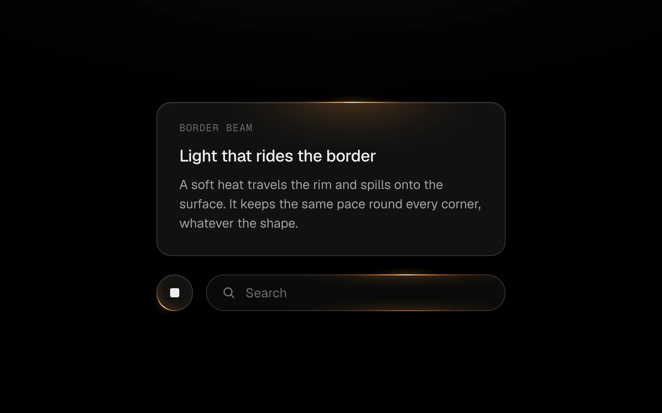
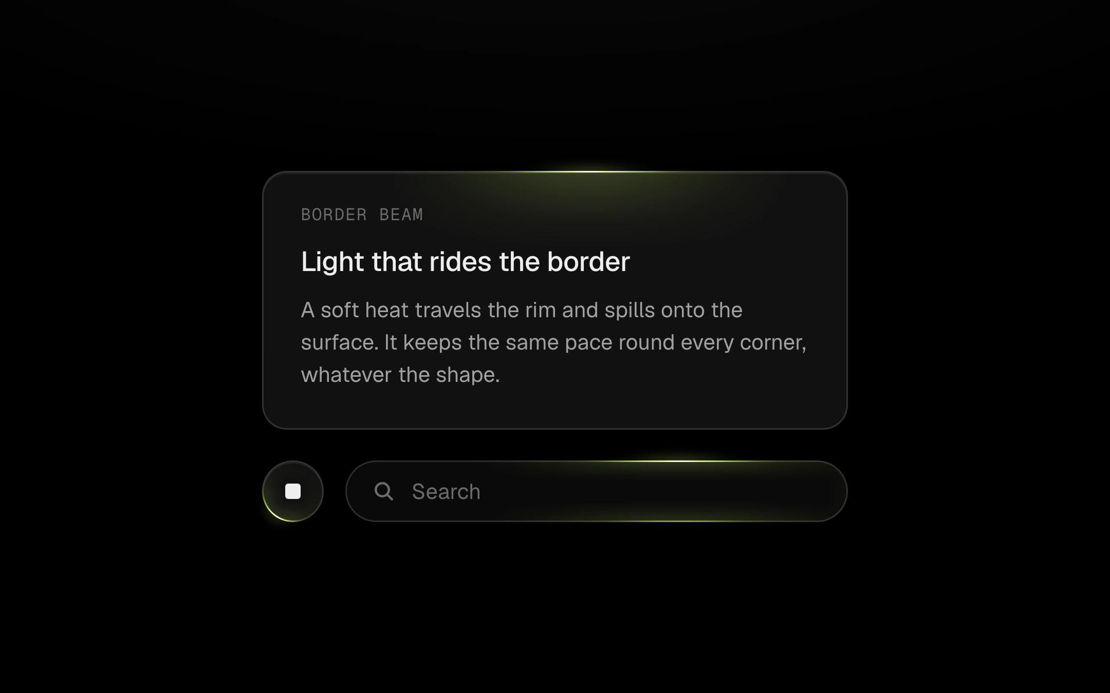
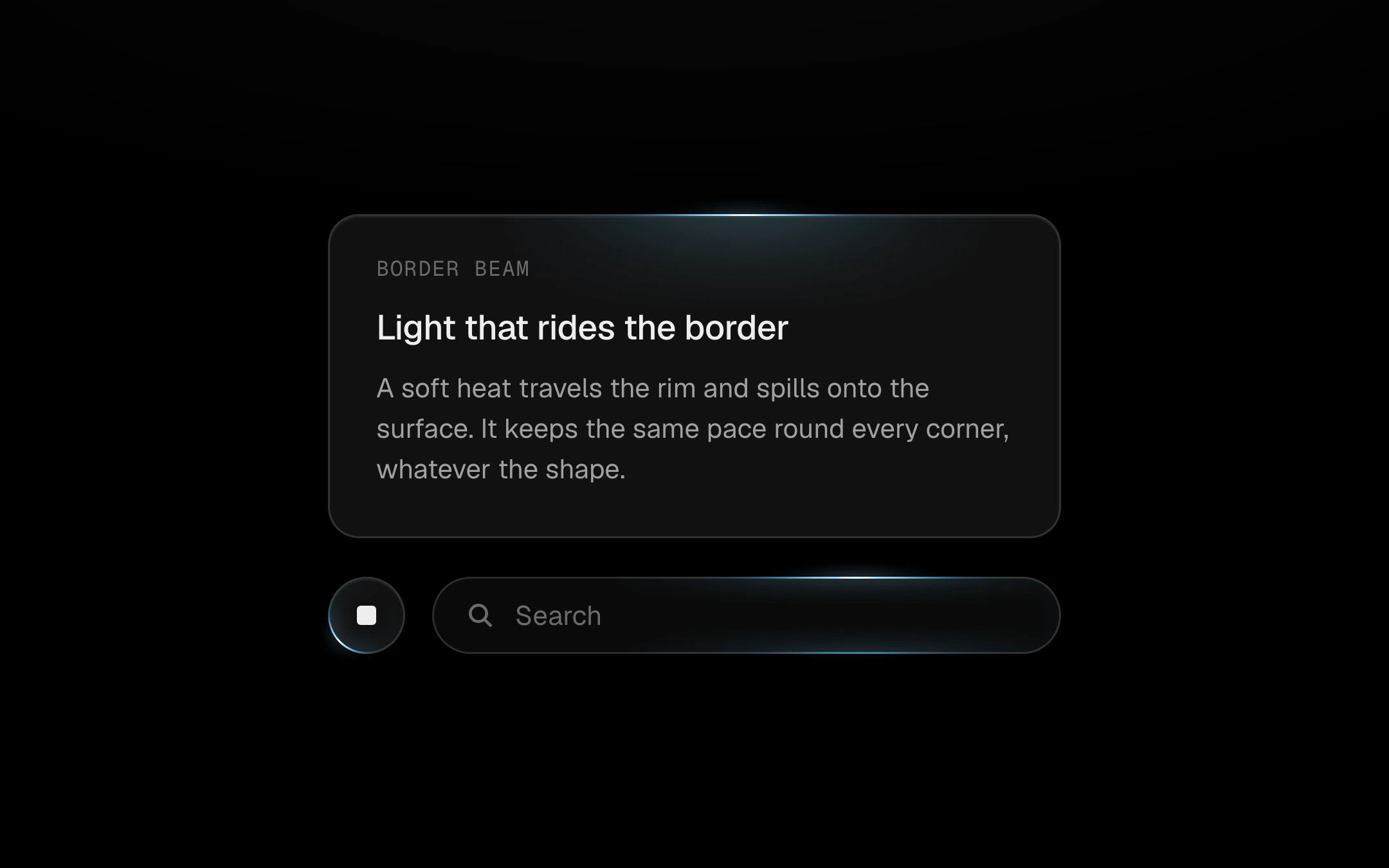
A soft light that travels the rim of a card, button or field and spills onto its surface, as if the edge were glass catching a passing light.
$149 once · every Pro piece
Customize
card
input
It reads the wrapped element's own size, border and corner radii, lights exactly its 1px border with a near-white core cooling to the accent, and keeps one calm speed round every corner. A second light can run half a lap behind; it eases to a stop on hover and fades out when inactive. Pure CSS motion on the compositor.
Install
npx shadcn@latest add @obsyde/border-beamNeeds your licence key · Get Pro
Usage
Import it from where the CLI puts it, or copy the files below by hand.
import { BorderBeam } from '@/components/obsyde/ember/border-beam/BorderBeam';

export function Example() {
  return (
    <BorderBeam />
  );
}
Files
What you get with Pro: plain React, TypeScript and CSS, with no dependencies.
ember/border-beam/BorderBeam.tsxcomponentember/border-beam/border-beam-demo.cssstylesember/border-beam/border-beam.cssstylesember/border-beam/BorderBeamDemo.tsxdemoember/shared/accent.tssharedember/shared/spring.tssharedember/shared/ember.cssshared
API
| Prop | Type | Default |
|---|---|---|
accentAccent | 'ember' | 'volt' | 'arc' | 'ember' |
exampleElement | 'card' | 'input' | 'card' |
speedSpeed (px/s) | number | 110 |
lengthLength (px) | number | 170 |
duoTwo beams | boolean | false |
pauseOnHoverPause on hover | boolean | false |
activeActive | boolean | true |