Unit Dots
A unit chart: every period is a column of equal-value squares, so one square is always the same amount and nothing can be exaggerated.
$149 once · every Pro piece
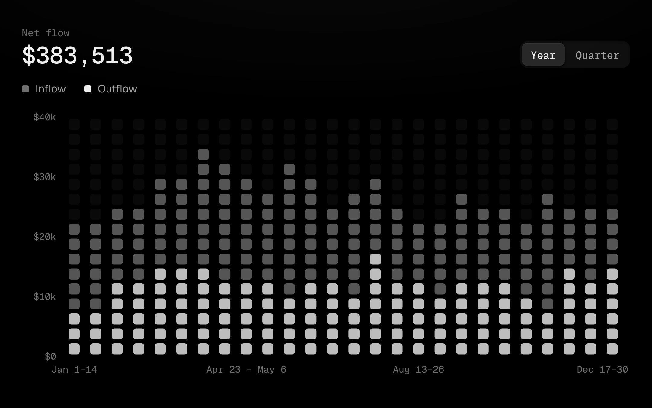
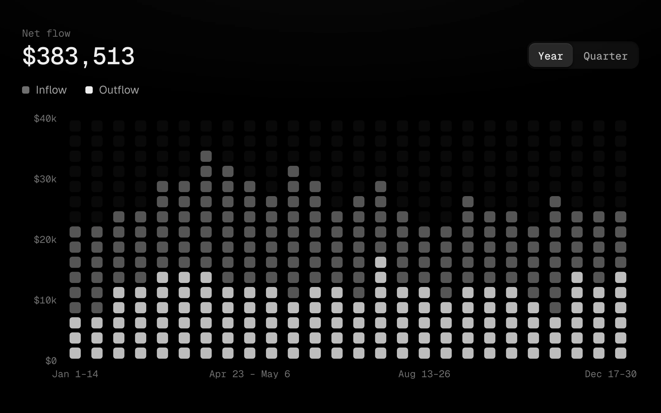
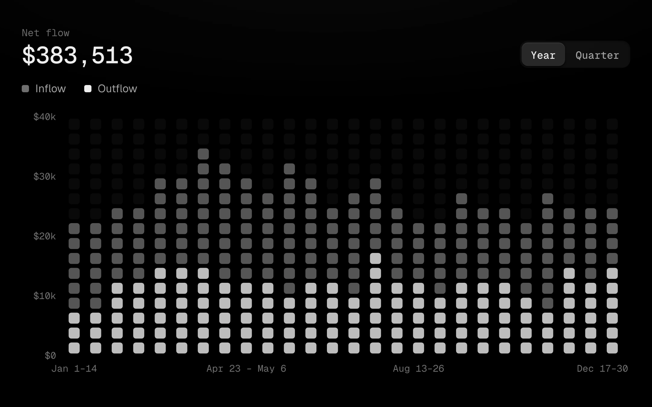
Two series share each column from the baseline, the larger one behind and the smaller lit inside it, with the empty squares above kept as a faint ghost grid that carries the scale. Scrub a column and it becomes a highlight band riding the cursor spring: its squares light up, the primary series in the accent, while every other column steps back. Squares cascade in column by column on a springy overshoot; switching the range re-deals them.
Install
npx shadcn@latest add @obsyde/unit-dotsNeeds your licence key · Get Pro
Usage
Import it from where the CLI puts it, or copy the files below by hand.
import { UnitDots } from '@/components/obsyde/ember/unit-dots/UnitDots';

export function Example() {
  return (
    <UnitDots />
  );
}
Files
What you get with Pro: plain React, TypeScript and CSS, with no dependencies.
ember/unit-dots/UnitDots.tsxcomponentember/unit-dots/unit-dots.cssstylesember/unit-dots/UnitDotsDemo.tsxdemoember/viz-kit/viz-kit.csssharedember/viz-kit/Tooltip.tsxsharedember/viz-kit/focus.tssharedember/viz-kit/patterns.tsxsharedember/viz-kit/roll.tssharedember/shared/rolling-number.csssharedember/shared/spring.tssharedember/shared/accent.tssharedember/viz-kit/scale.tssharedember/viz-kit/motion.tssharedember/viz-kit/chart.tsxsharedember/shared/ember.csssharedember/viz-kit/touch.tssharedember/viz-kit/keyboard.tssharedember/viz-kit/size.tssharedember/viz-kit/States.tsxsharedember/viz-kit/shape.tssharedember/viz-kit/Legend.tsxsharedember/viz-kit/Grid.tsxsharedember/viz-kit/demo.tsxsharedember/viz-kit/demo.csssharedember/viz-kit/Axis.tsxshared
API
| Prop | Type | Default |
|---|---|---|
accentAccent | 'ember' | 'volt' | 'arc' | 'ember' |
rangeRange | 'year' | 'quarter' | 'year' |
shapeShape | 'square' | 'round' | 'square' |
rowsRows | number | 16 |
ghostGhost grid | boolean | true |
legendLegend | 'row' | 'none' | 'row' |
tooltipTooltip | 'panel' | 'corner' | 'none' | 'panel' |
patternPattern | 'none' | 'diagonal-up' | 'diagonal-down' | 'dots' | 'vertical' | 'crosshatch' | 'none' |
revealReveal | 'cascade' | 'none' | 'cascade' |
statusStatus | 'ready' | 'loading' | 'empty' | 'ready' |
heightHeight | number | 300 |
seedSeed | number | 4 |