Pulse Line
A live line whose newest point is the only hot thing on screen.
$149 once · every Pro piece
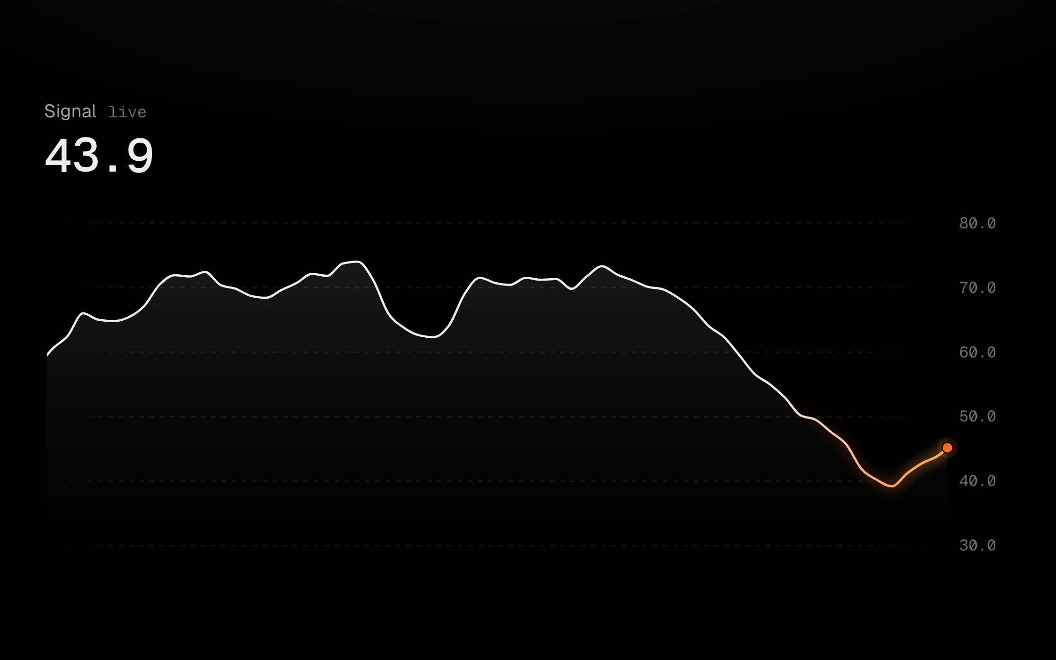
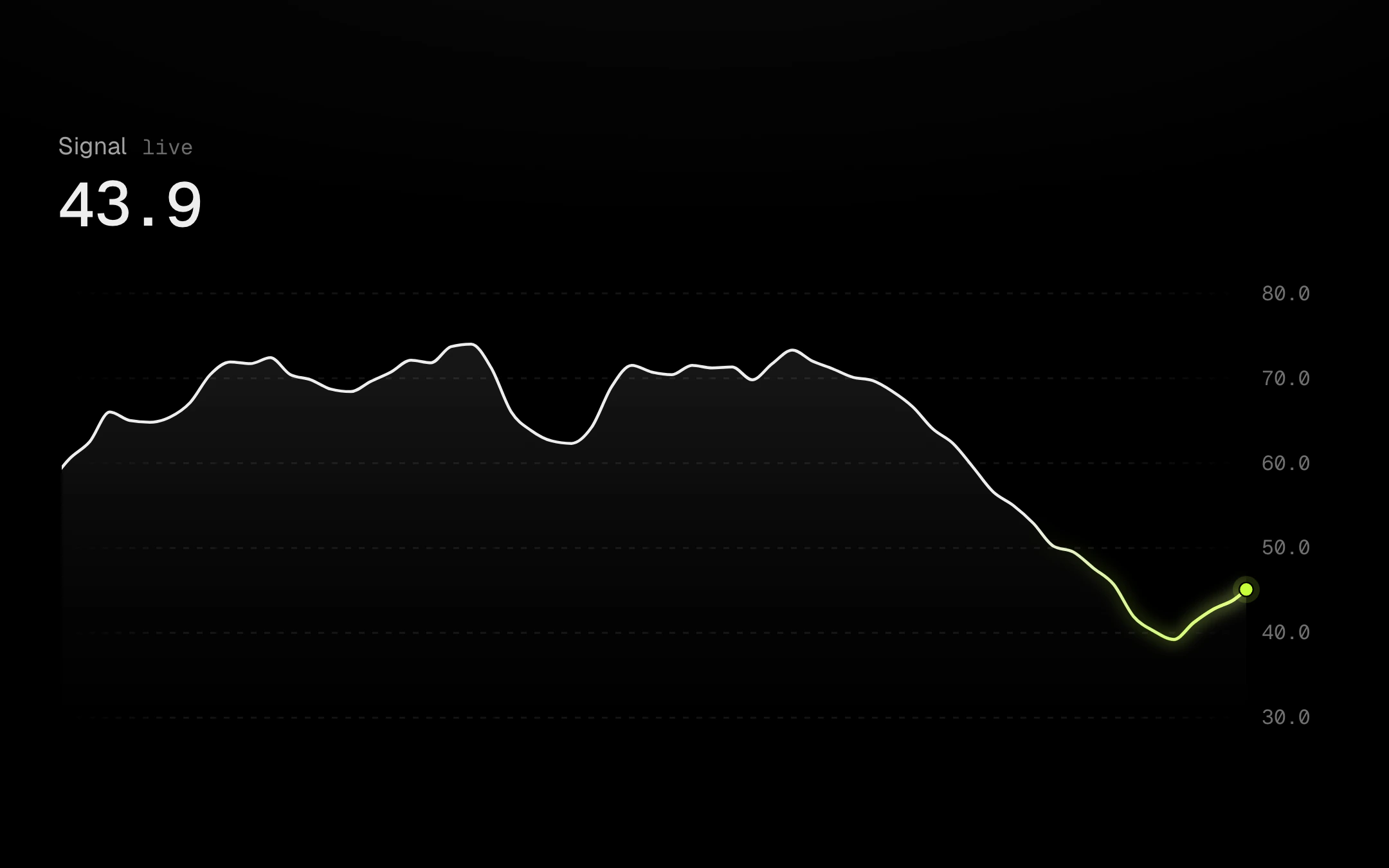
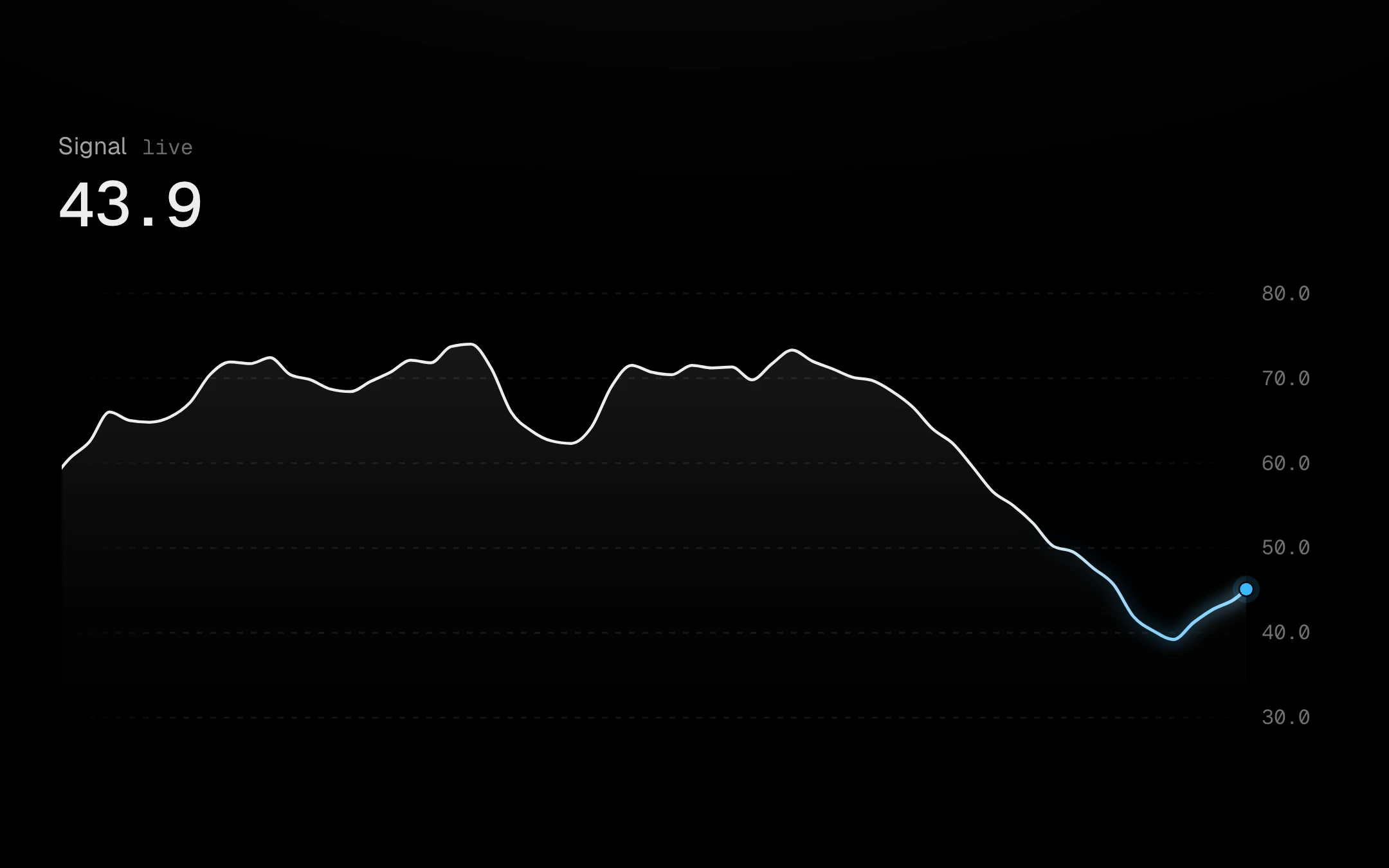
Points arrive on an interval and the line scrolls left under a head that never leaves the plot: in glide it runs at the stream’s own pace about one point behind the newest, like a seismograph; in step it eases one point left as each lands. The y scale eases and axis ticks fade rather than jump, and the head breathes like a pilot light while points keep coming and goes ash and still when they stop. The newest stretch carries a heat trail that cools with age. A crosshair glides between points under the pointer, a finger or the arrow keys, reaching every point from the first to the newest; while you read, the picture holds on a real point and catches up in one swell when you let go, and the header rolls to the value and how long ago it was. Optional extras: dashed min, max, average and median lines that either glide with the visible window or ease once per point, with pills that never overlap; a threshold past which the line runs hot over a hatched zone, draggable along the axis or with the arrow keys; a stream that holds while you read it; a floating tooltip; dotted or hatched backgrounds; and loading and empty states. It pauses off screen and in hidden tabs and steps without motion under reduced motion.
Install
npx shadcn@latest add @obsyde/pulse-lineNeeds your licence key · Get Pro
Usage
Import it from where the CLI puts it, or copy the files below by hand.
import { PulseLine } from '@/components/obsyde/ember/pulse-line/PulseLine';

export function Example() {
  return (
    <PulseLine live />
  );
}
Files
What you get with Pro: plain React, TypeScript and CSS, with no dependencies.
ember/pulse-line/PulseLine.tsxcomponentember/pulse-line/pulse-line.cssstylesember/pulse-line/PulseLineDemo.tsxdemoember/viz-kit/viz-kit.csssharedember/viz-kit/Tooltip.tsxsharedember/viz-kit/focus.tssharedember/viz-kit/patterns.tsxsharedember/viz-kit/roll.tssharedember/shared/rolling-number.csssharedember/shared/spring.tssharedember/shared/accent.tssharedember/viz-kit/scale.tssharedember/viz-kit/motion.tssharedember/viz-kit/chart.tsxsharedember/shared/ember.csssharedember/viz-kit/touch.tssharedember/viz-kit/keyboard.tssharedember/viz-kit/size.tssharedember/viz-kit/States.tsxsharedember/viz-kit/shape.tssharedember/viz-kit/series.tsxsharedember/viz-kit/Grid.tsxsharedember/viz-kit/Axis.tsxsharedember/viz-kit/annotations.tsxshared
API
| Prop | Type | Default |
|---|---|---|
accentAccent | 'ember' | 'volt' | 'arc' | 'ember' |
labelLabel | string | 'Signal' |
unitUnit | string | — |
liveLive | boolean | true |
intervalMsInterval (ms) | number | 1000 |
motionMotion | 'glide' | 'step' | 'glide' |
heatHeat trail | boolean | true |
fillFill | 'gradient' | 'none' | 'gradient' |
refLinesReference lines | 'none' | 'min-max' | 'avg' | 'median' | 'all' | 'none' |
refMotionReference motion | 'fixed' | 'live' | 'fixed' |
thresholdThreshold | 'none' | 'above' | 'below' | 'none' |
thresholdValueThreshold value | number | 45 |
pauseOnScrubPause on scrub | boolean | false |
showAxisAxis | boolean | true |
tooltipTooltip | 'none' | 'panel' | 'none' |
crosshairCrosshair | 'solid' | 'dashed' | 'gradient' | 'none' | 'solid' |
dotsDots | 'halo' | 'ring' | 'none' | 'halo' |
backgroundBackground | 'grid' | 'dots' | 'hatch' | 'none' | 'grid' |
curveCurve | 'monotone' | 'linear' | 'catmull' | 'step' | 'monotone' |
revealReveal | 'sweep' | 'cool' | 'rise' | 'fade' | 'none' | 'sweep' |
statusStatus | 'ready' | 'loading' | 'empty' | 'ready' |
heightHeight | number | 240 |
pointsPoints | number | 60 |
seedSeed | number | 7 |