Line Chart
Up to six series drawn in greys of different strength, never a rainbow.
$149 once · every Pro piece
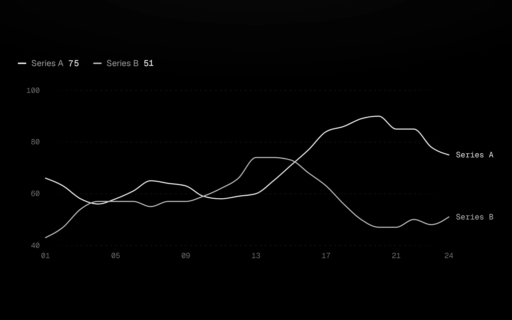
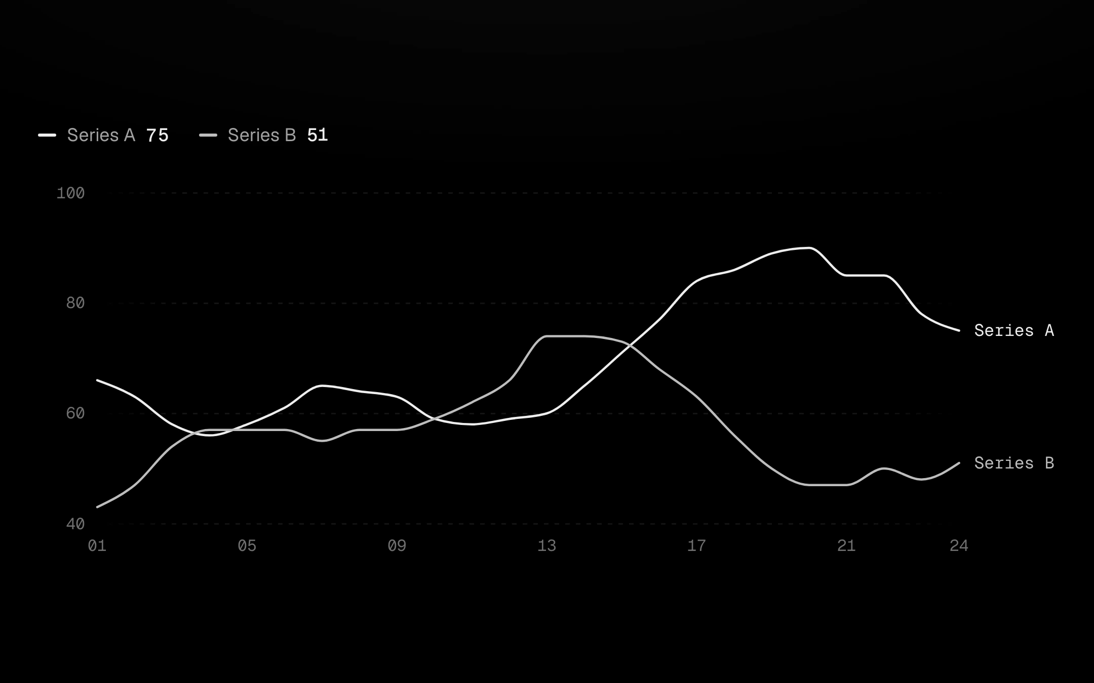
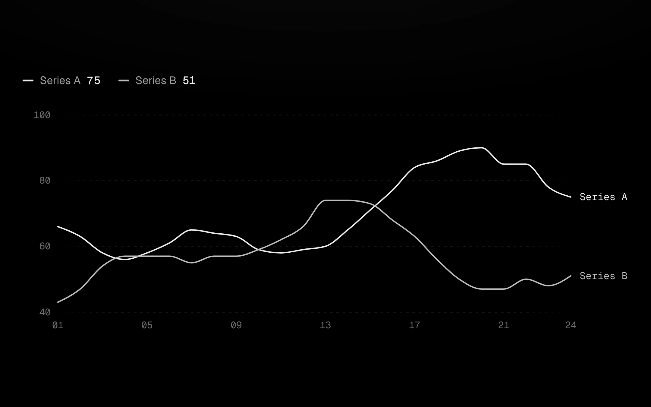
Focus one from the legend, with a click or Up and Down on the plot, and it alone turns accent while the rest step back. A hairline crosshair snaps to the nearest row with a floating panel or a corner readout, the line around the cursor stays bright while the rest dims, and names sit at the right edge, nudged apart. Optional layers: the kiln sky (a warm glow rising off the lead line), a gradient or hatched fill, a trend line, a projection with a widening cone, a Bollinger envelope, dashed min, max and average lines with value pills, a threshold past which every line runs hot, event badges that fan out, a dashed previous period, a dashed unfinished tail, drag-to-select a span, a brush strip that zooms, a live stream with a pilot light, and loading and empty states on the same instance.
Install
npx shadcn@latest add @obsyde/line-chartNeeds your licence key · Get Pro
Usage
Import it from where the CLI puts it, or copy the files below by hand.
import { LineChart } from '@/components/obsyde/ember/line-chart/LineChart';

export function Example() {
  return (
    <LineChart series={2} />
  );
}
Files
What you get with Pro: plain React, TypeScript and CSS, with no dependencies.
ember/line-chart/LineChart.tsxcomponentember/line-chart/line-chart.cssstylesember/line-chart/LineChartDemo.tsxdemoember/viz-kit/viz-kit.csssharedember/viz-kit/Tooltip.tsxsharedember/viz-kit/focus.tssharedember/viz-kit/patterns.tsxsharedember/viz-kit/roll.tssharedember/shared/rolling-number.csssharedember/shared/spring.tssharedember/shared/accent.tssharedember/viz-kit/scale.tssharedember/viz-kit/motion.tssharedember/viz-kit/chart.tsxsharedember/shared/ember.csssharedember/viz-kit/touch.tssharedember/viz-kit/keyboard.tssharedember/viz-kit/size.tssharedember/viz-kit/States.tsxsharedember/viz-kit/shape.tssharedember/viz-kit/series.tsxsharedember/viz-kit/Legend.tsxsharedember/viz-kit/Grid.tsxsharedember/viz-kit/demo.tsxsharedember/viz-kit/demo.csssharedember/viz-kit/Brush.tsxsharedember/viz-kit/Axis.tsxsharedember/viz-kit/annotations.tsxshared
API
| Prop | Type | Default |
|---|---|---|
accentAccent | 'ember' | 'volt' | 'arc' | 'ember' |
seriesSeries | number | 2 |
focusedFocused series (-1 none) | number | -1 |
legendLegend | 'focus' | 'toggle' | 'list' | 'none' | 'focus' |
endLabelsEnd labels | boolean | true |
areaFill | 'none' | 'gradient' | 'pattern' | 'none' |
skyKiln sky | boolean | false |
glowGlow | boolean | false |
markersMarkers | 'none' | 'ring' | 'dot' | 'none' |
trendTrend | 'none' | 'dashed' | 'gradient' | 'none' |
projectionProjection | 'none' | 'regression' | 'target' | 'none' |
bandEnvelope | boolean | false |
refLinesReference lines | 'none' | 'min-max' | 'avg' | 'median' | 'all' | 'none' |
thresholdThreshold | 'none' | 'above' | 'below' | 'none' |
thresholdValueThreshold value | number | 70 |
annotationsAnnotations | boolean | false |
compareCompare | boolean | false |
tailDashed tail | boolean | false |
selectionSelect a span | boolean | false |
brushBrush zoom | boolean | false |
yTicksY ticks | number | 4 |
showAxisAxes | boolean | true |
tooltipTooltip | 'panel' | 'corner' | 'none' | 'panel' |
crosshairCrosshair | 'solid' | 'dashed' | 'gradient' | 'none' | 'solid' |
dotsDots | 'halo' | 'ring' | 'none' | 'halo' |
patternPattern | 'none' | 'diagonal-up' | 'diagonal-down' | 'dots' | 'vertical' | 'crosshatch' | 'none' |
backgroundBackground | 'grid' | 'dots' | 'hatch' | 'none' | 'grid' |
curveCurve | 'monotone' | 'linear' | 'catmull' | 'step' | 'monotone' |
revealReveal | 'sweep' | 'cool' | 'rise' | 'fade' | 'none' | 'sweep' |
statusStatus | 'ready' | 'loading' | 'empty' | 'ready' |
valueLabelsValue labels | boolean | false |
liveLive | boolean | false |
heightHeight | number | 260 |
pointsPoints | number | 24 |
seedSeed | number | 11 |