Bar Chart
Vertical bars on the viz-kit chart: single, grouped or stacked, morphing between layouts bar by bar on staggered springs.
$149 once · every Pro piece
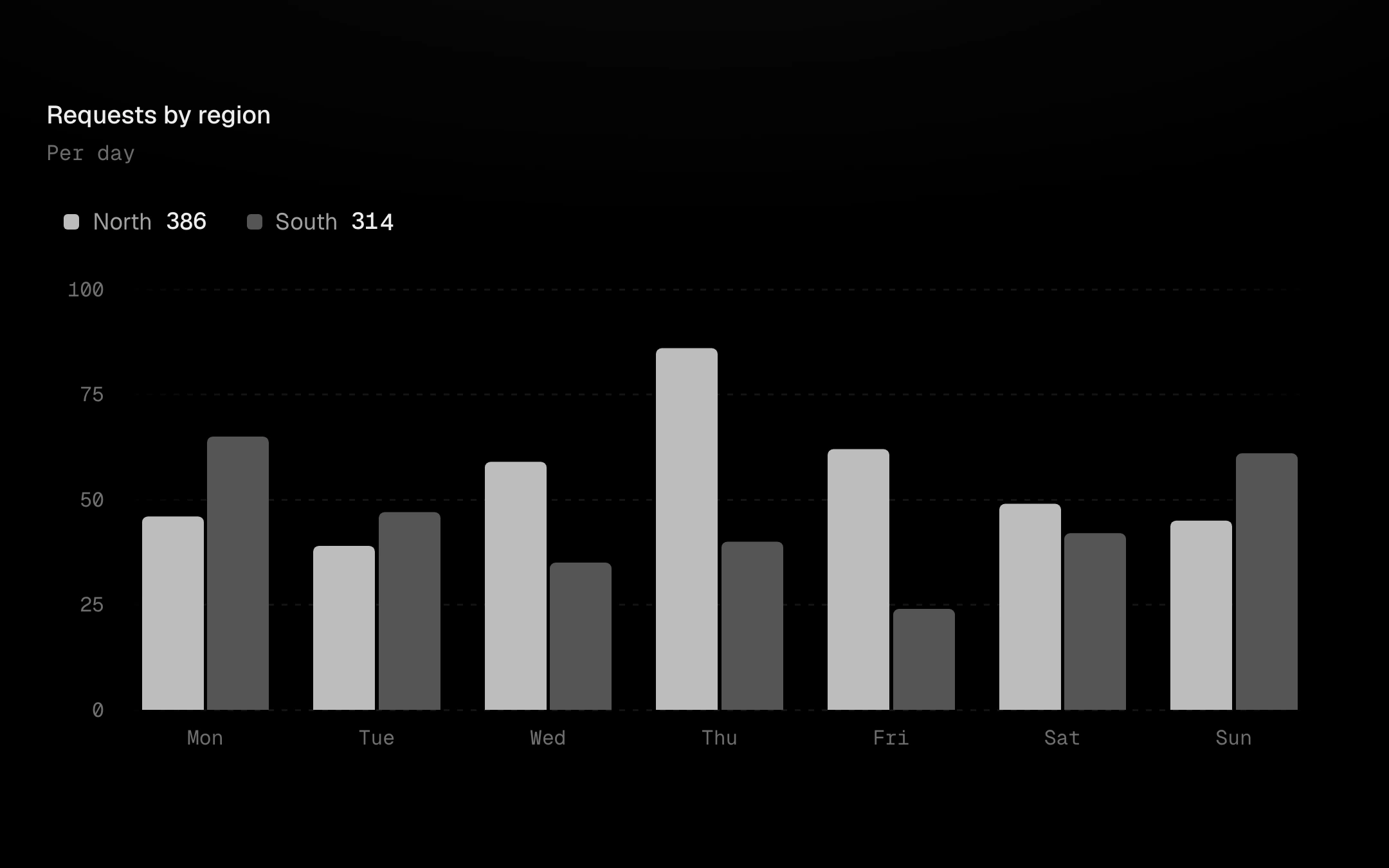
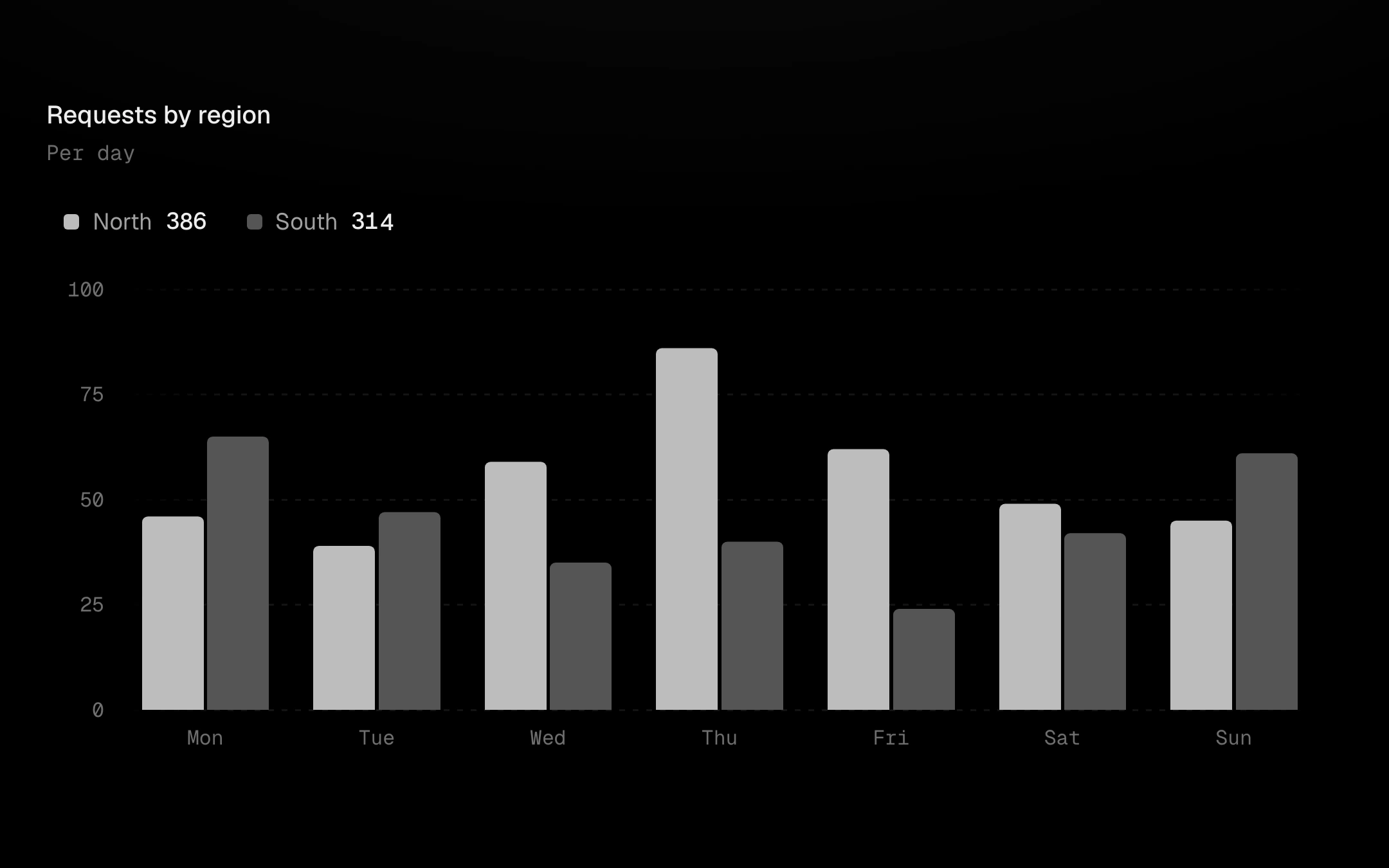
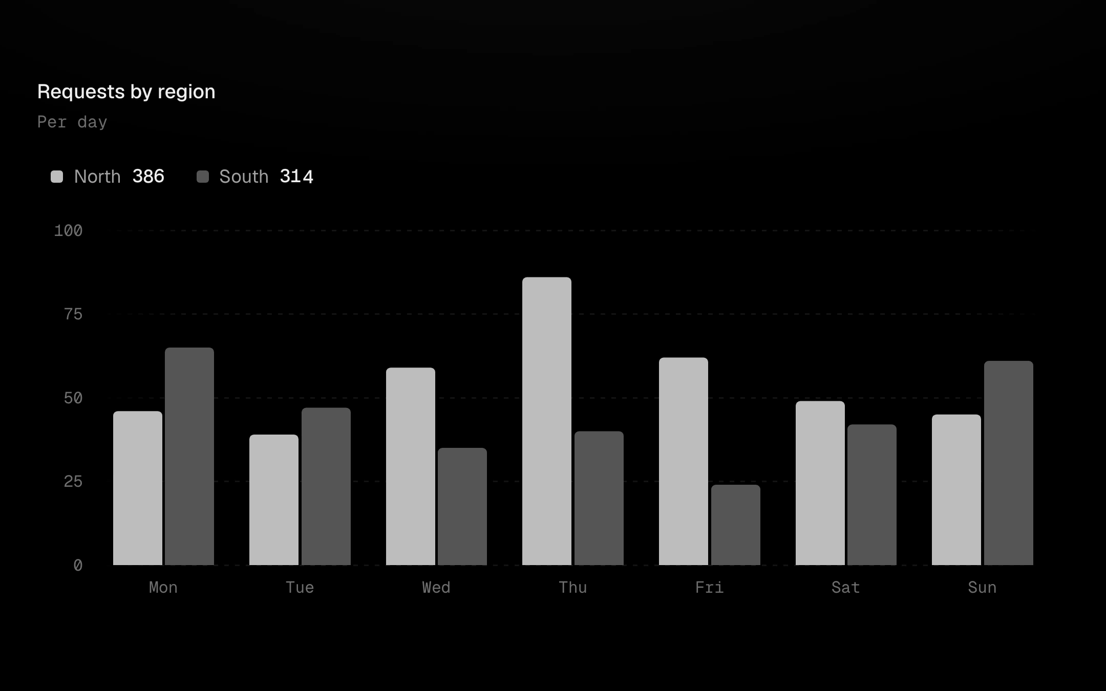
The signature is the selected-value grammar: one bar runs hot with a dashed leader to its value pill, and the pill springs and rolls as you scrub. Options: squircle unit columns with a ring on the top unit, hatched remaining tracks, per-series patterns, gradient fills, positive and negative bars from a bright zero line, value labels thinned to avoid collisions, sort with FLIP springs, mass-by-value landing, reference lines with pills, a reference band, a trend line, a threshold that runs hot, event markers, the previous period as dashed ghosts, a legend that isolates, toggles and locks, panel or corner tooltips, grid or textured backgrounds, keyboard scrubbing with detents, and loading and empty states.
Install
npx shadcn@latest add @obsyde/bar-chartNeeds your licence key · Get Pro
Usage
Import it from where the CLI puts it, or copy the files below by hand.
import { BarChart } from '@/components/obsyde/ember/bar-chart/BarChart';

export function Example() {
  return (
    <BarChart series={2} mode="grouped" />
  );
}
Files
What you get with Pro: plain React, TypeScript and CSS, with no dependencies.
ember/bar-chart/BarChart.tsxcomponentember/bar-chart/bar-chart.cssstylesember/bar-chart/BarChartDemo.tsxdemoember/viz-kit/viz-kit.csssharedember/viz-kit/Tooltip.tsxsharedember/viz-kit/focus.tssharedember/viz-kit/patterns.tsxsharedember/viz-kit/roll.tssharedember/shared/rolling-number.csssharedember/shared/spring.tssharedember/shared/accent.tssharedember/viz-kit/scale.tssharedember/viz-kit/motion.tssharedember/viz-kit/chart.tsxsharedember/shared/ember.csssharedember/viz-kit/touch.tssharedember/viz-kit/keyboard.tssharedember/viz-kit/size.tssharedember/viz-kit/States.tsxsharedember/viz-kit/shape.tssharedember/viz-kit/Legend.tsxsharedember/viz-kit/Grid.tsxsharedember/viz-kit/demo.tsxsharedember/viz-kit/demo.csssharedember/viz-kit/Axis.tsxsharedember/viz-kit/annotations.tsxshared
API
| Prop | Type | Default |
|---|---|---|
accentAccent | 'ember' | 'volt' | 'arc' | 'ember' |
modeMode | 'grouped' | 'stacked' | 'grouped' |
categoriesCategories | number | 12 |
seriesSeries | number | 1 |
modeSwitchMode switch | boolean | false |
sortSwitchSort switch | boolean | false |
sortSort | 'none' | 'desc' | 'asc' | 'none' |
shapeShape | 'bar' | 'units' | 'bar' |
fillFill | 'solid' | 'gradient' | 'solid' |
trackTrack | 'none' | 'hatch' | 'solid' | 'none' |
selectedSelected bar | number | -1 |
signedPositive & negative | boolean | false |
massMass landing | boolean | false |
refLinesReference lines | 'none' | 'min-max' | 'avg' | 'median' | 'all' | 'none' |
bandReference band | boolean | false |
trendTrend | 'none' | 'dashed' | 'gradient' | 'none' |
thresholdThreshold | 'none' | 'above' | 'below' | 'none' |
annotationsMarkers | boolean | false |
compareCompare | boolean | false |
legendLegend | 'row' | 'list' | 'none' | 'row' |
tooltipTooltip | 'panel' | 'corner' | 'none' | 'panel' |
patternPattern | 'none' | 'series' | 'diagonal-up' | 'diagonal-down' | 'dots' | 'vertical' | 'crosshatch' | 'none' |
backgroundBackground | 'grid' | 'dots' | 'hatch' | 'none' | 'grid' |
revealReveal | 'sweep' | 'cool' | 'fade' | 'none' | 'sweep' |
statusStatus | 'ready' | 'loading' | 'empty' | 'ready' |
valueLabelsValue labels | boolean | false |
showAxisAxis | boolean | true |
heightHeight | number | 260 |
seedSeed | number | 5 |